Design
168 design.
Ét af dem er dit.
Ethvert Plot-site kan bære alle de her udtryk — lyst eller mørkt, roligt eller markant. Tryk på et for at se det live, og byg så dit eget.
Alle design virker med alle funktioner — booking, menukort, gallerier, medarbejdere. Se det hele i en fuld demo: Restaurant, Salon, Butik, Klinik eller Konsulent.
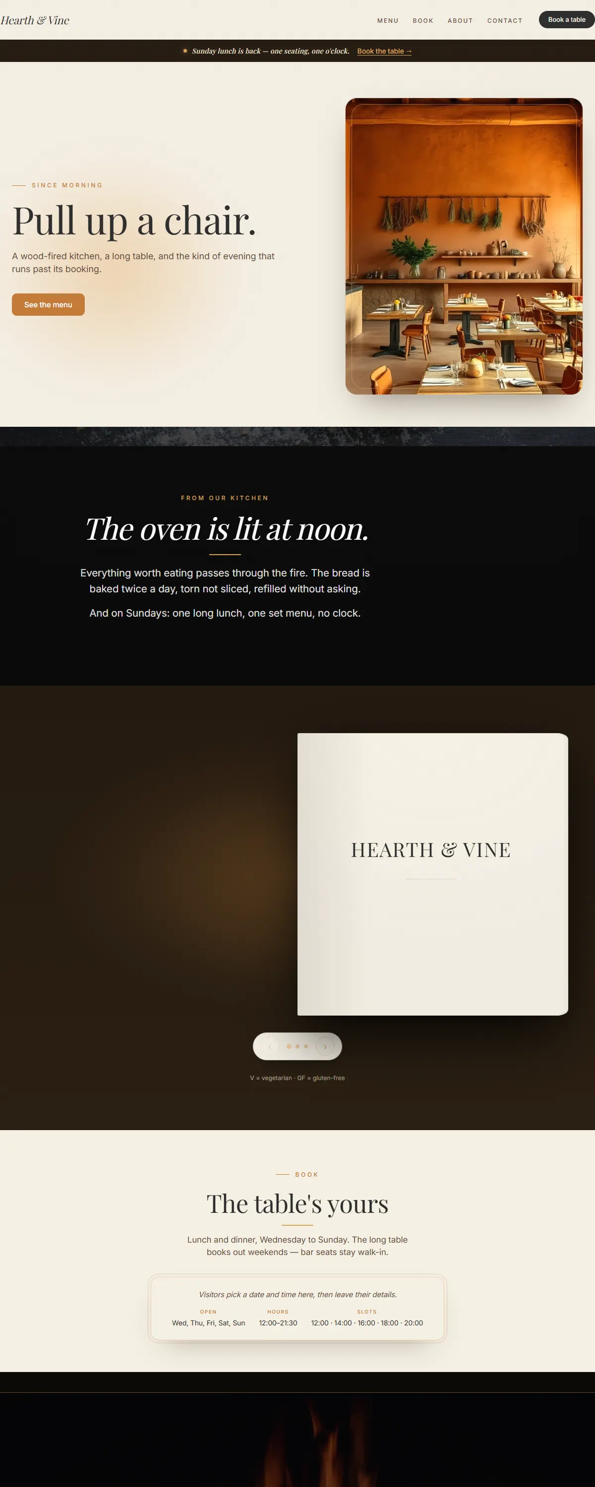
Warm, hospitable feel with classic serif headlines for businesses where atmosphere matters.
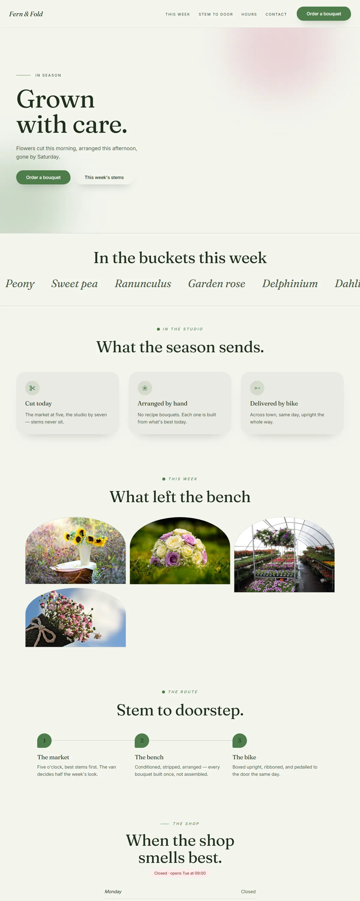
Fresh, leafy calm with an organic serif — green and growing.
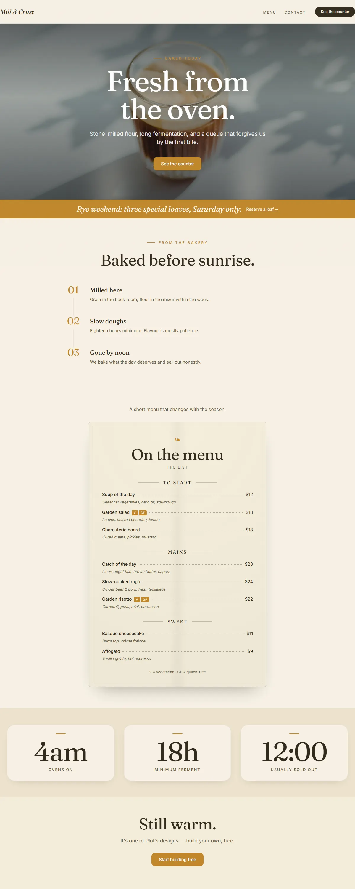
Stone-mill bakery warmth — ochre paper, crust gold and Fraunces italics.
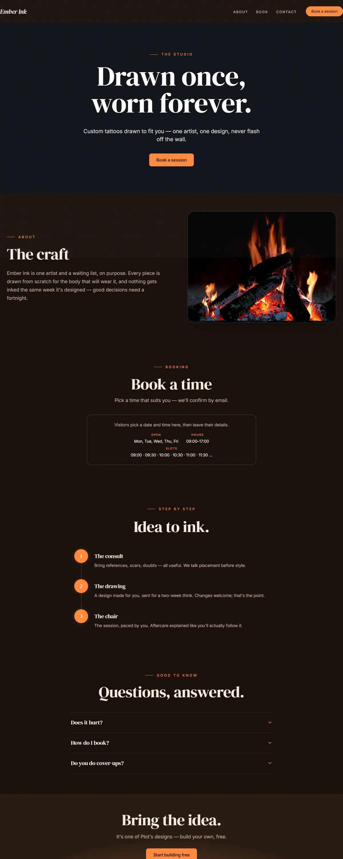
Dark espresso and warm amber with a display serif. The custom tattoo studio.
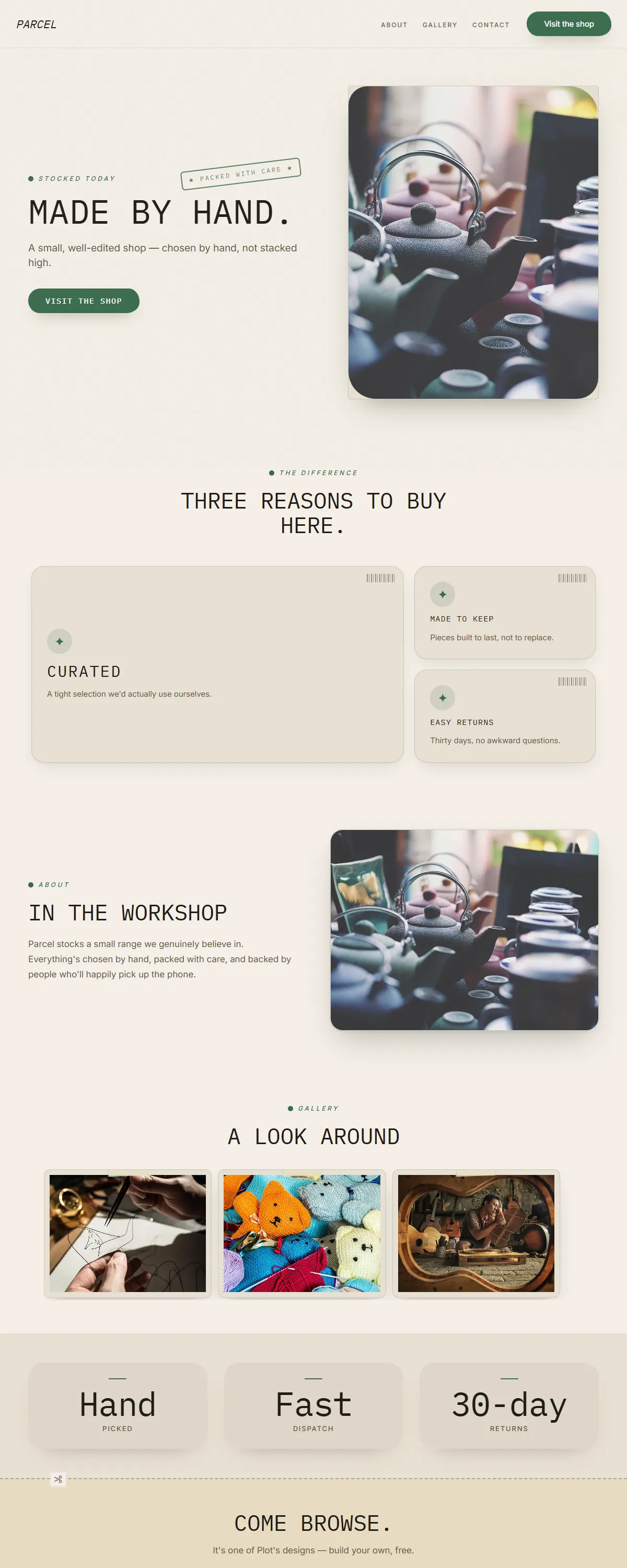
Kraft tan and forest green with monospaced labels. The corner provisions shop.
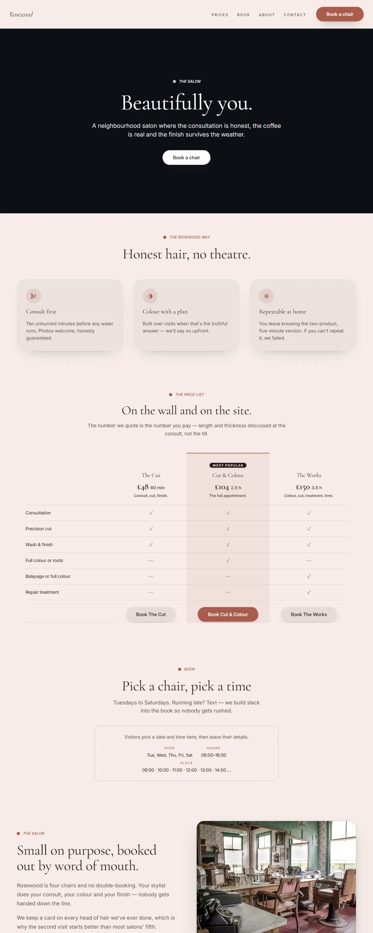
Dusty rose and deep brown with a soft serif. Warm, mature, never sugary.
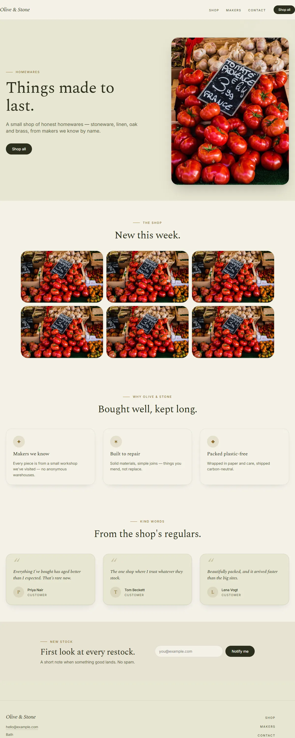
Olive and cream with a mustard accent and a Spectral serif. Farmhouse-fresh.
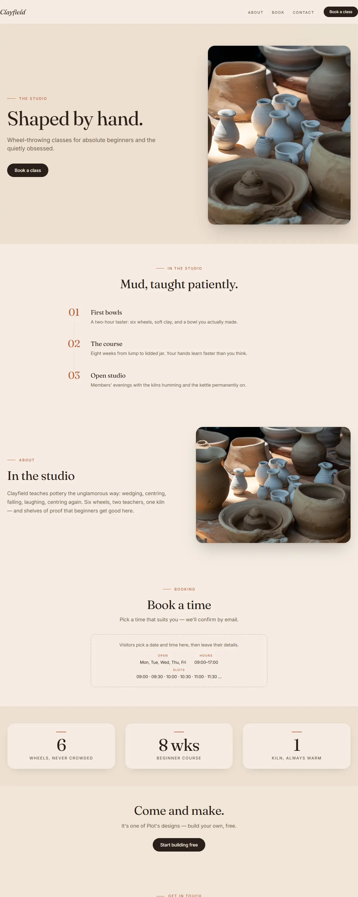
Warm clay and sand with a characterful Fraunces. The pottery school.
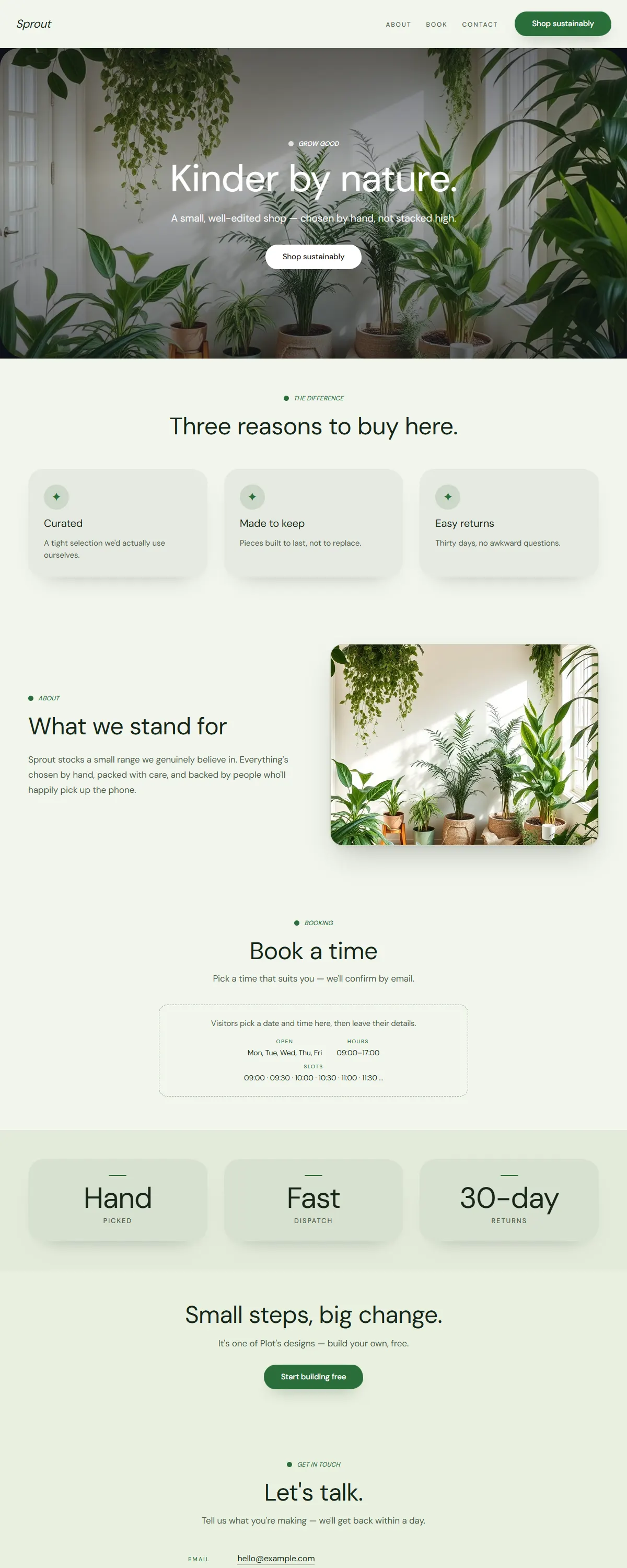
Fresh, bright and eco — leaf green on soft cream with a friendly rounded sans.
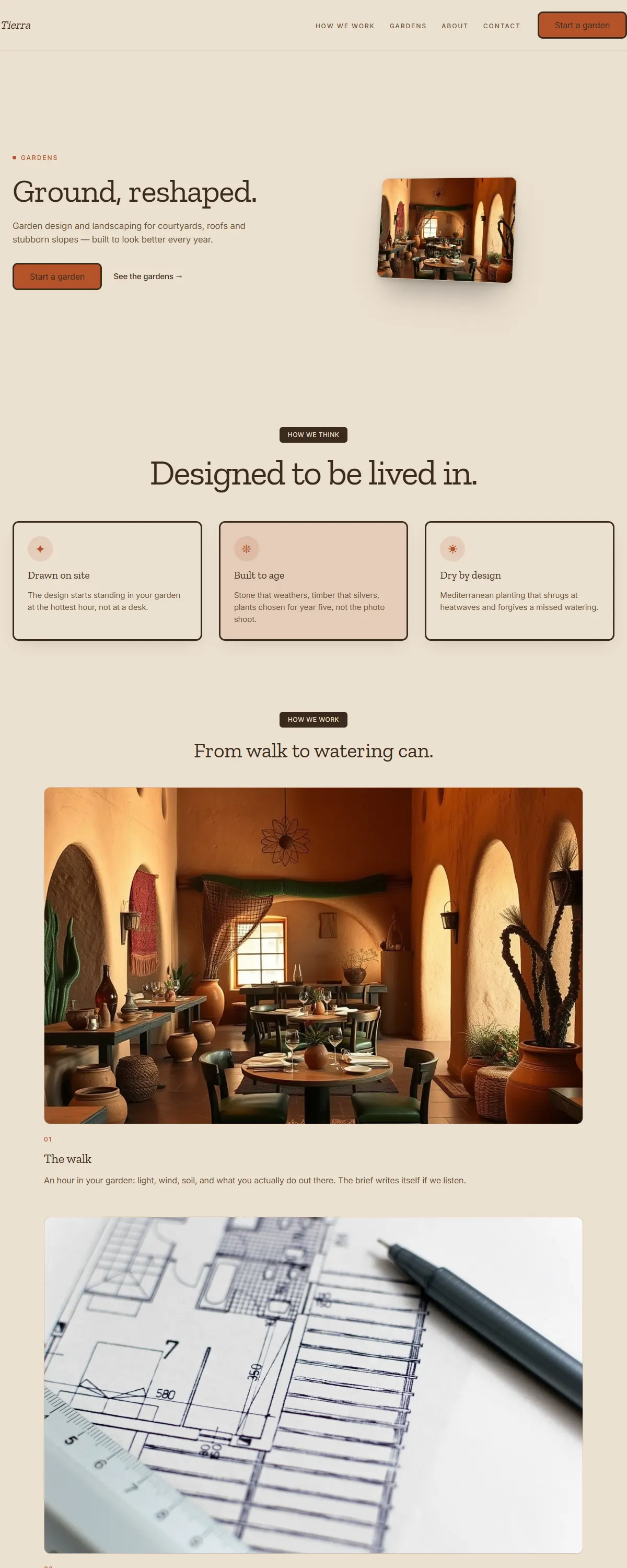
Earthy maximalist — warm sand, rust and deep green with a sturdy Zilla slab serif.
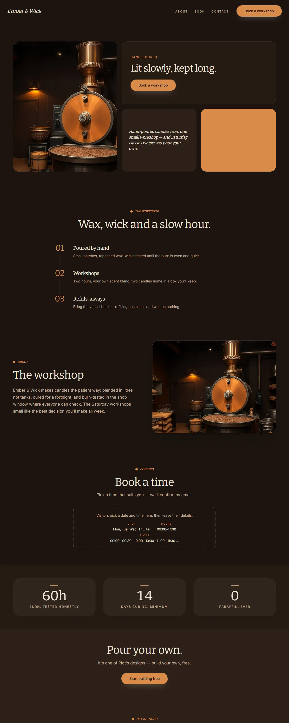
Dark hearth warmth — umber and caramel with a sturdy Bitter slab serif. The candle workshop.
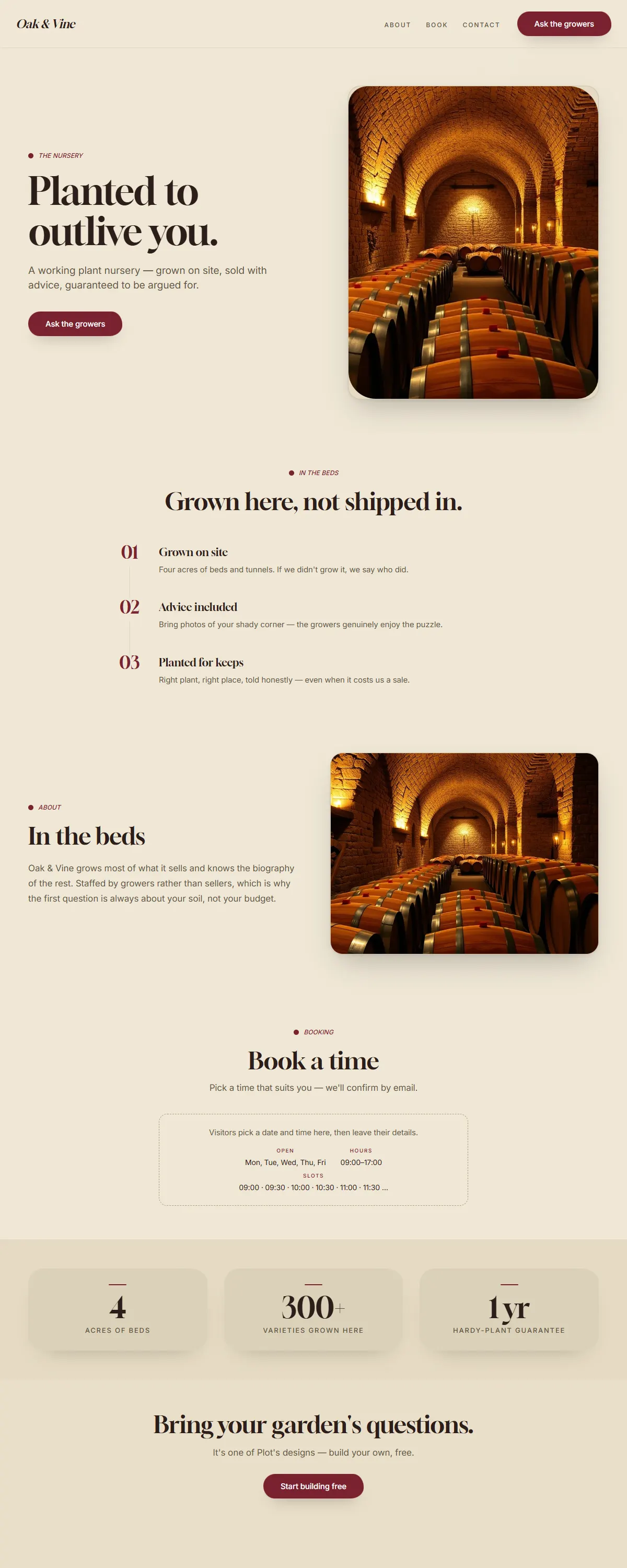
Rustic winery warmth — parchment and deep wine-red with an elegant Gloock serif.
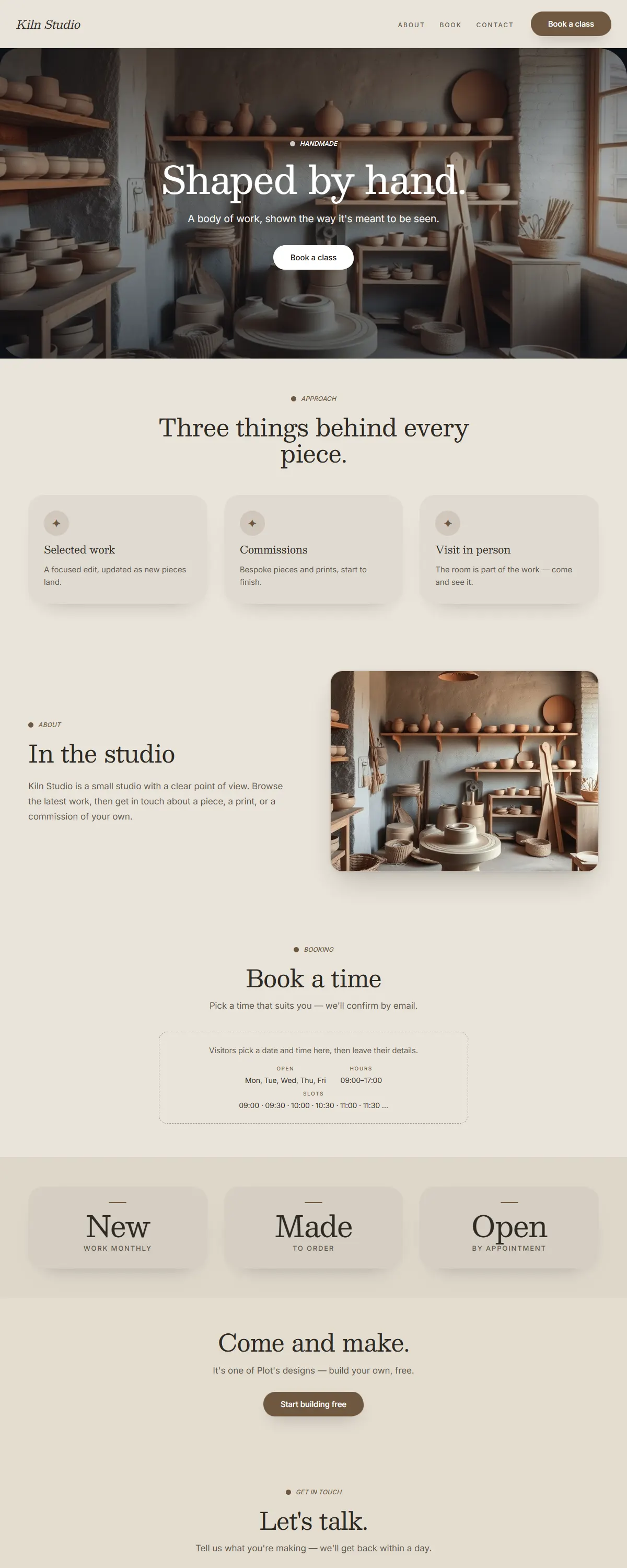
Stoneware tableware studio — kiln grey and raw umber with a soft Besley slab.
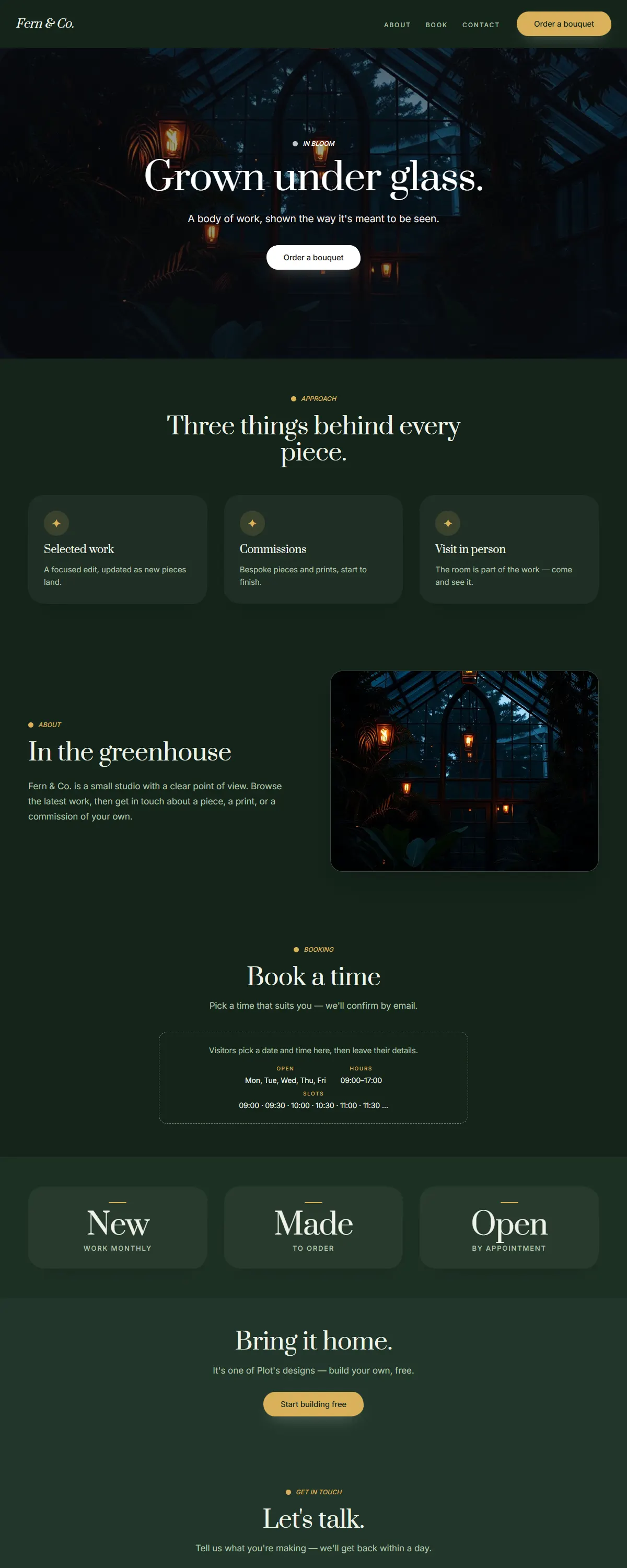
Dark greenhouse botanical — deep forest green with warm brass and an elegant Prata serif.
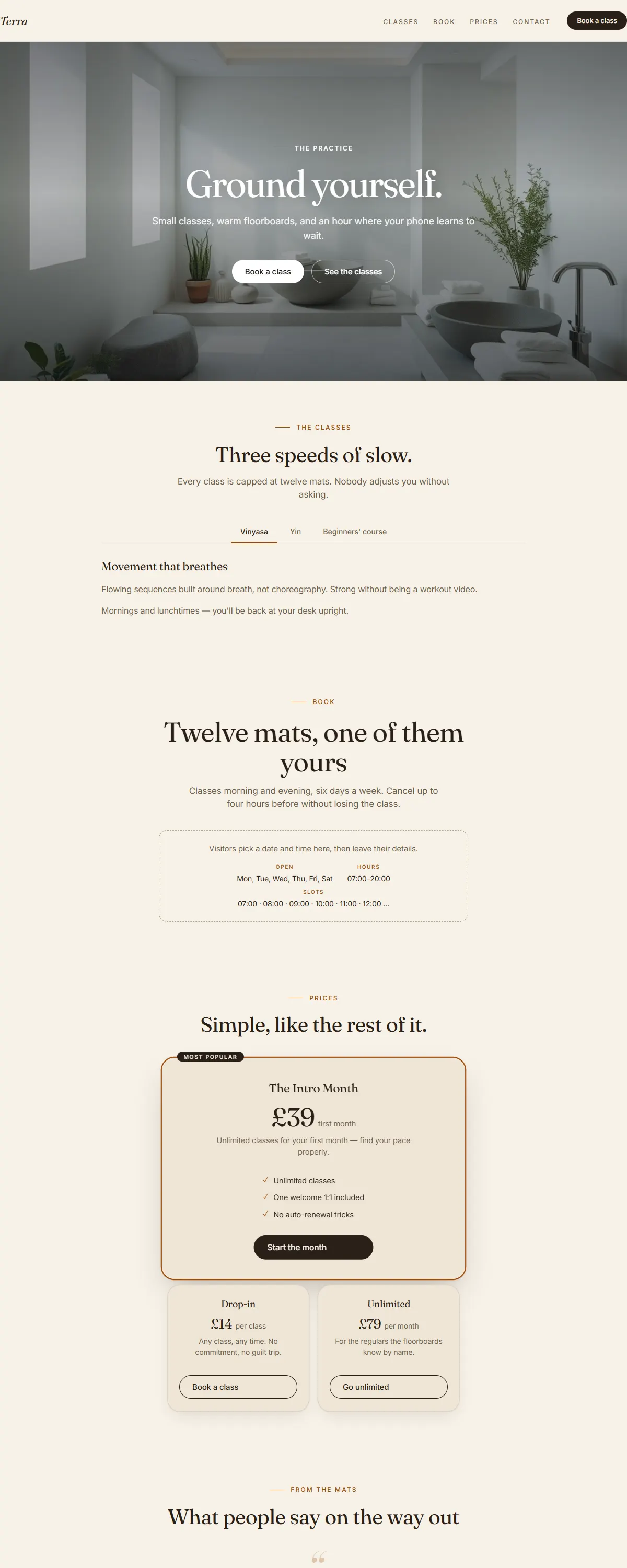
Warm clay and sand with burnt orange and a characterful Fraunces. Honest, hearty, farm-to-table.
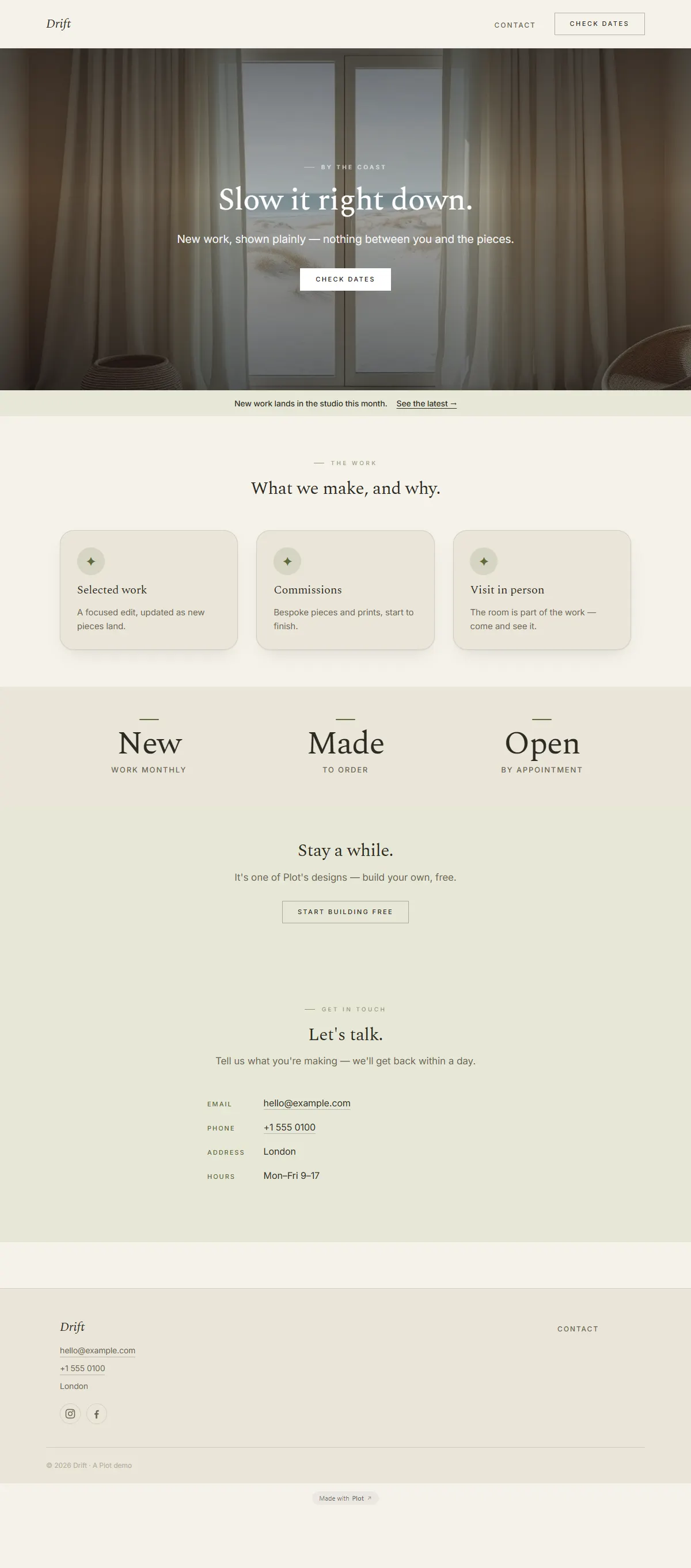
Soft sand and sage with a gentle Spectral serif. Slow, coastal, unhurried.
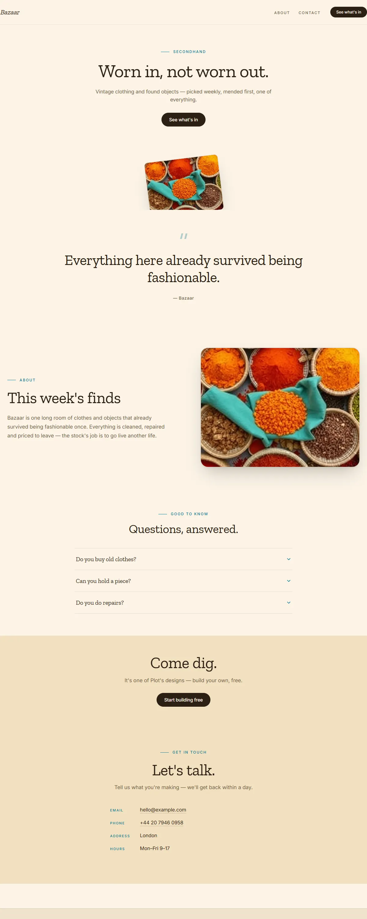
Saffron, terracotta and teal with a sturdy Zilla slab. Earthy maximalist, warm and abundant.
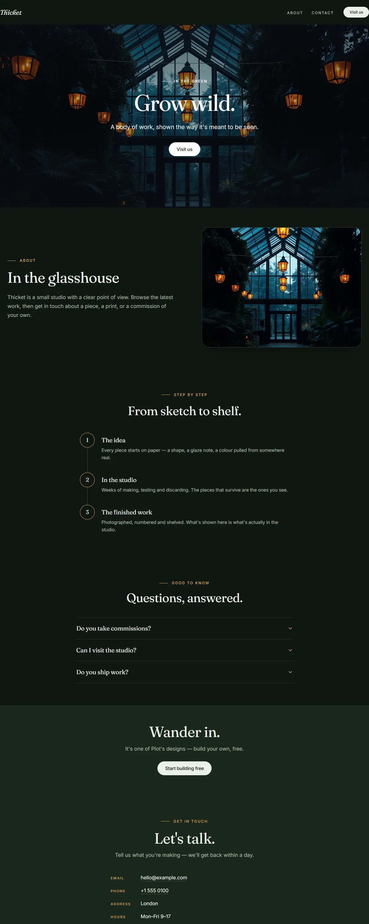
Deep forest green with warm amber and a characterful Fraunces. Moody botanical after dusk.
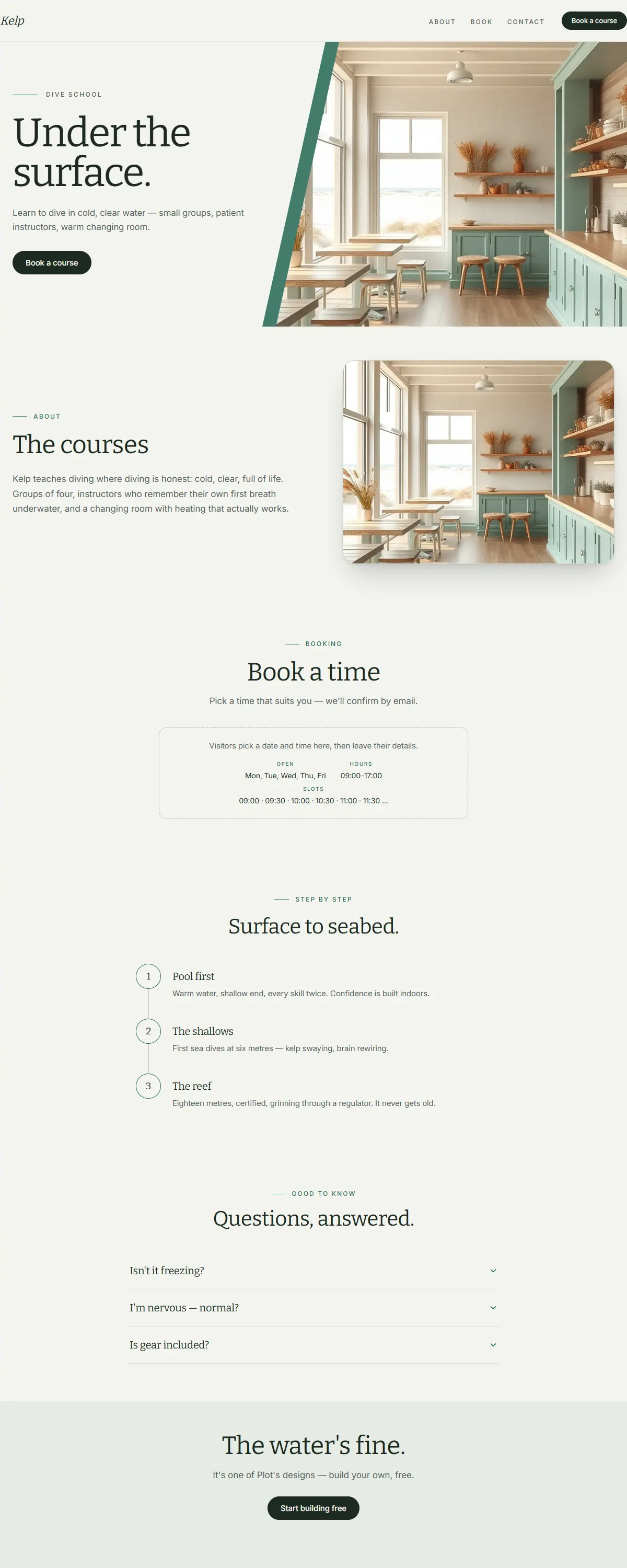
Sea-glass green and warm sand with a sturdy Bitter slab. Breezy, coastal, unhurried.
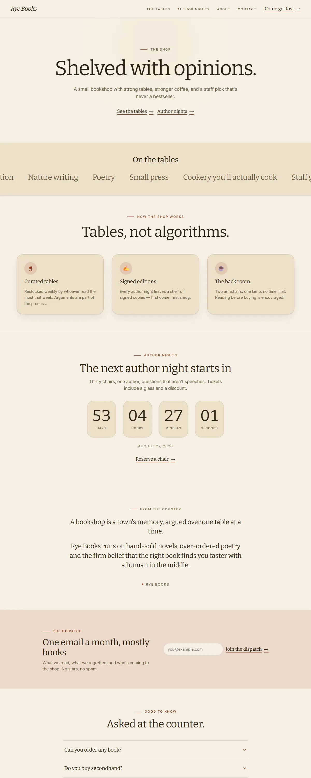
Wheat and brown with a barn-red accent and a sturdy Bitter slab. Honest, hand-made, just-baked.
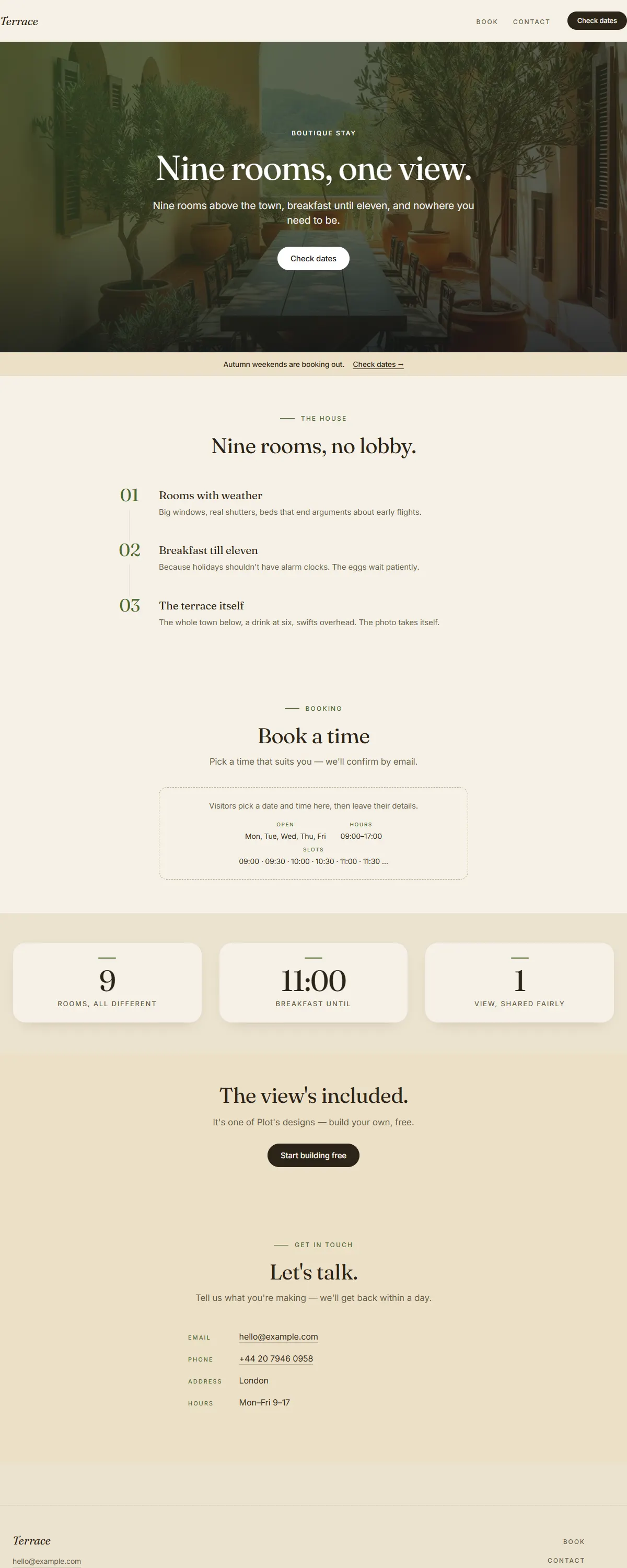
Clay and olive on warm cream with a characterful Fraunces. Sun-warmed Mediterranean ease.
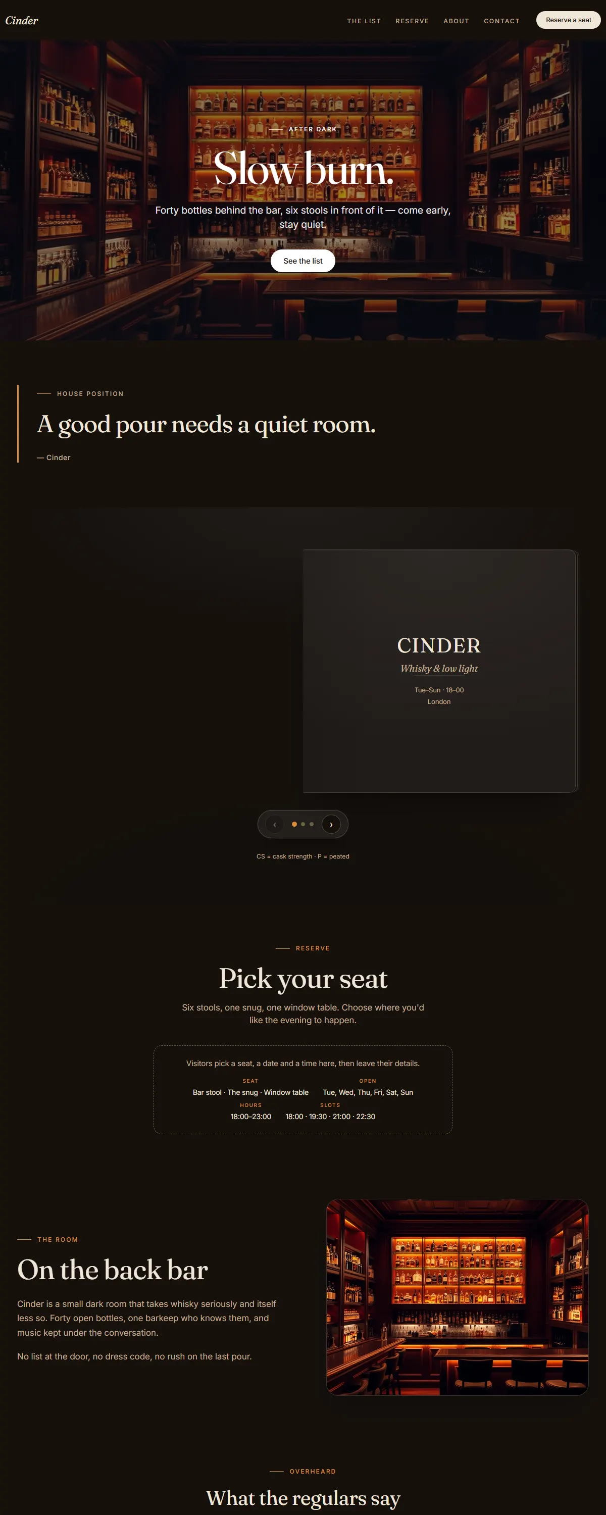
Espresso-dark with a warm amber glow and a characterful Fraunces. Slow-burn, after-dark warmth.
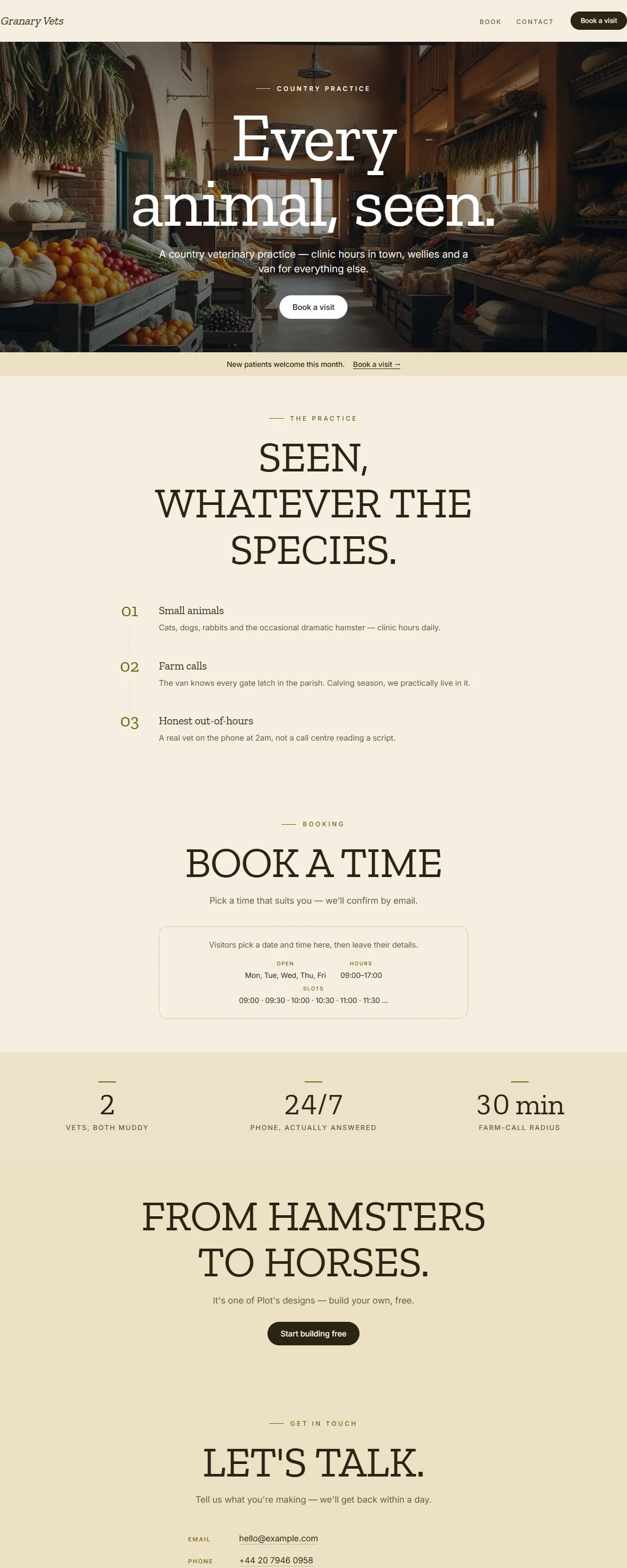
Wheat and sand with a dark-mustard accent and a sturdy Zilla slab. Honest, sturdy, wellies-on warm.
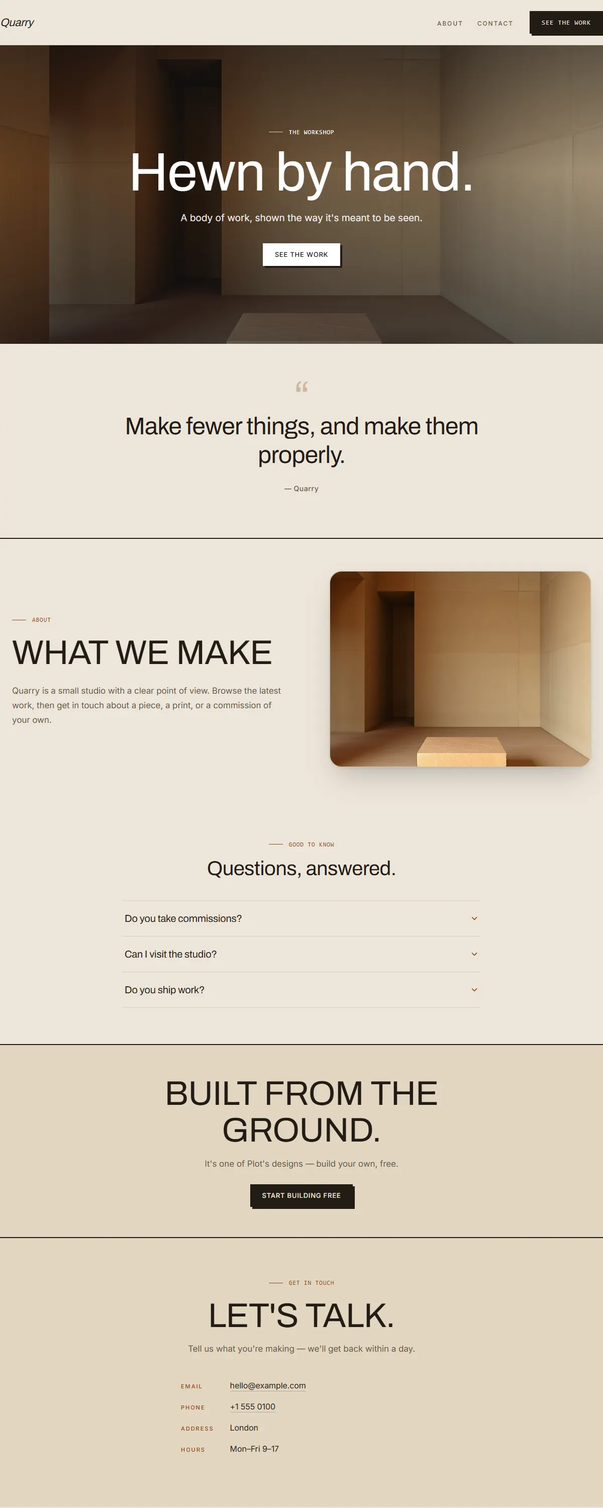
Warm sand concrete with a terracotta accent and heavy Archivo. Raw, earthy, hand-hewn brutalism.
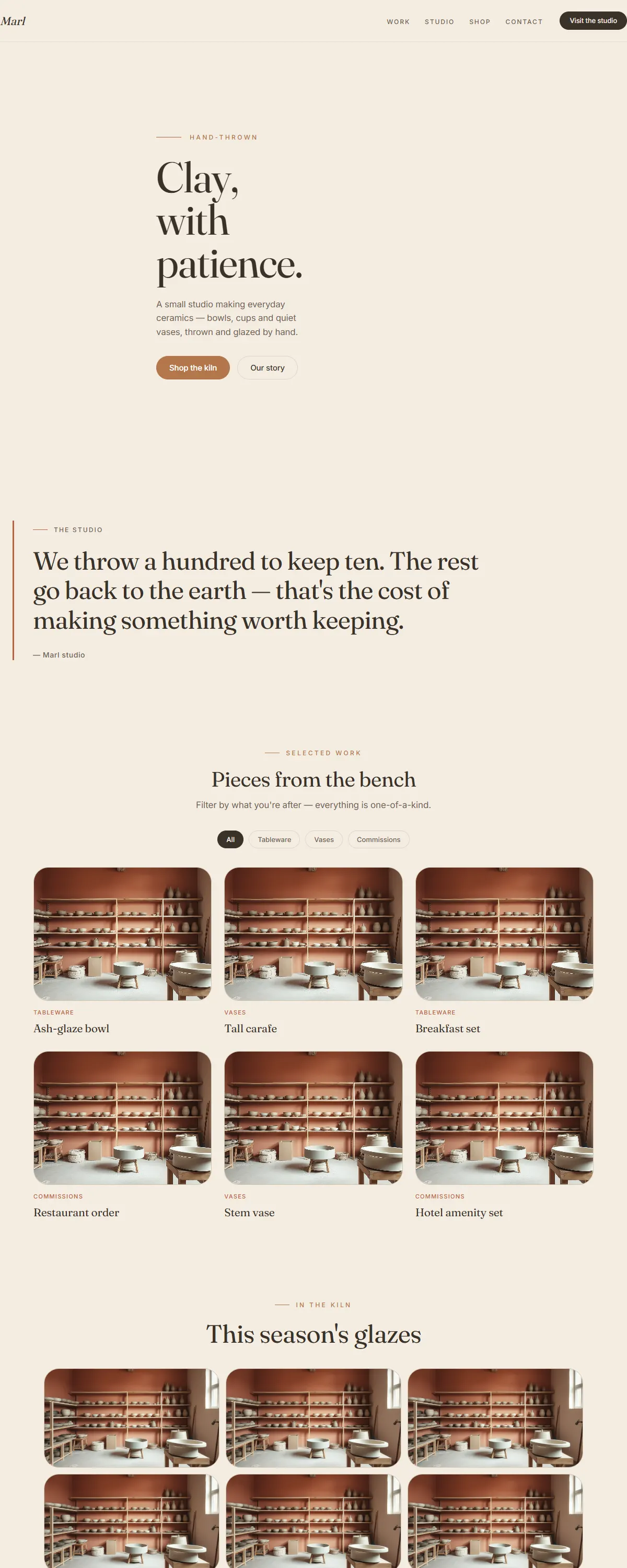
Warm unglazed neutrals and a soft terracotta accent — a calm, hand-made feel for studios and makers.
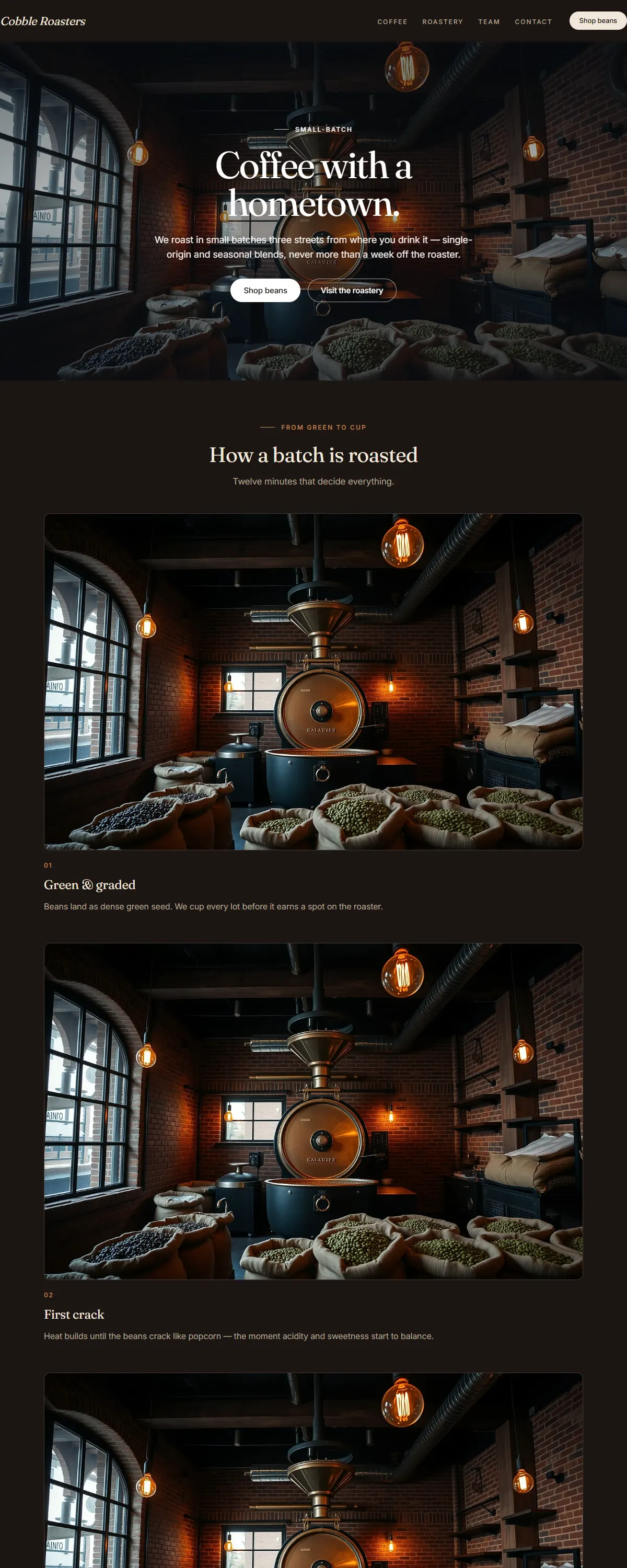
Dark roasted espresso-browns with a warm crema accent — rich and grounded for roasters, bars and brands.
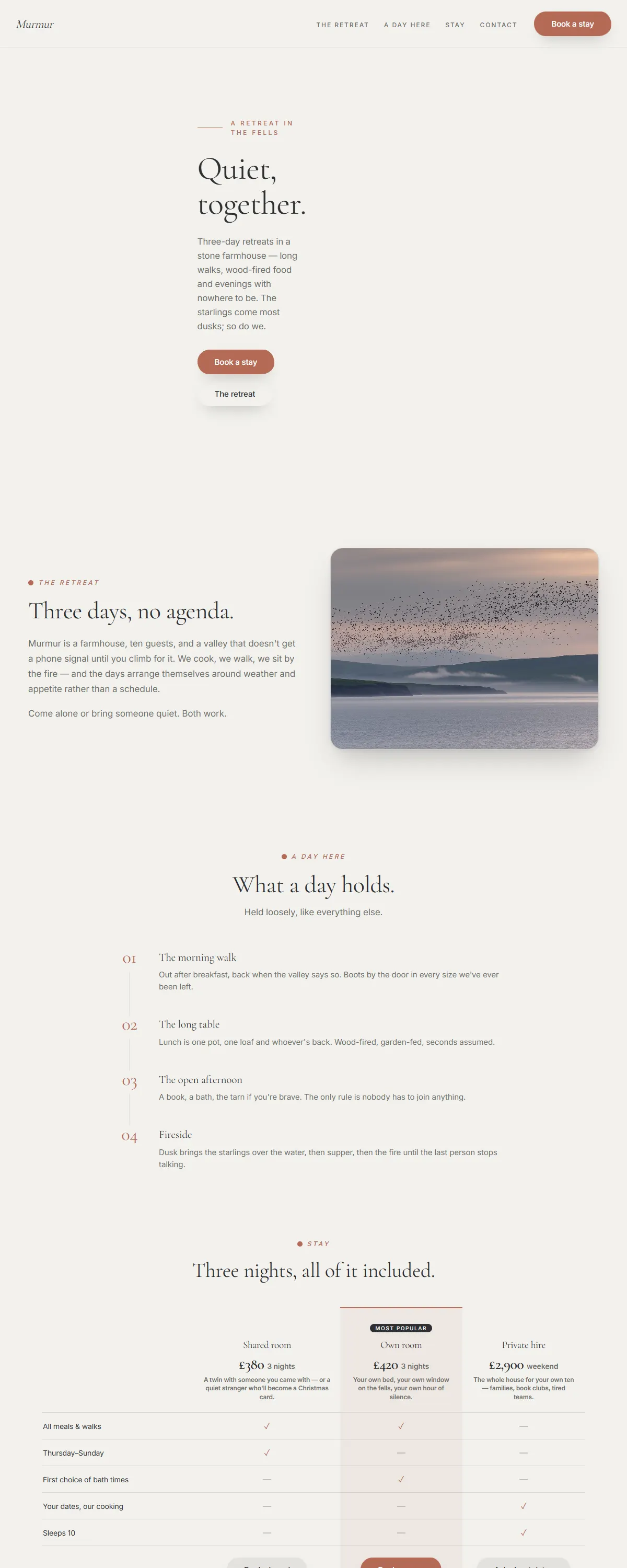
Fog-soft calm with a living murmuration of birds that travels the page with you.
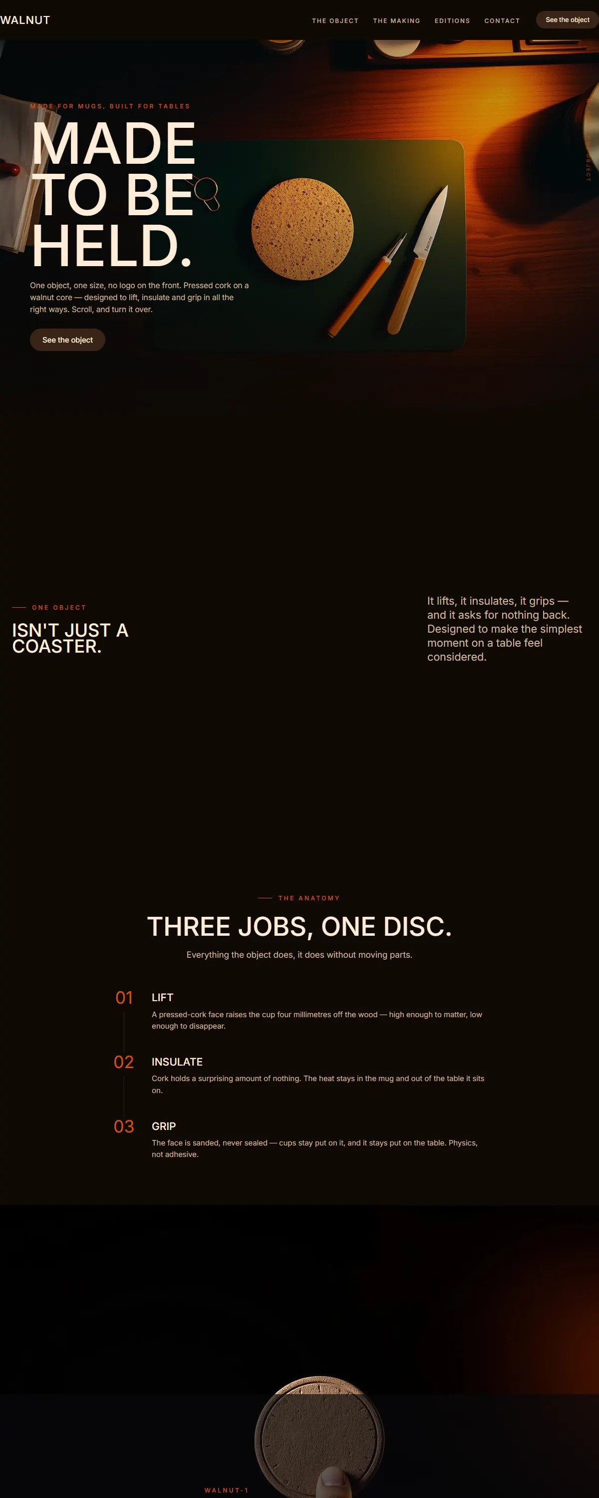
Warm walnut darkness with cream uppercase type and a single ember accent — one object, shown like an artifact.
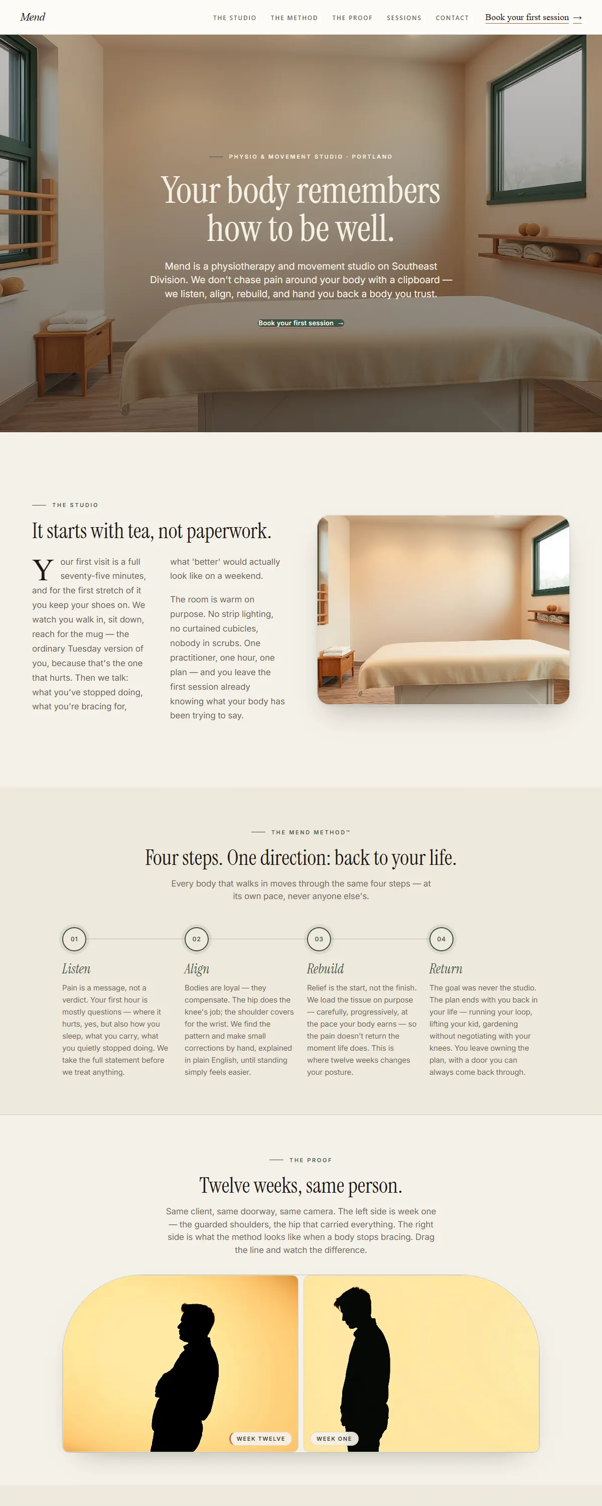
Warm cream and fig green with a named method and a posture before/after — physio as a brand you'd wear.
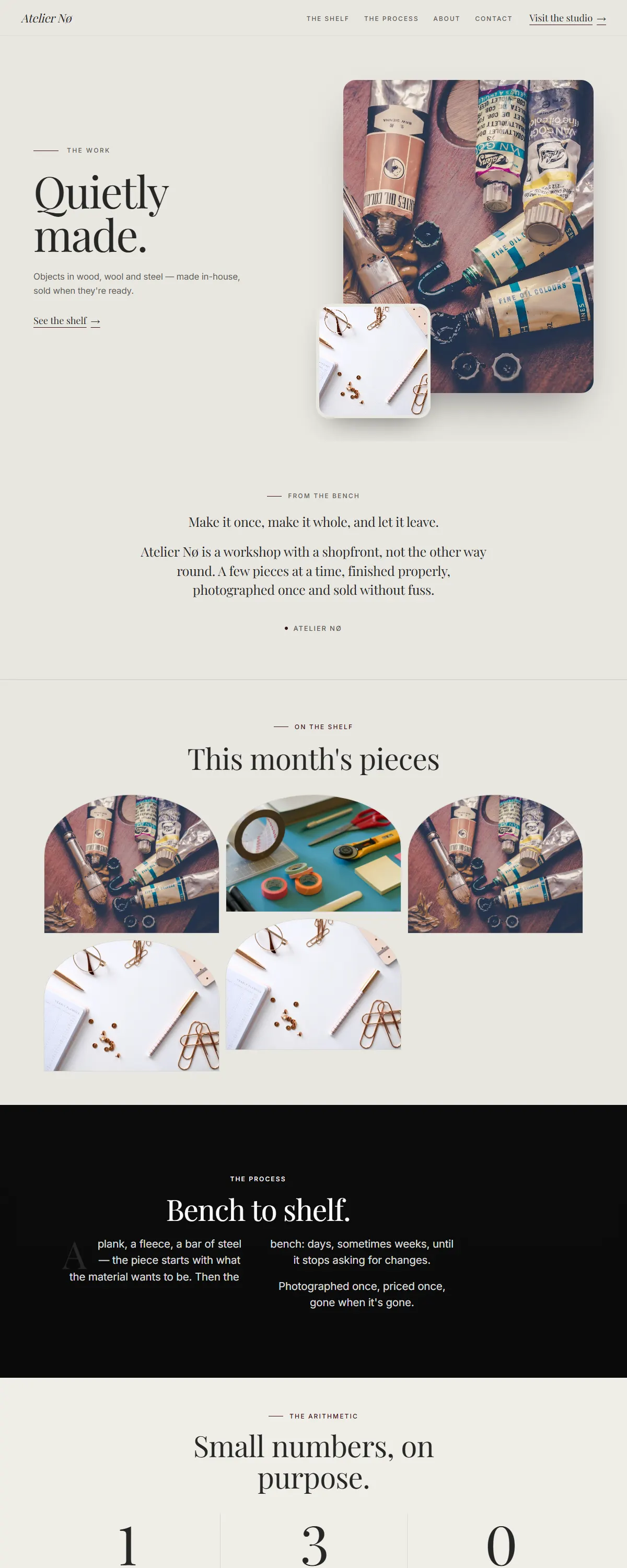
Gallery-like neutrals with a deep oxblood accent. Quiet luxury for craft-driven businesses.
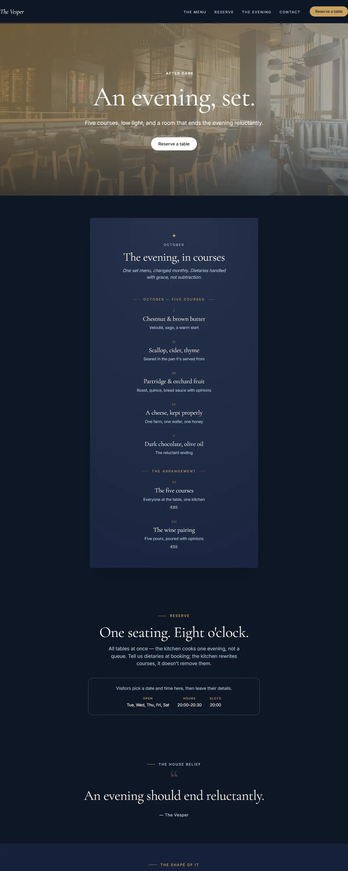
Deep navy with warm gold. Quiet, after-dark luxury.
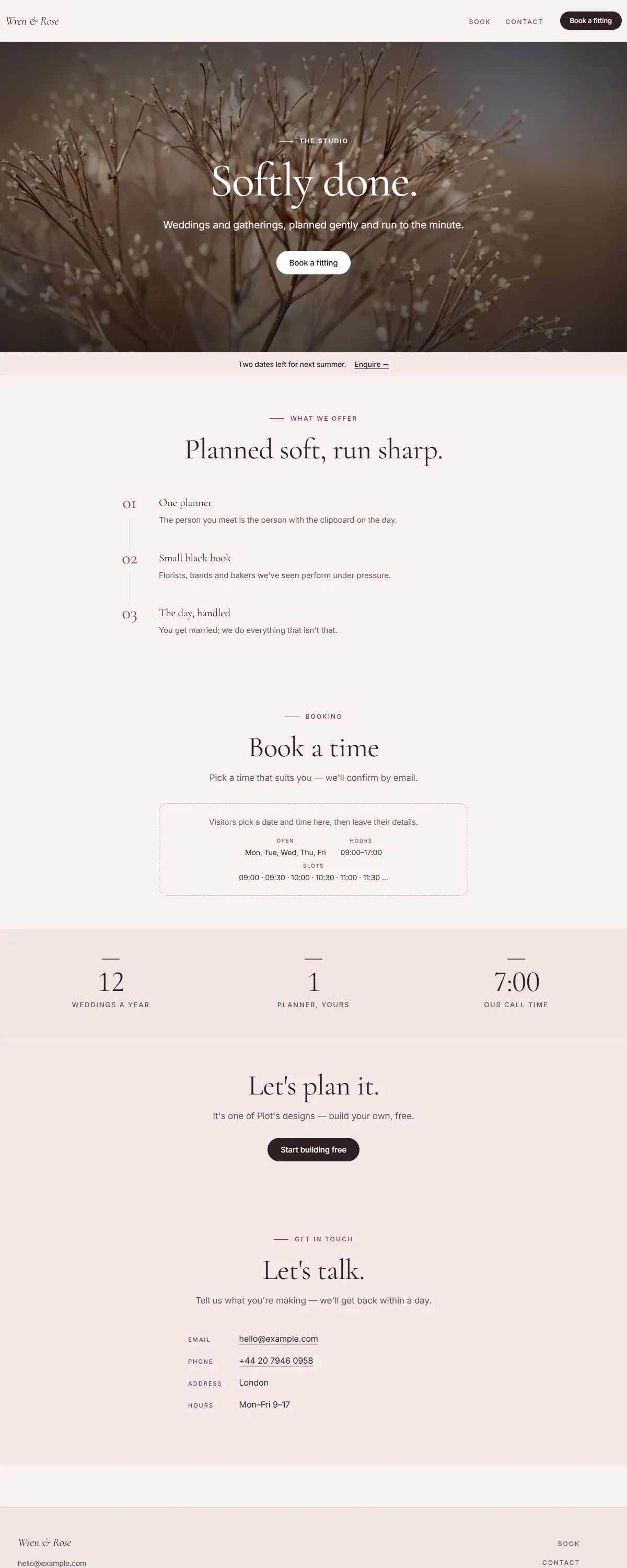
Soft blush with a deep berry accent. The patisserie vitrine.
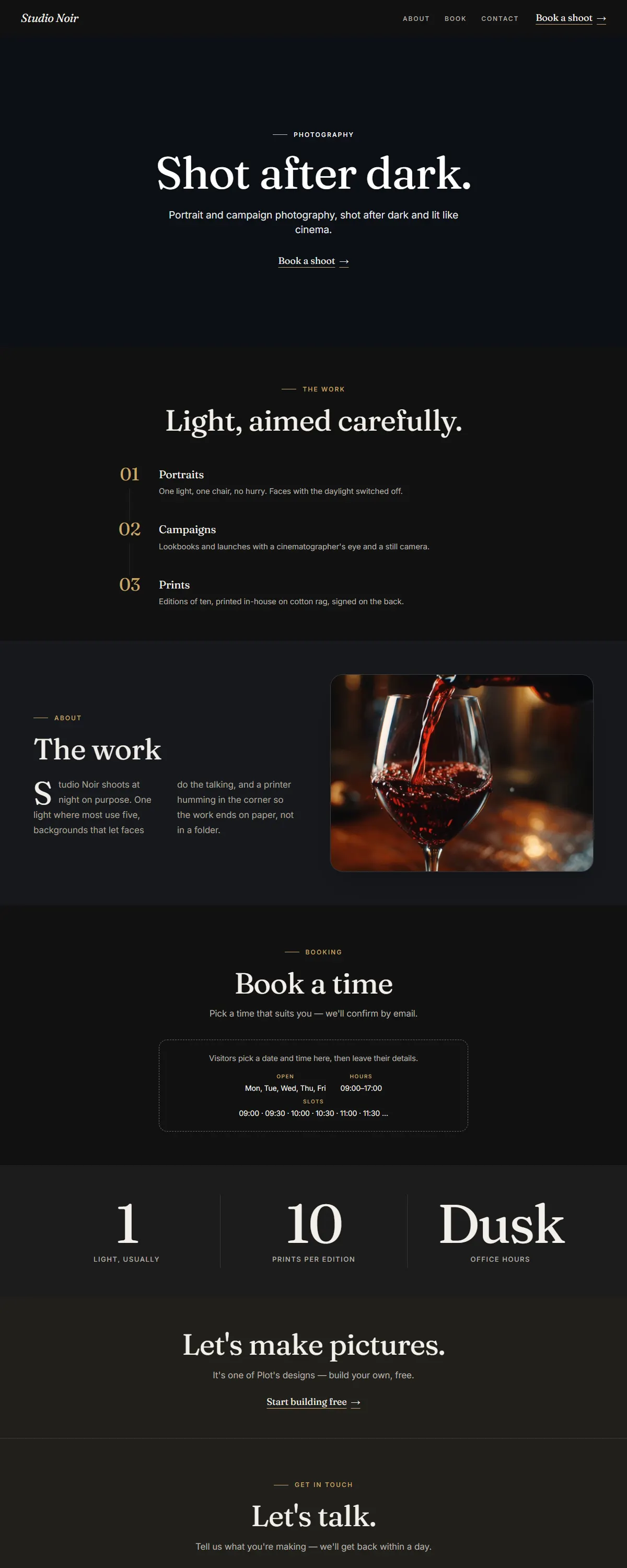
Charcoal and champagne gold with an elegant serif. The after-dark photography studio.
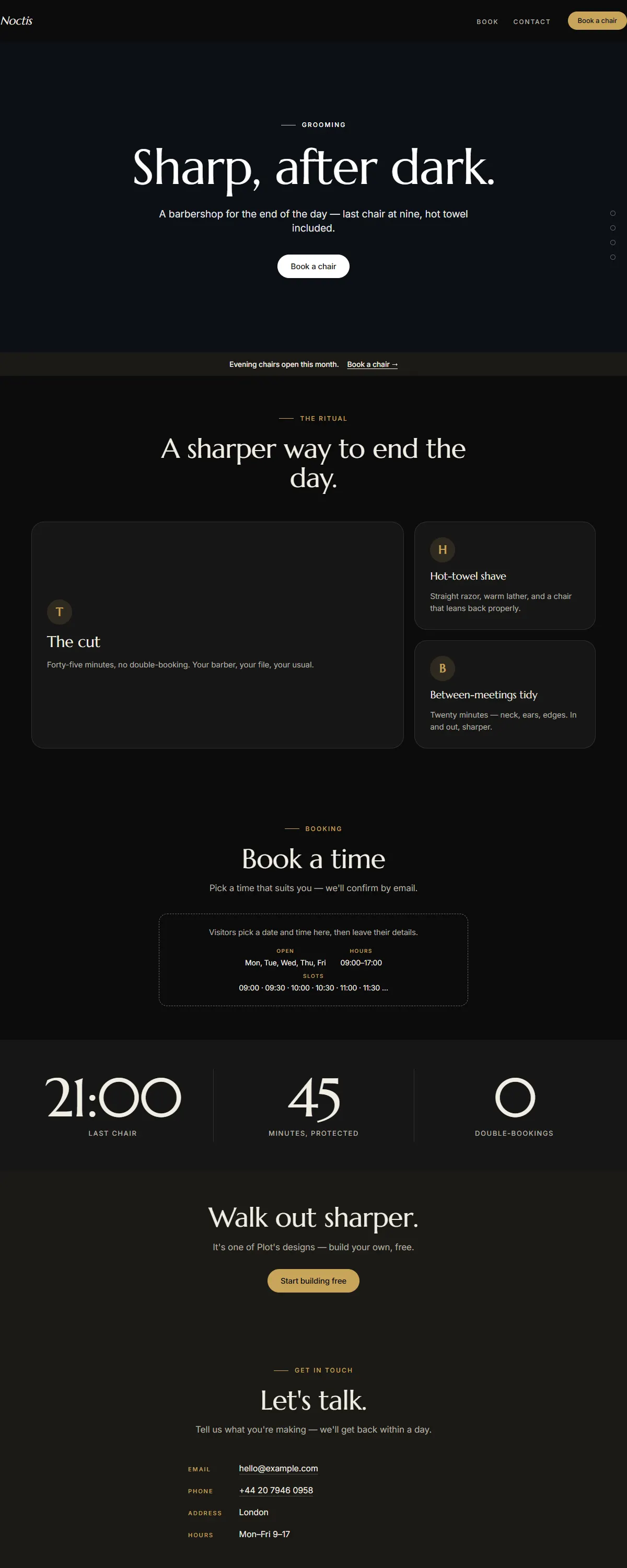
Pure black with electrum gold and an elegant Marcellus serif. The after-dark barbershop.
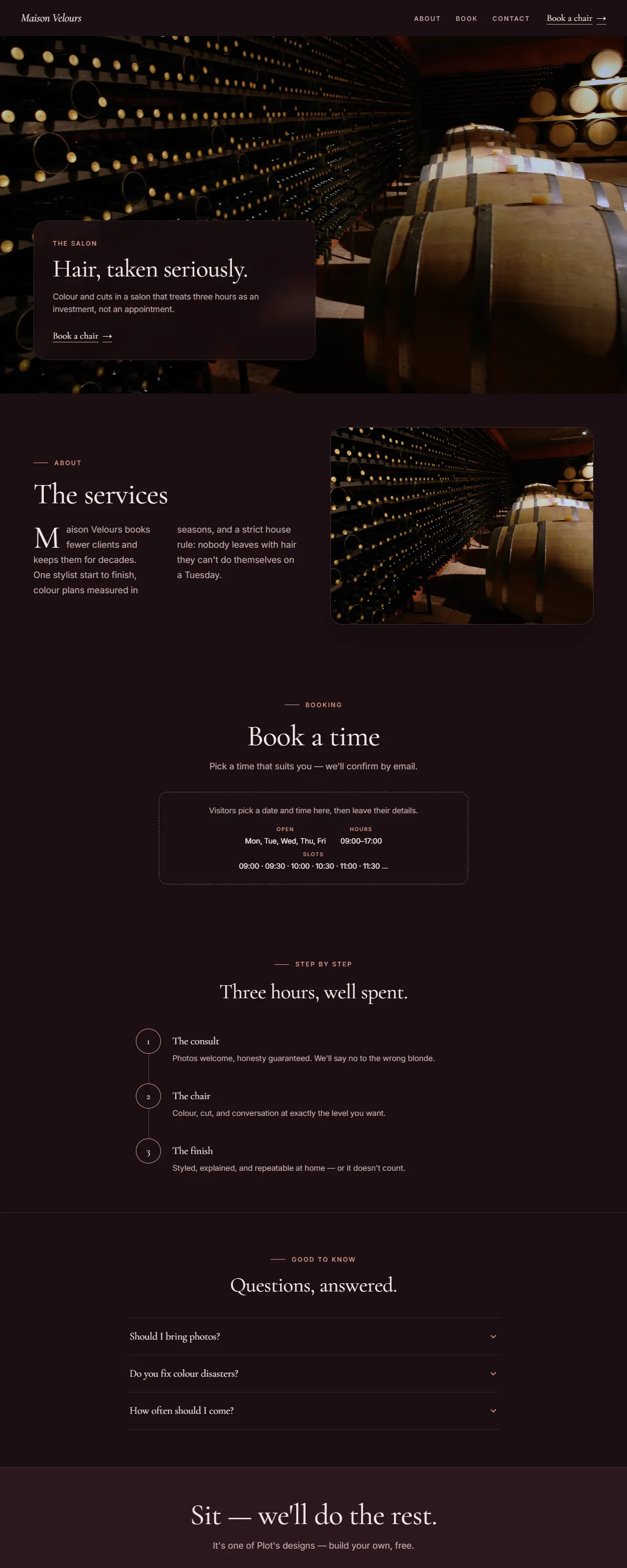
Deep wine and rose-gold with a soft serif. The long-appointment hair salon.
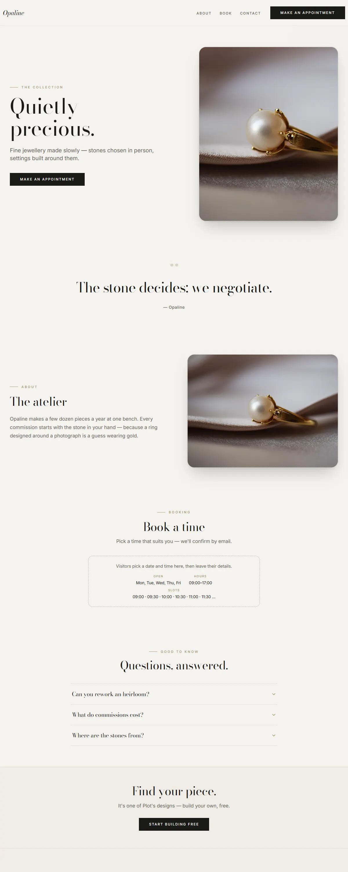
Pearl ivory and champagne with high-contrast Bodoni. Quiet, precious refinement.
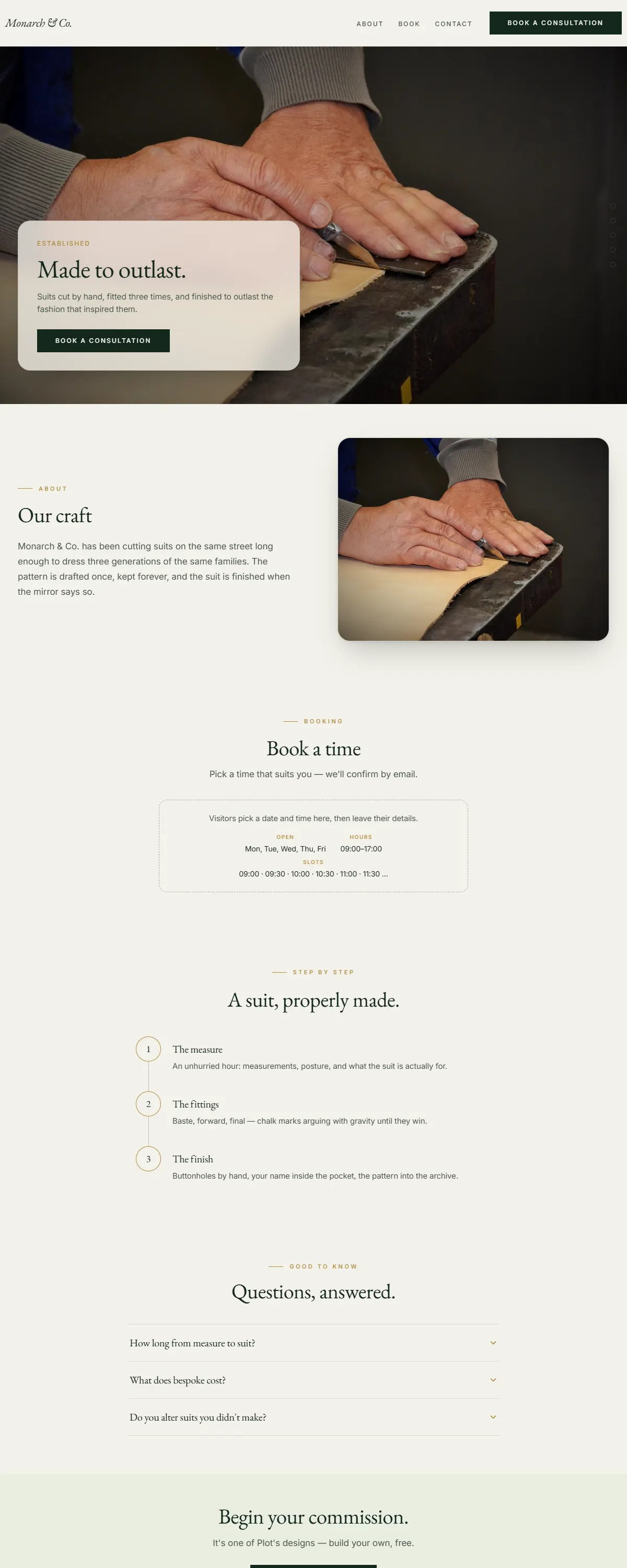
Deep emerald and gold with a classic Garamond. Heritage luxury, built to outlast.
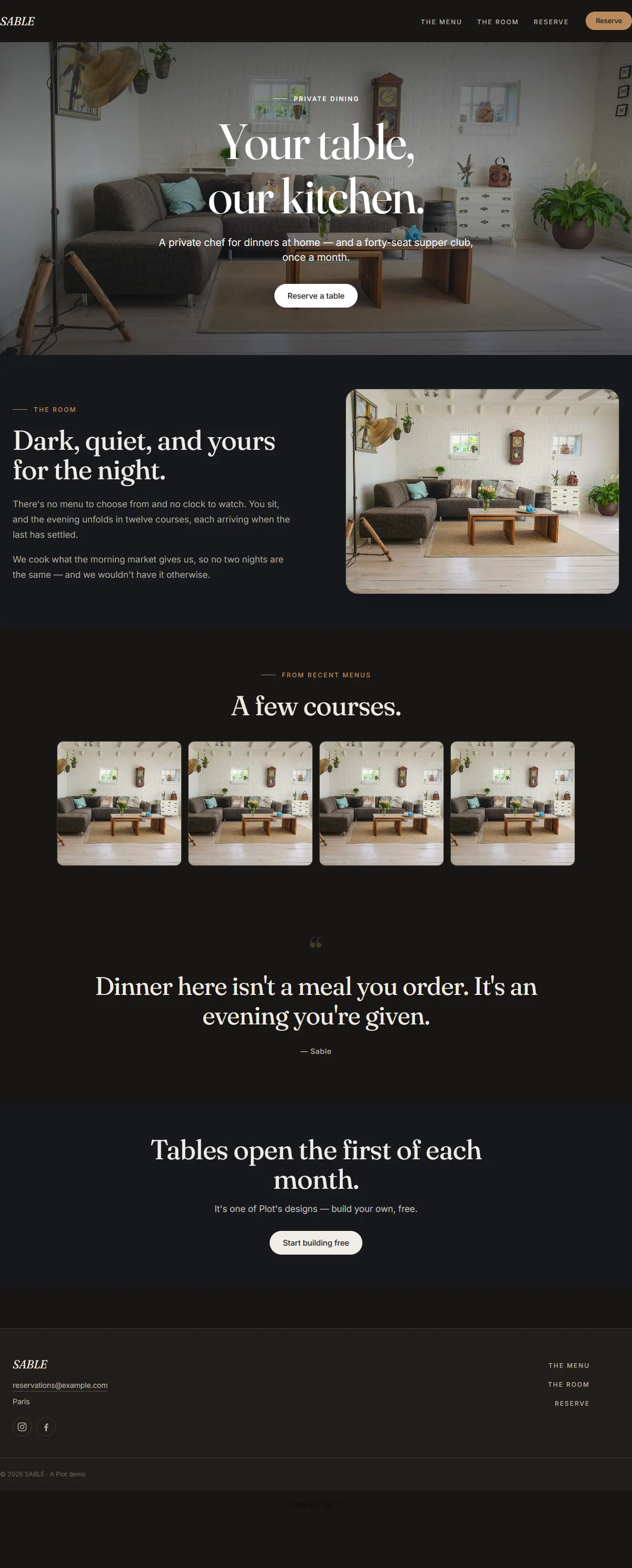
Warm charcoal and bronze with a characterful Fraunces. Understated dark luxury.
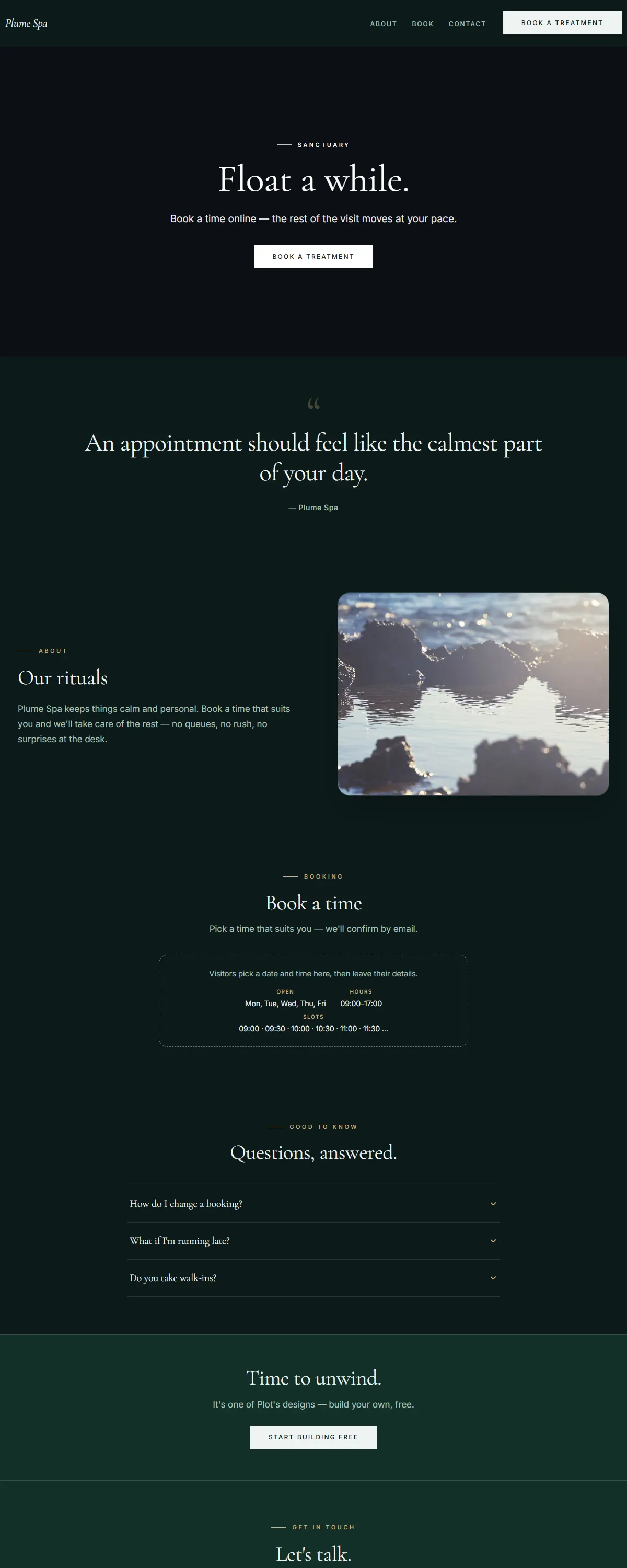
Deep teal and champagne with a soft serif. Serene, after-dark spa luxury.
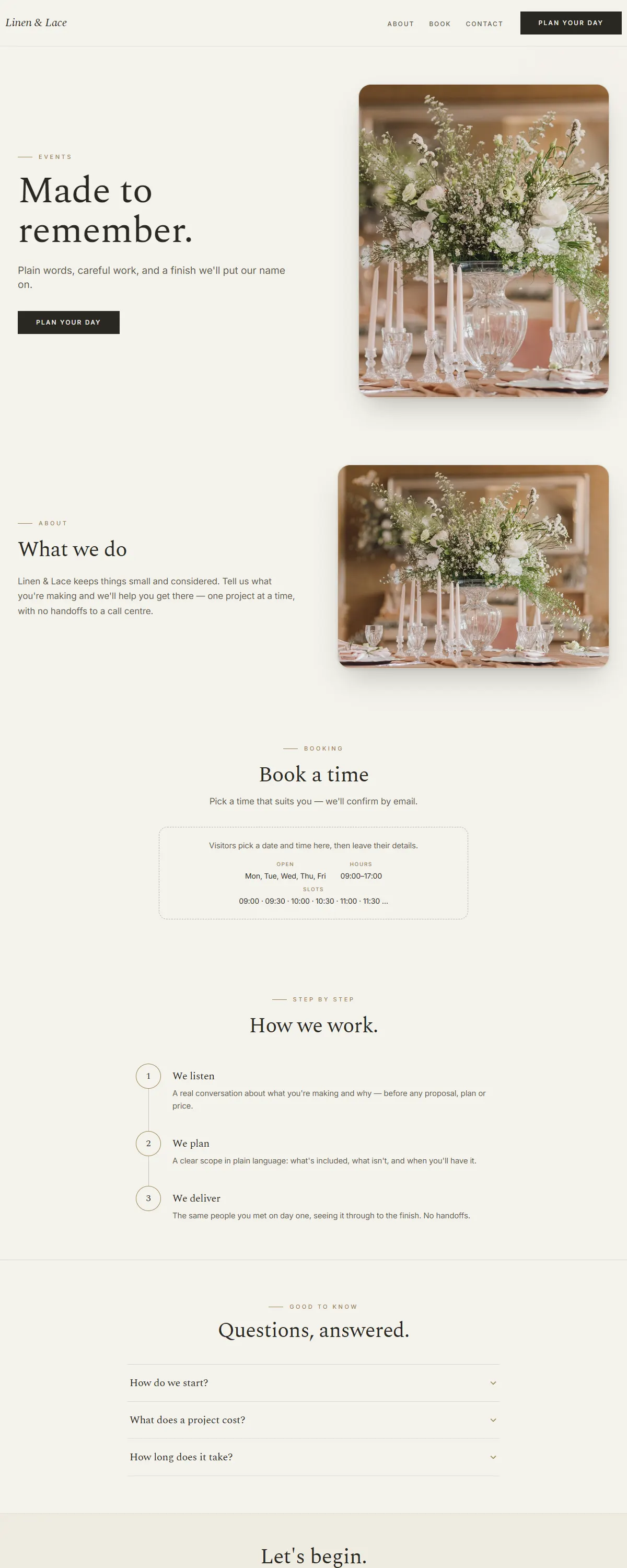
Soft greige and sage-gold with a gentle Spectral serif. The wedding planner's studio.
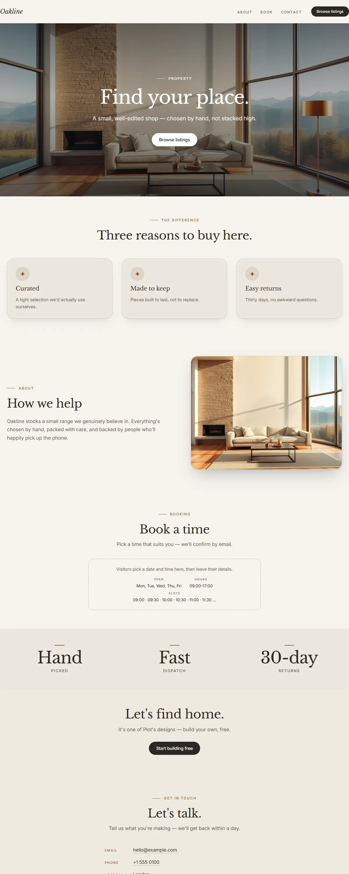
Grounded oak and warm stone with a classic Baskerville serif. Premium and calm.
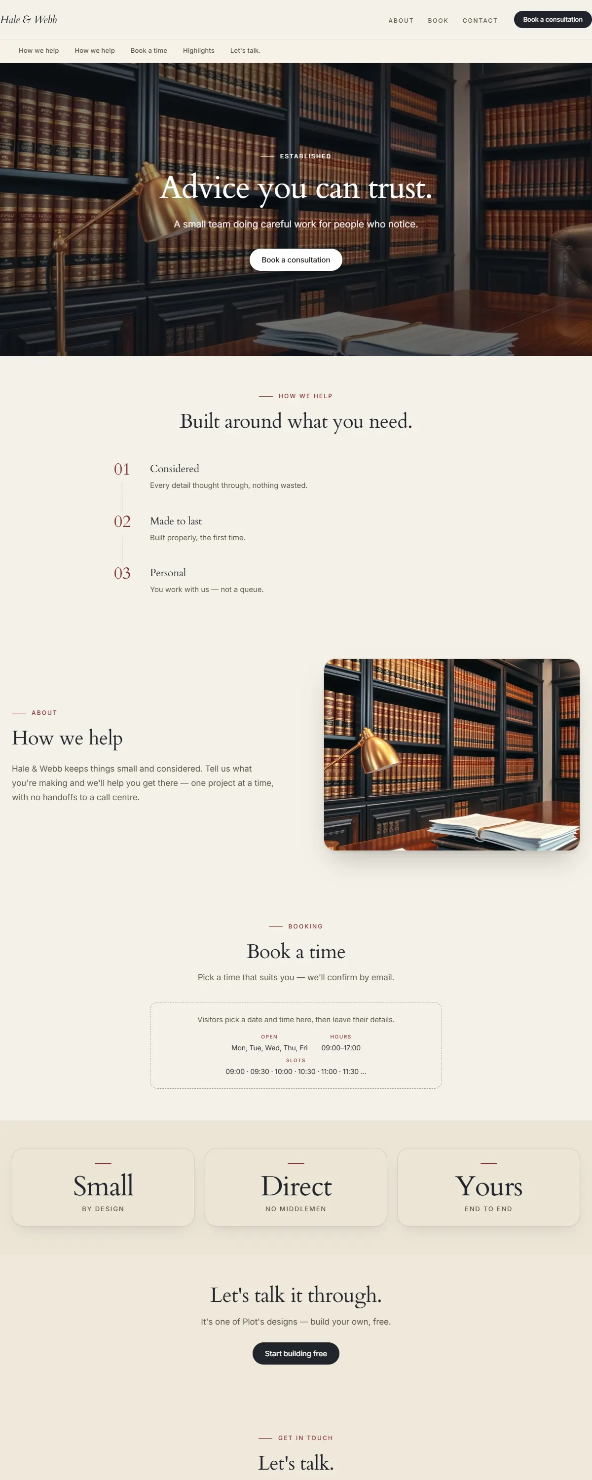
Warm, trustworthy professional — ivory and deep navy with a classic Cardo serif.
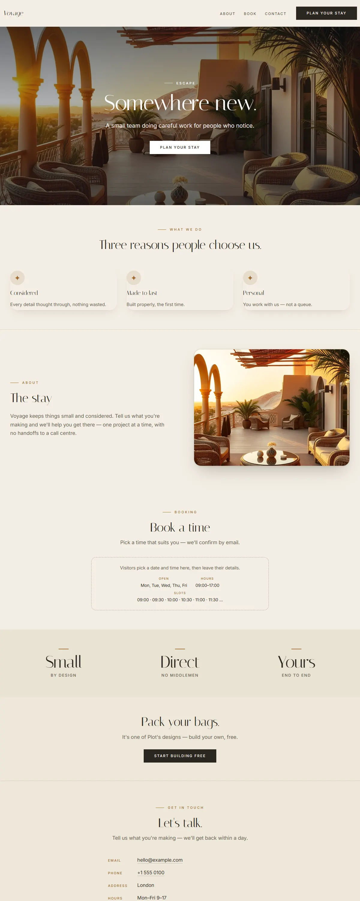
Warm, wanderlust hospitality — golden sand and an elegant Italiana display serif.
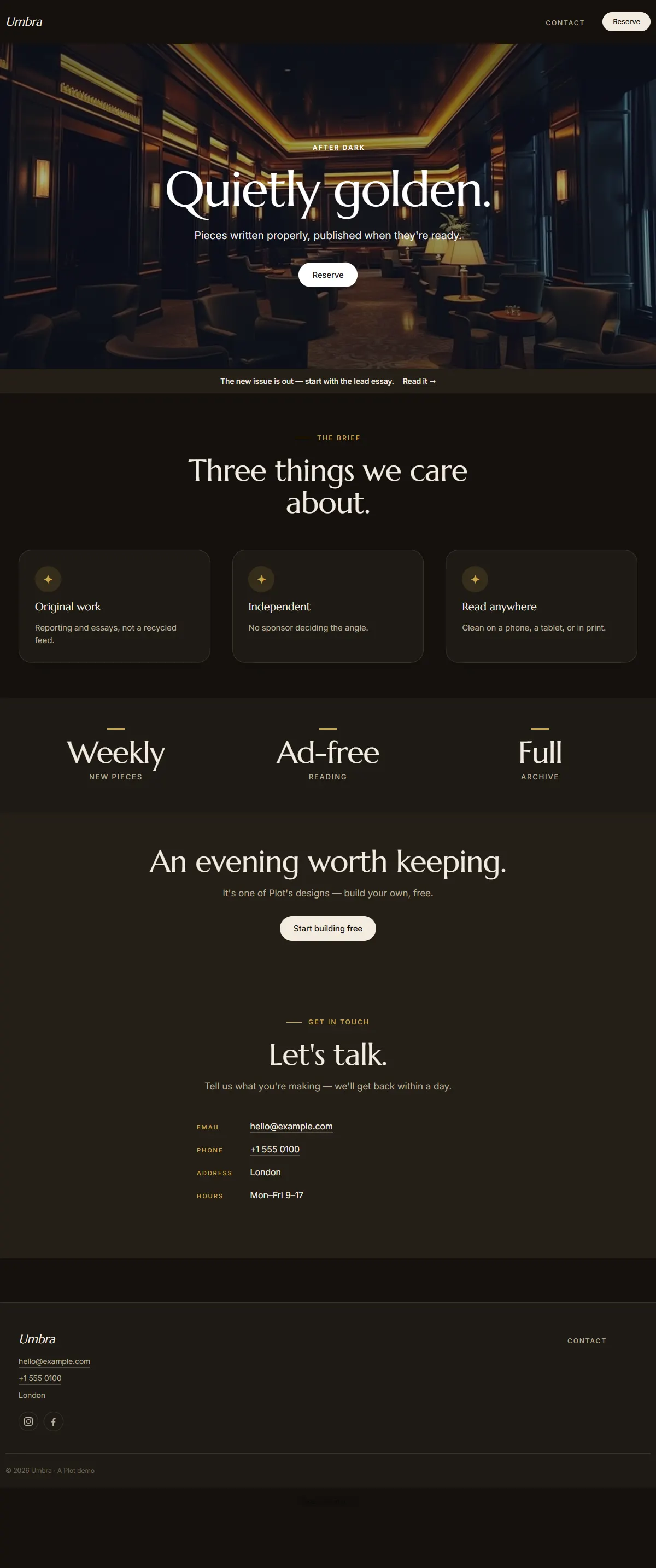
Near-black after-dark luxury with champagne gold and a classic Marcellus serif.
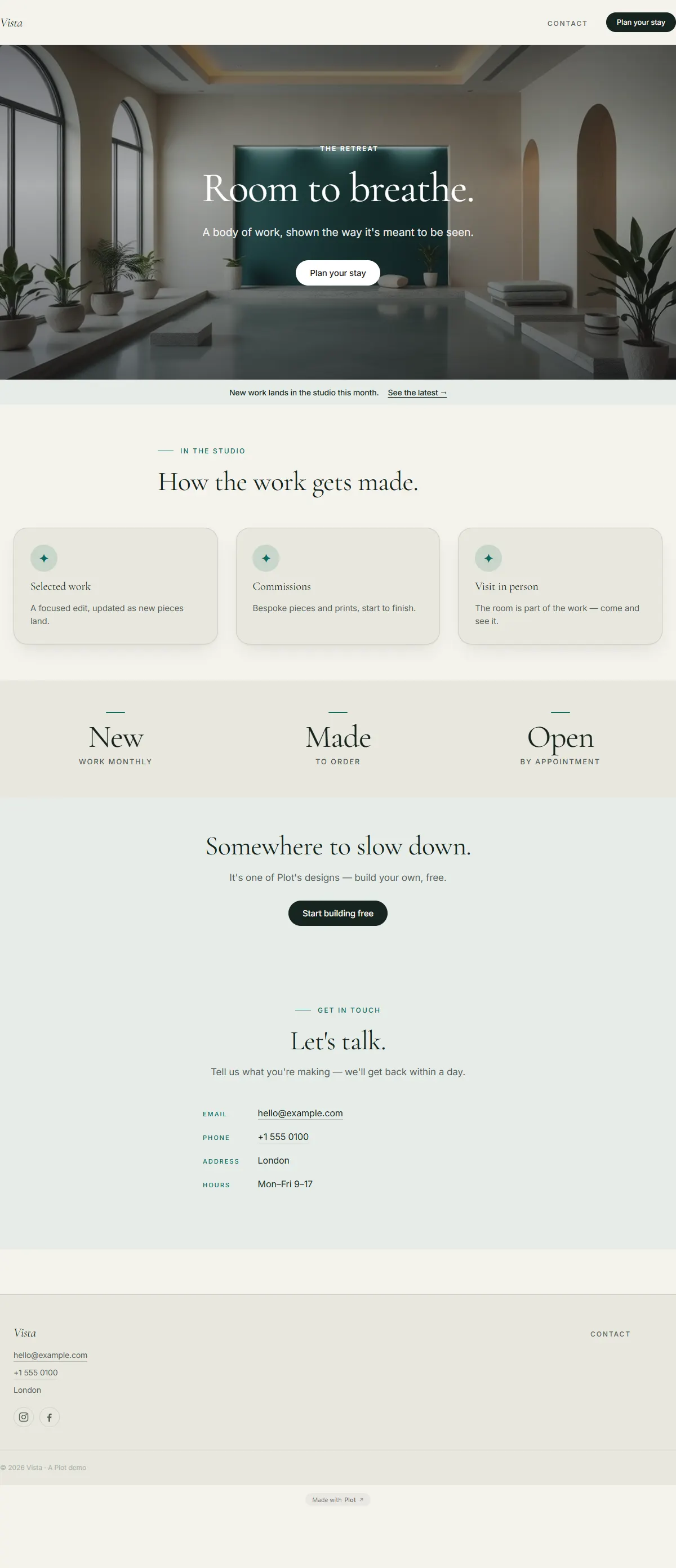
Calm sage and cream with a deep-teal accent and an airy Cormorant serif. Quiet, spacious luxury.
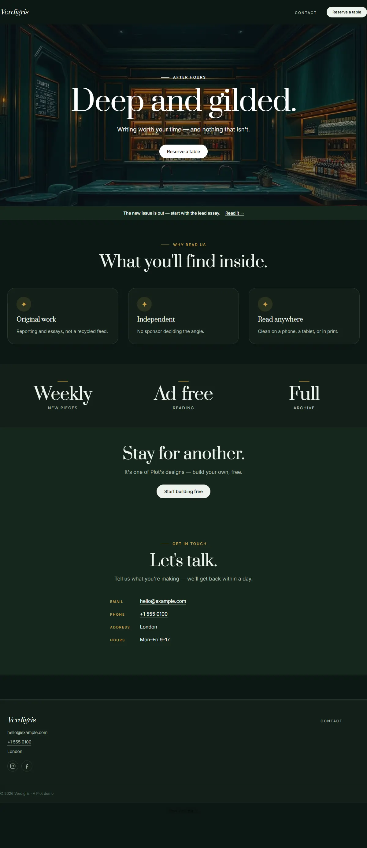
Deep emerald and brushed gold with an elegant Prata serif. Opulent, after-dark indulgence.
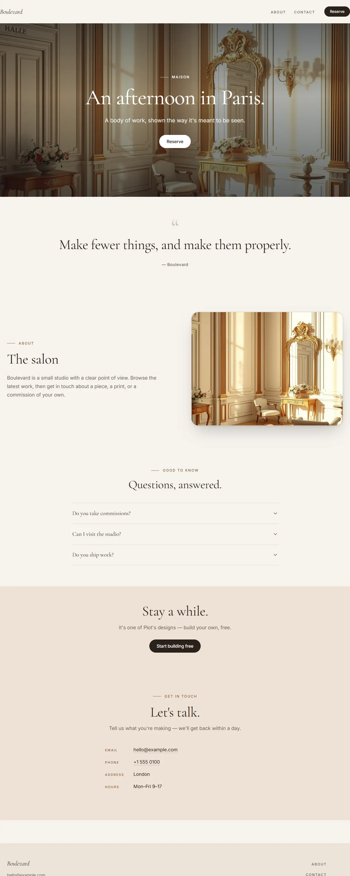
Cream and warm bronze with an elegant Cormorant. Parisian, refined, unhurried luxury.
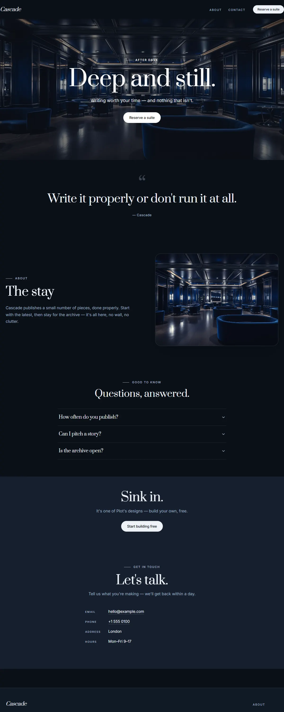
Deep sapphire and brushed silver with an elegant Prata. Still, after-dark hotel luxury.
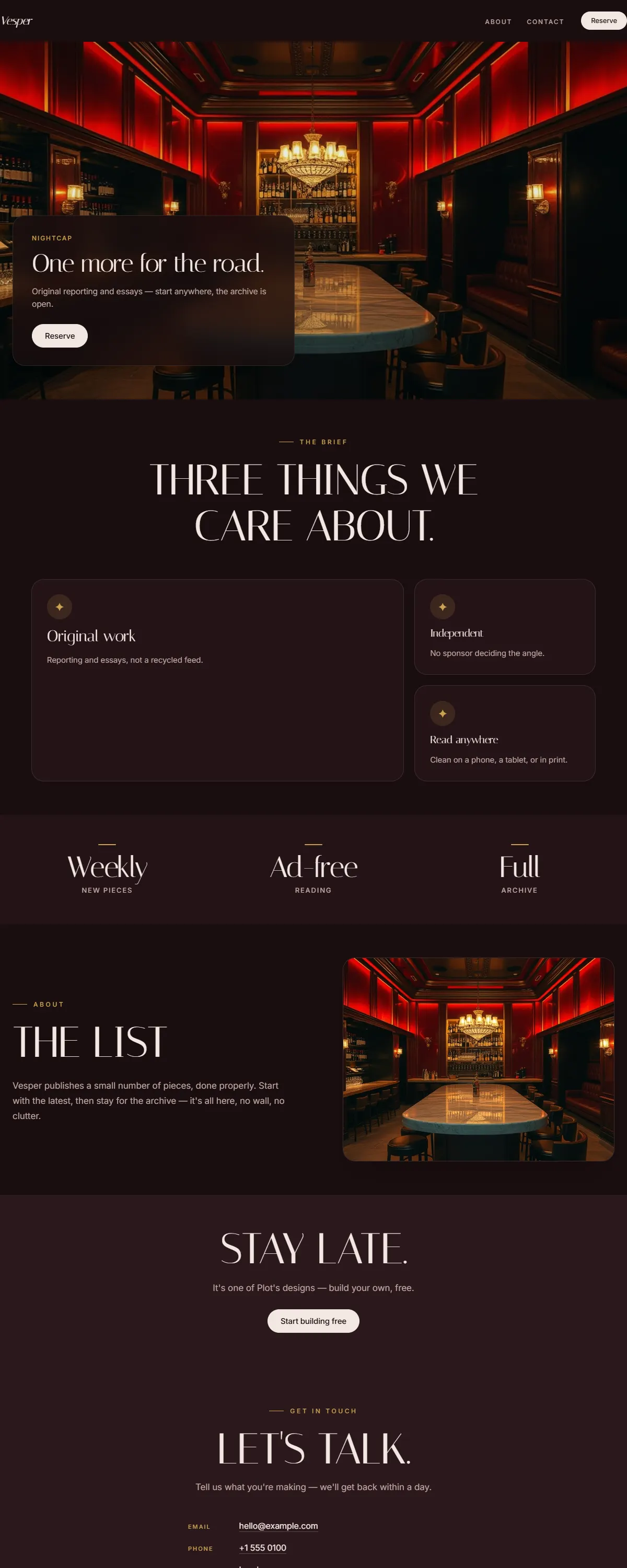
Deep wine and gold with an elegant Italiana display. After-dark poster luxury.
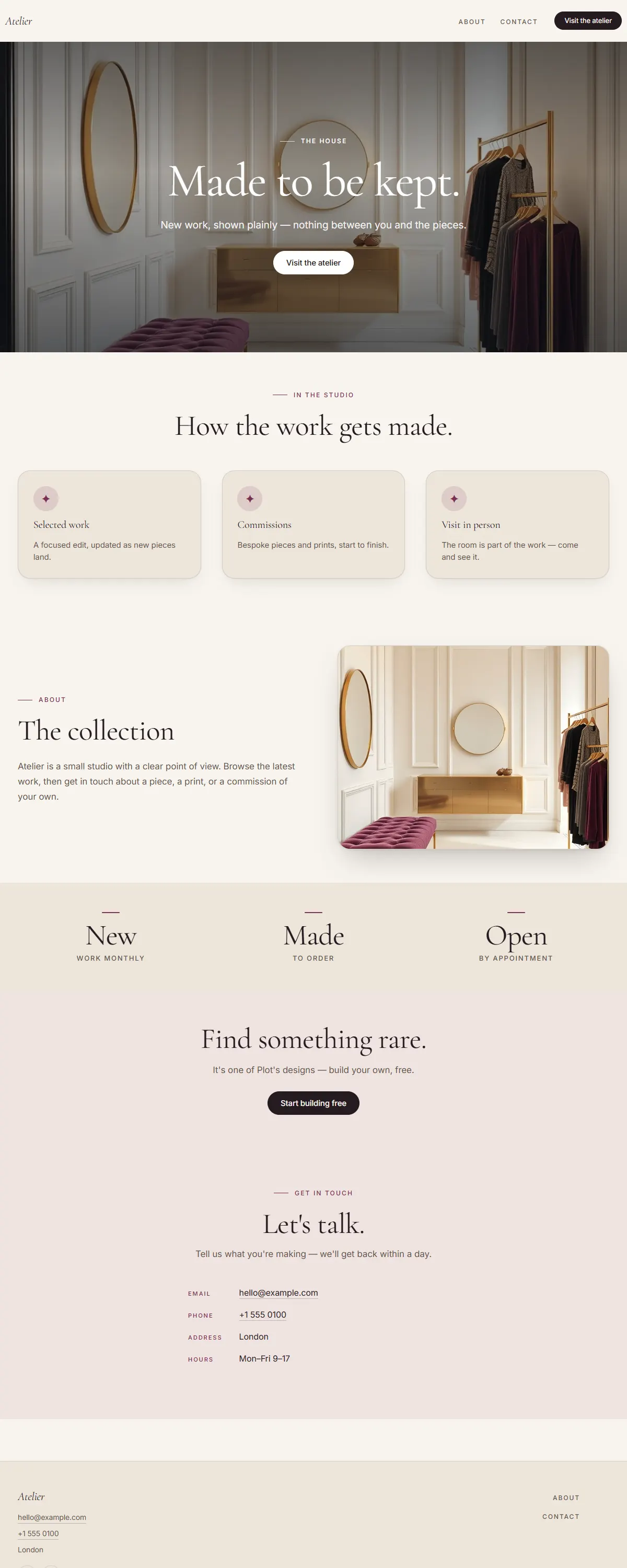
Soft ivory and deep aubergine with an elegant Cormorant. Quiet, considered boutique luxury.
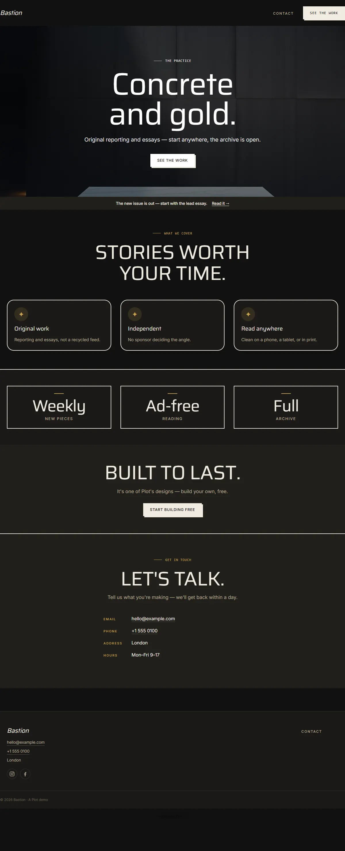
Black board-formed concrete with a single champagne-gold line and heavy Saira. Brutalist luxury.
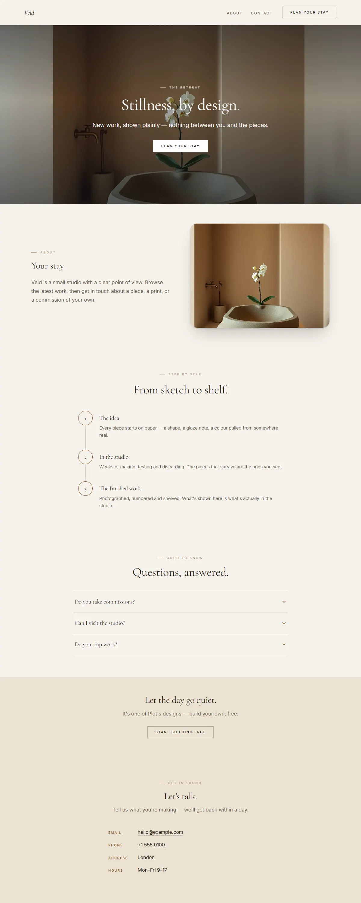
Warm greige and antique bronze with an airy Cormorant. Spacious, quiet, spa-grade luxury.
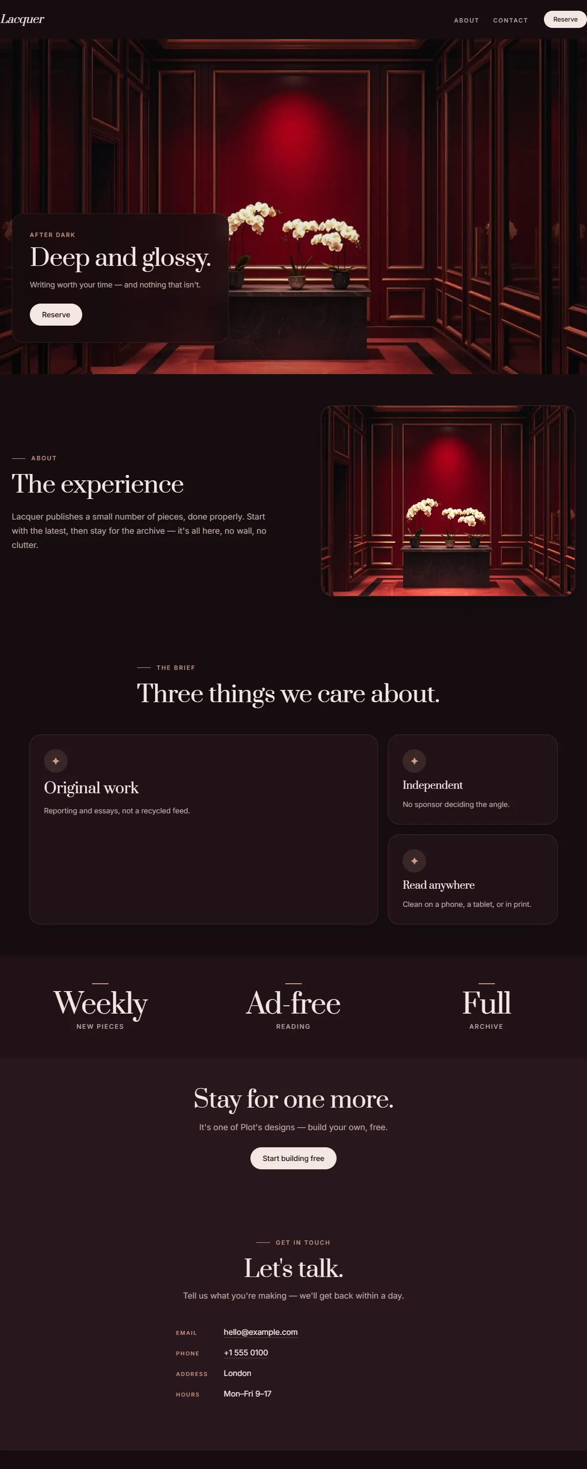
Oxblood lacquer with a soft rose-gold accent and an elegant Prata. Glossy, intimate, after-dark.
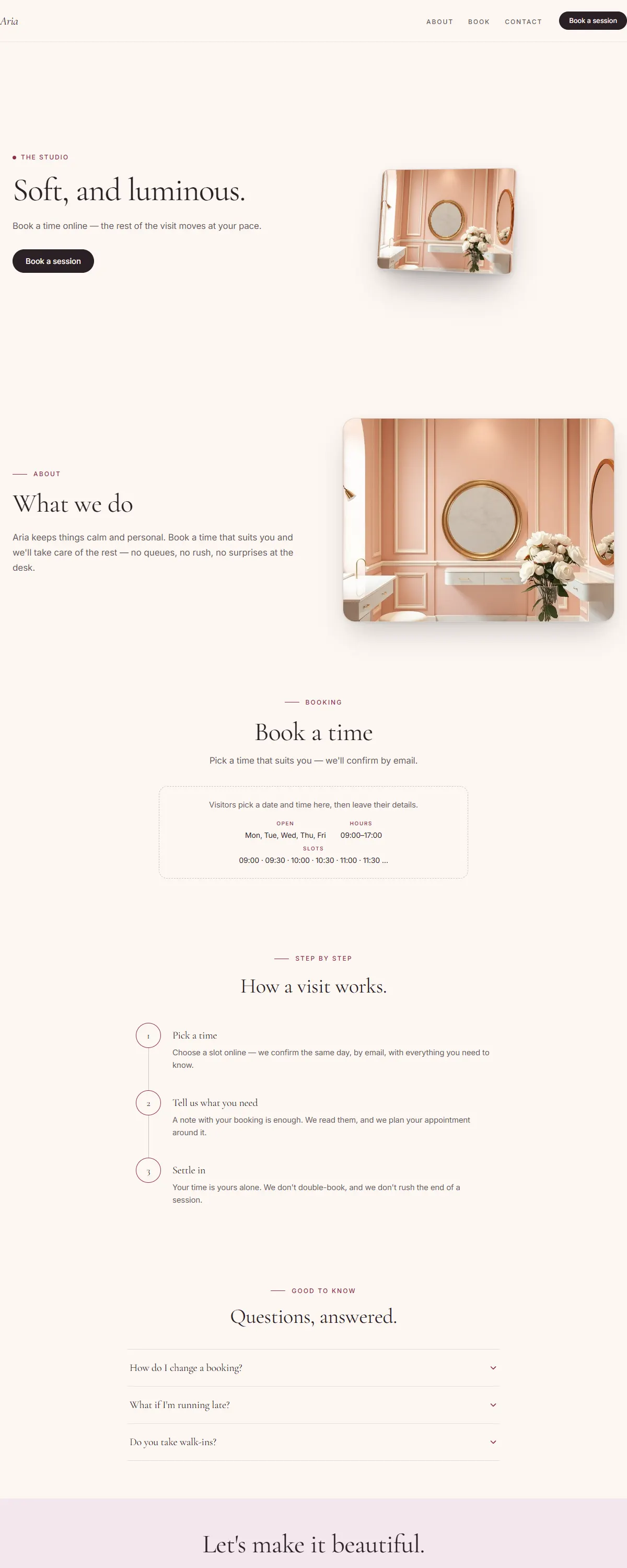
A soft champagne-to-blush gradient with a deep berry accent and an elegant Cormorant. Refined and lovely.
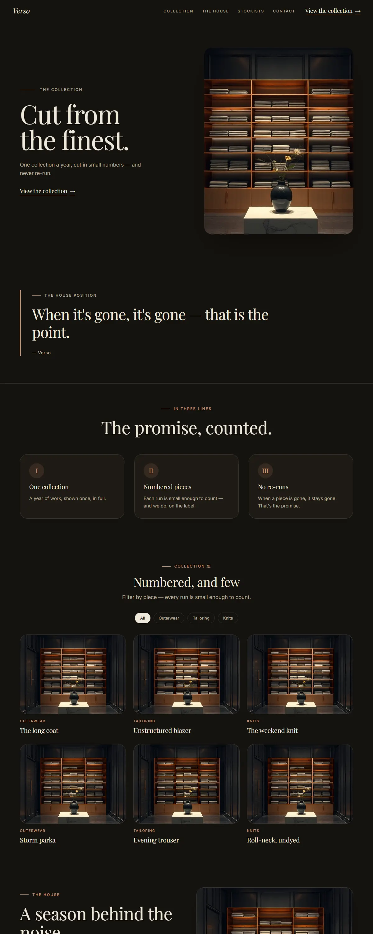
Charcoal and rose-bronze with an elegant Playfair. After-dark editorial luxury.
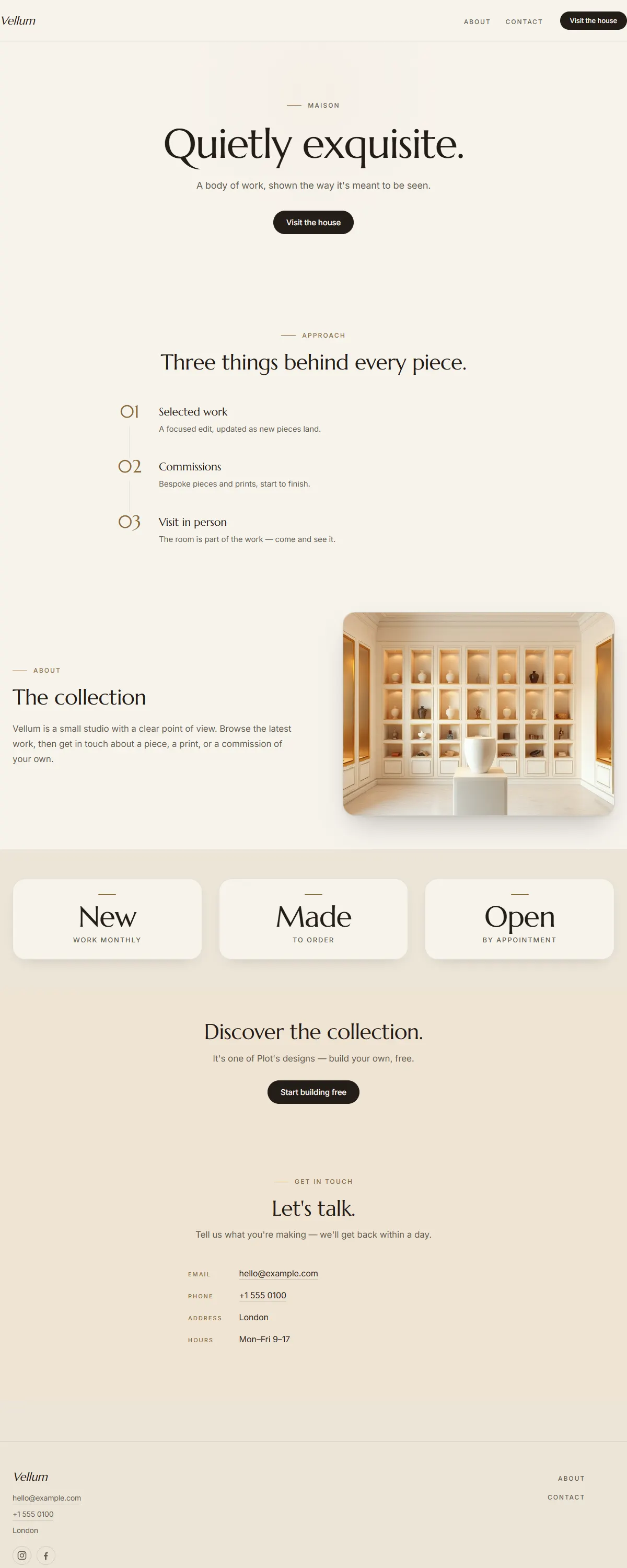
Soft ivory with a warm bronze accent and a classic Marcellus. Quietly exquisite boutique luxury.
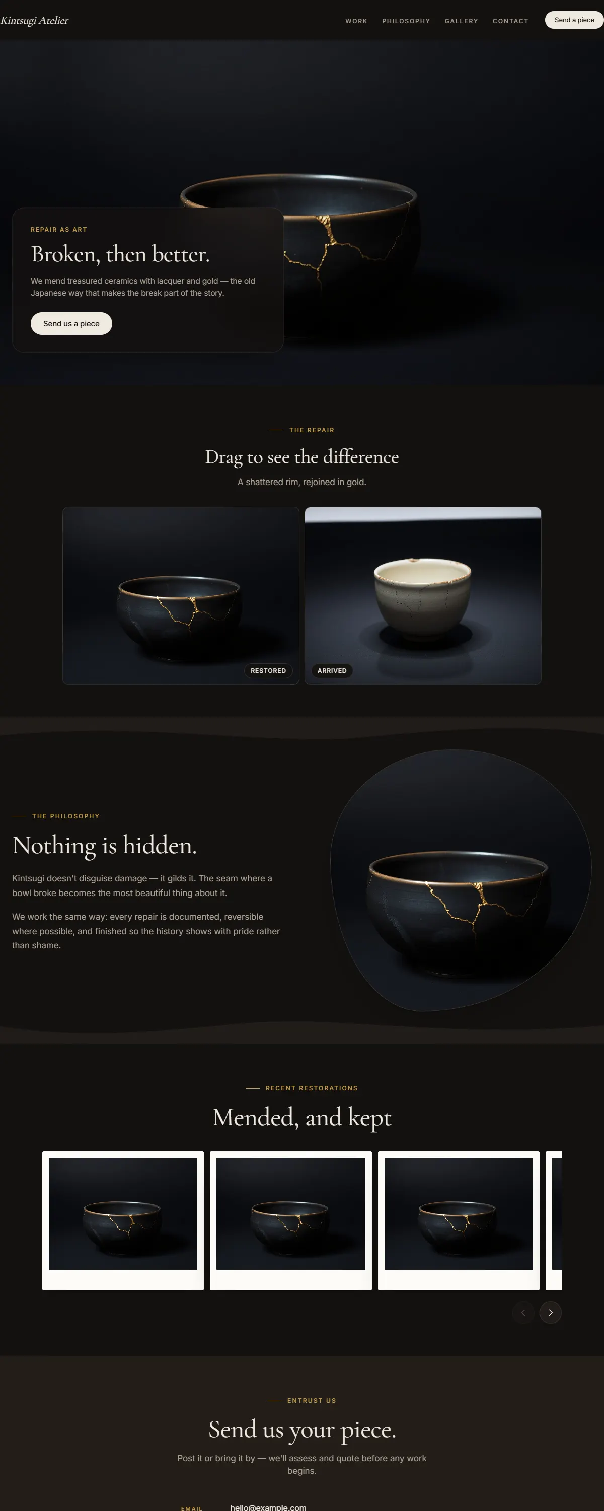
Near-black charcoal with a true gold accent — hushed, reverent luxury for ateliers and fine craft.
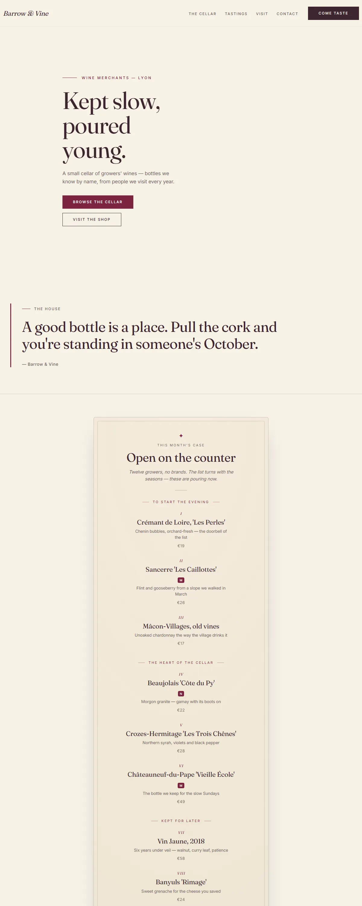
Cellar cream and deep claret with a bottle that turns as you scroll — a wine journey, not a page.
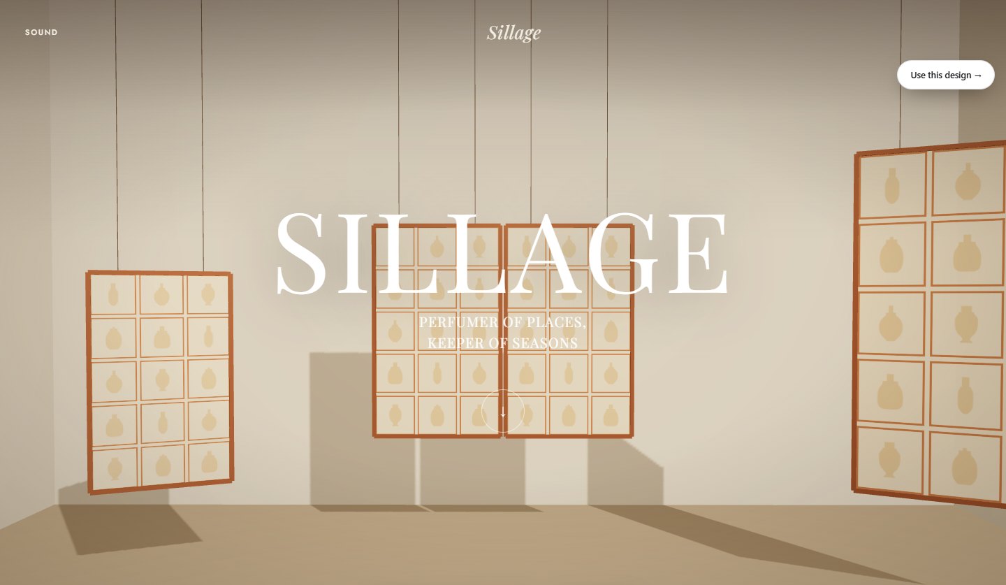 Maison de Parfum The nature you carry with you. Discover
 An immersive luxury perfume house — scrolling is a journey through five nature worlds, one per fragrance, in the manner of a Maison's editorial campaign.
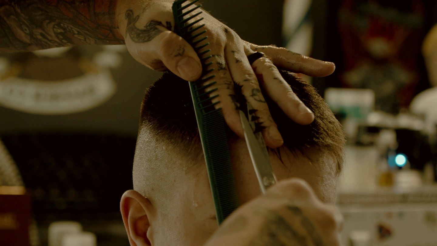 Hair studio Nine chairs. One of them is yours. Book a chair
 One dark salon, walked through on scroll — the door, the mirror, the blade, and the proof that the cut worked.
Massage & wellness An hour that stays quiet. Book an hour Chair's skeleton in warm cream and old gold — the same didone editorial and scroll-through room, lit instead of darkened.
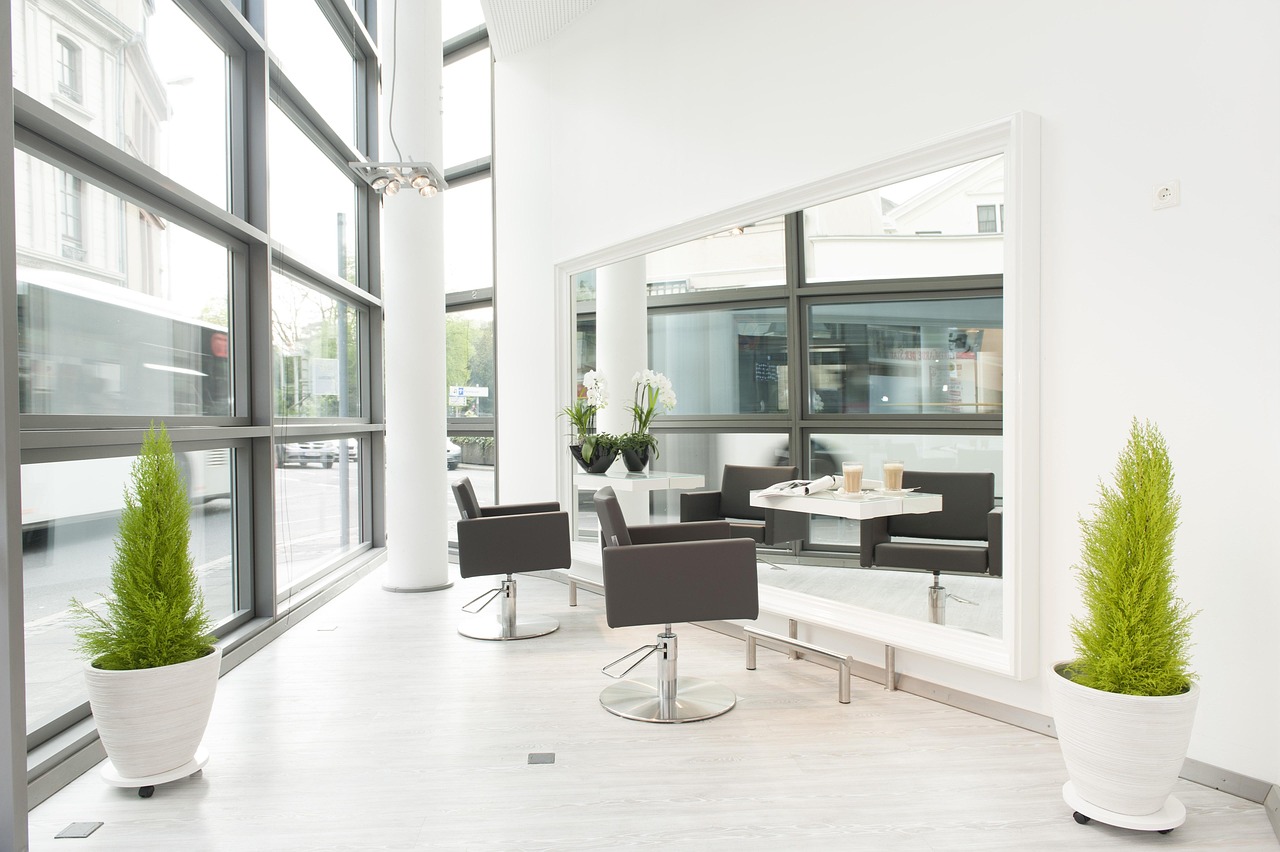 Private salon suites Stop renting a chair. Book a viewing
 Warm off-white with a fat didone headline that finishes in italic — a private-suite landlord selling rooms to beauty professionals, not haircuts to clients.
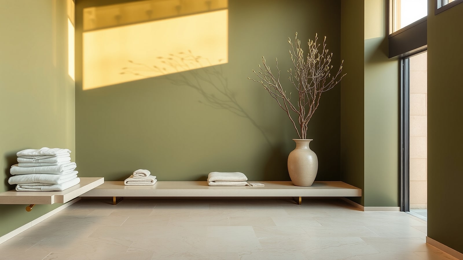 Day spa & wellness An hour that belongs to nobody else. Book treatment
 Deep olive and warm parchment with oversized geometric headlines, blob-cropped photographs and a didone whisper — a day spa priced like one.
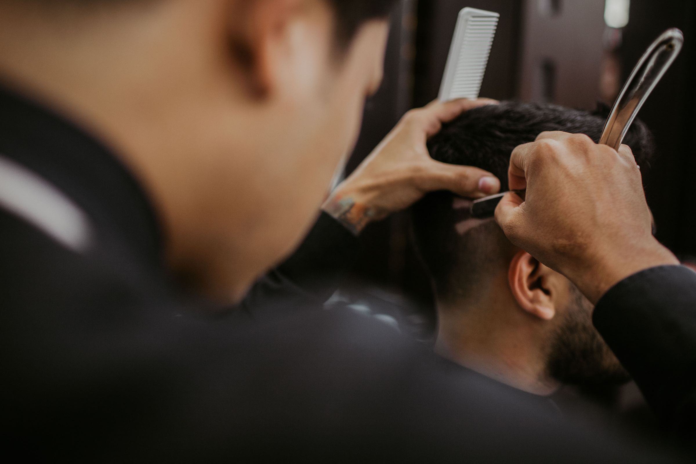 Men's grooming The Perfect Grooming Salon for Men Book Now
 Warm near-black with gold lettering, pill buttons and service names set as oversized outlines behind the photographs.
Hair & barber The Perfect Grooming Salon for Men Book Now Warm ivory with bronze lettering, pill buttons and service names set as oversized outlines behind the photographs — groomy's daylight sibling.
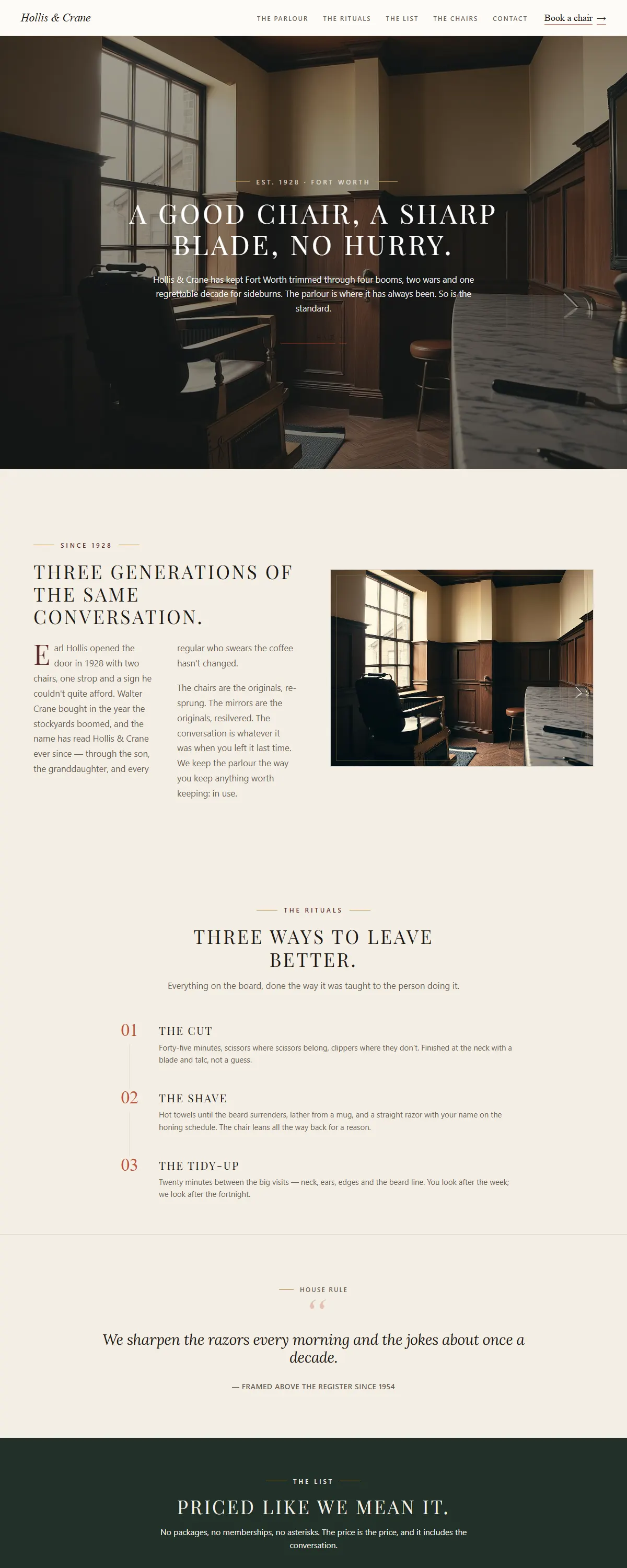
Cream field, charcoal ink and engraved brass caps — a heritage parlour where stillness is the luxury.
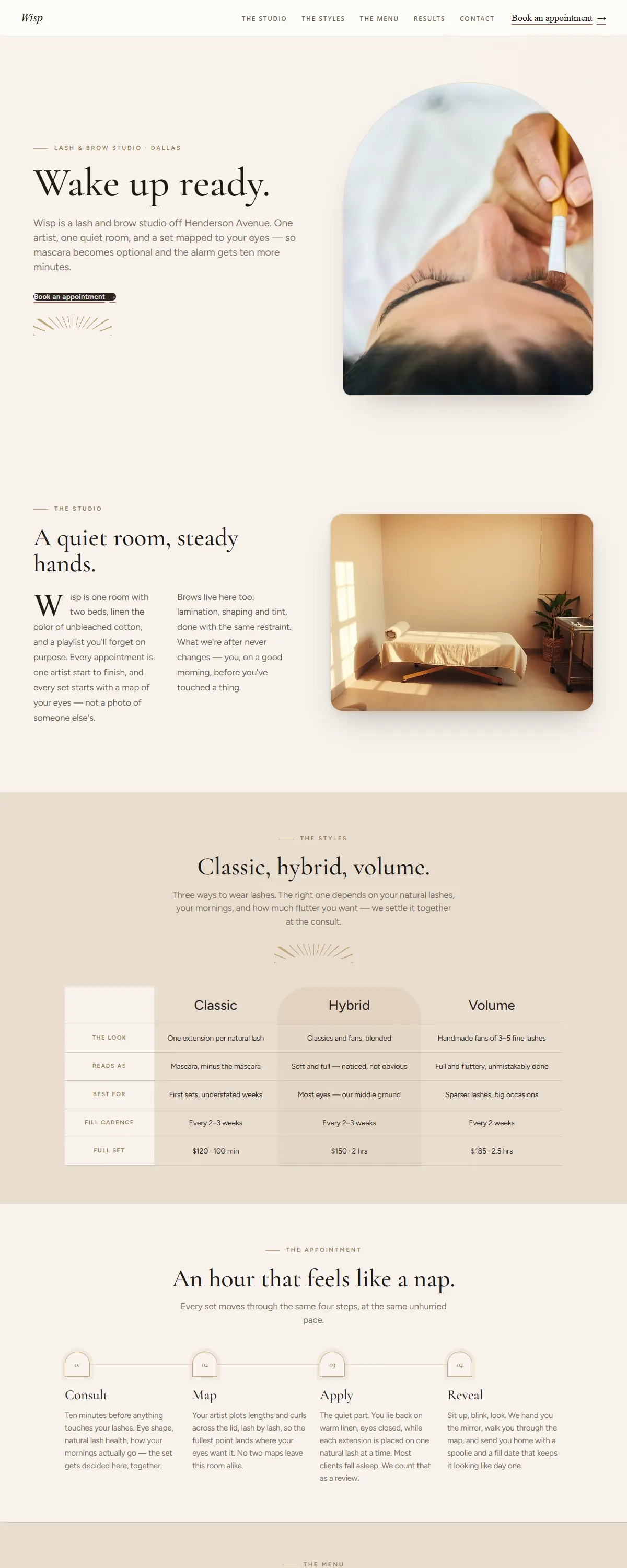
Hushed champagne minimalism with arch-cropped photos and a lash-map fan motif — a lash & brow studio set for soft mornings.
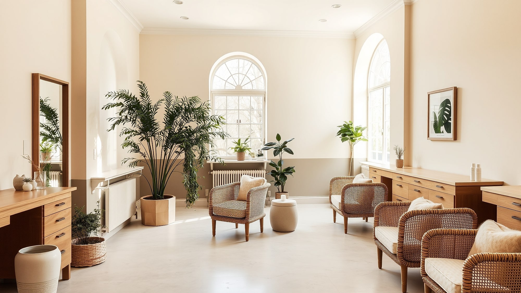 Nail & beauty lounge An hour you don't have to be anything for. Book an hour
 Parchment and sage with a classical roman display face and every photograph cut to a leaf — a lounge that sells the hour, not the hurry.
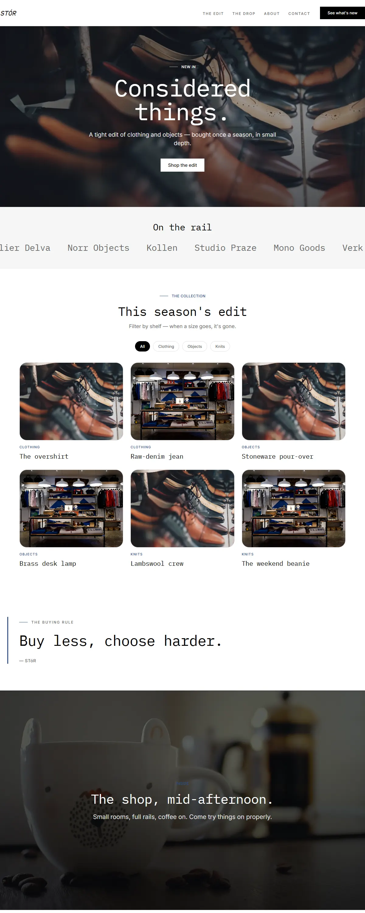
High-contrast type on white, monospace headings, product-photo-first. Curated retail.
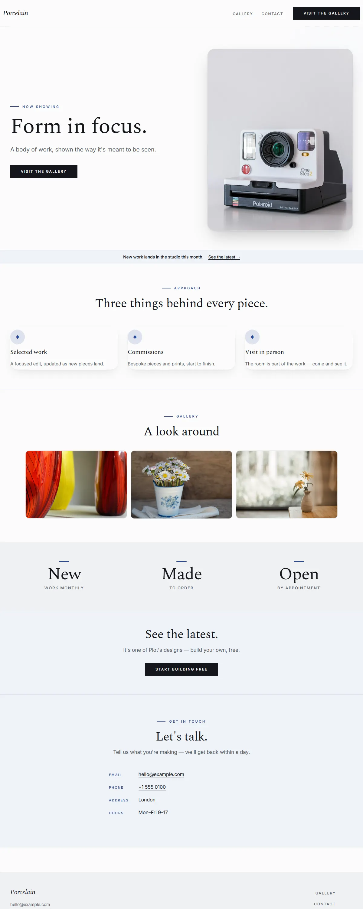
Bright white and cobalt with a fine Spectral serif. Clean, museum-grade calm.
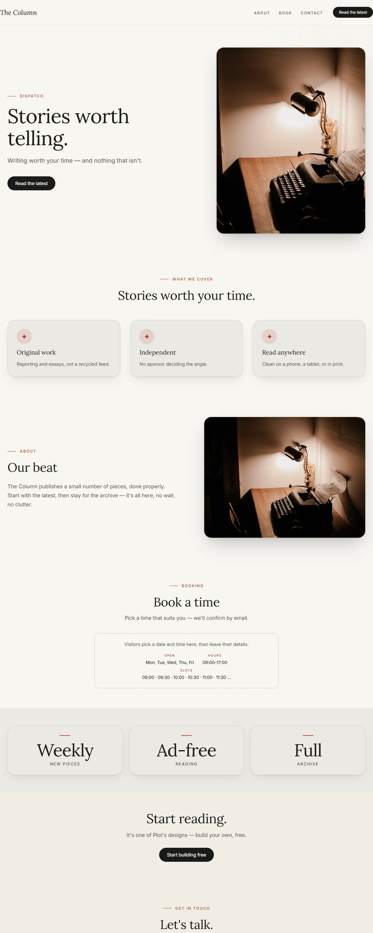
Newsprint cream and ink with a Lora serif and a rust accent. Editorial and literary.
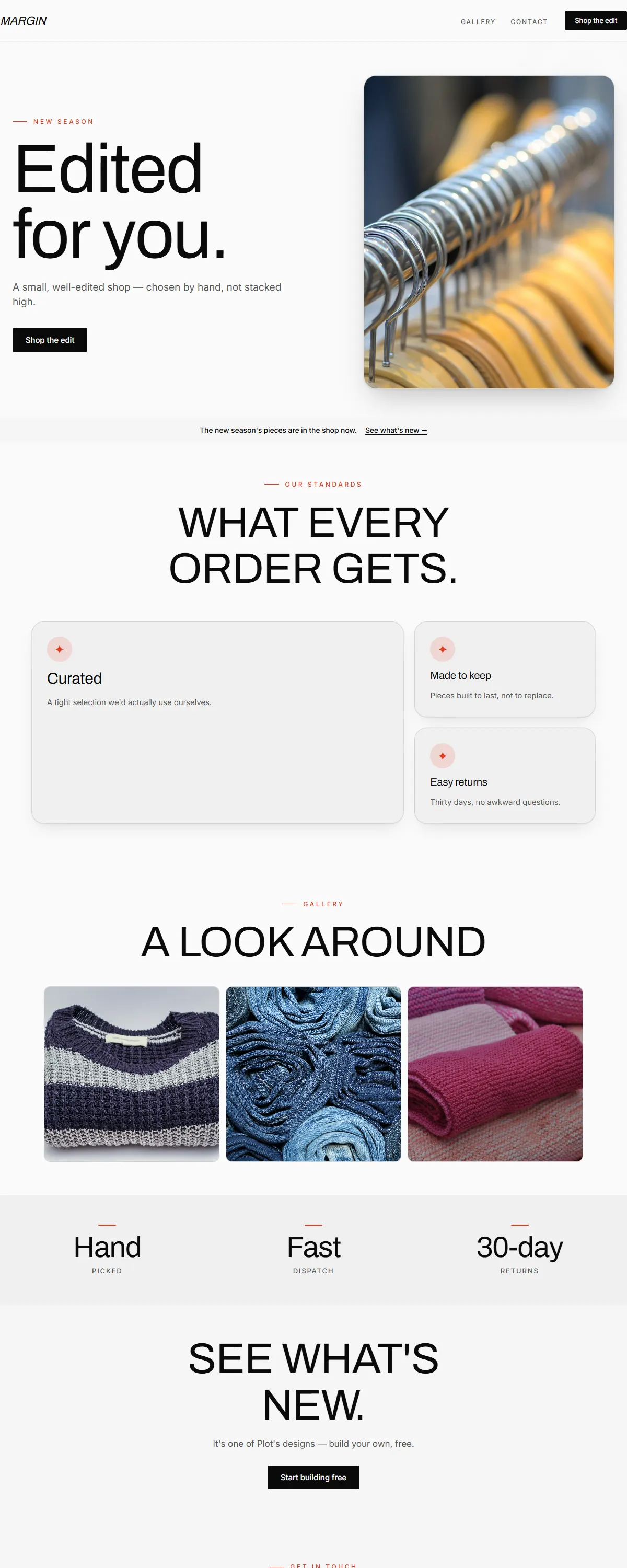
Off-white and black with bold Archivo and a single red accent. Fashion-editorial.
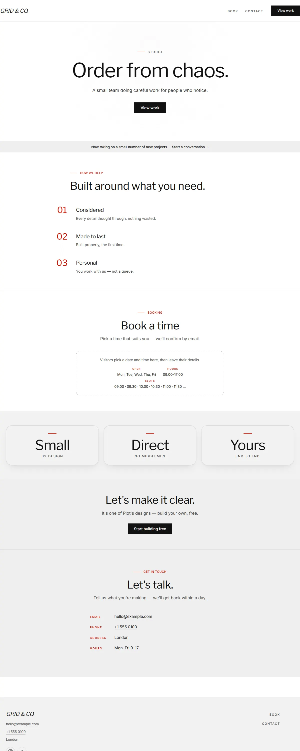
International typographic style — pure white, a precise grotesk and one red accent.
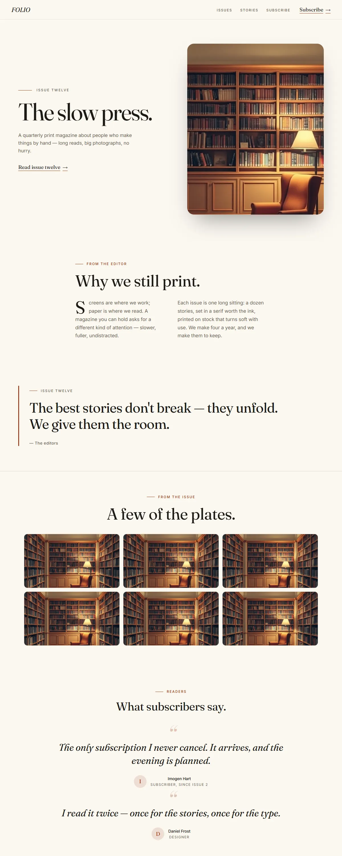
Newsprint cream and ink with a rust accent and a literary Fraunces serif. Editorial and considered.
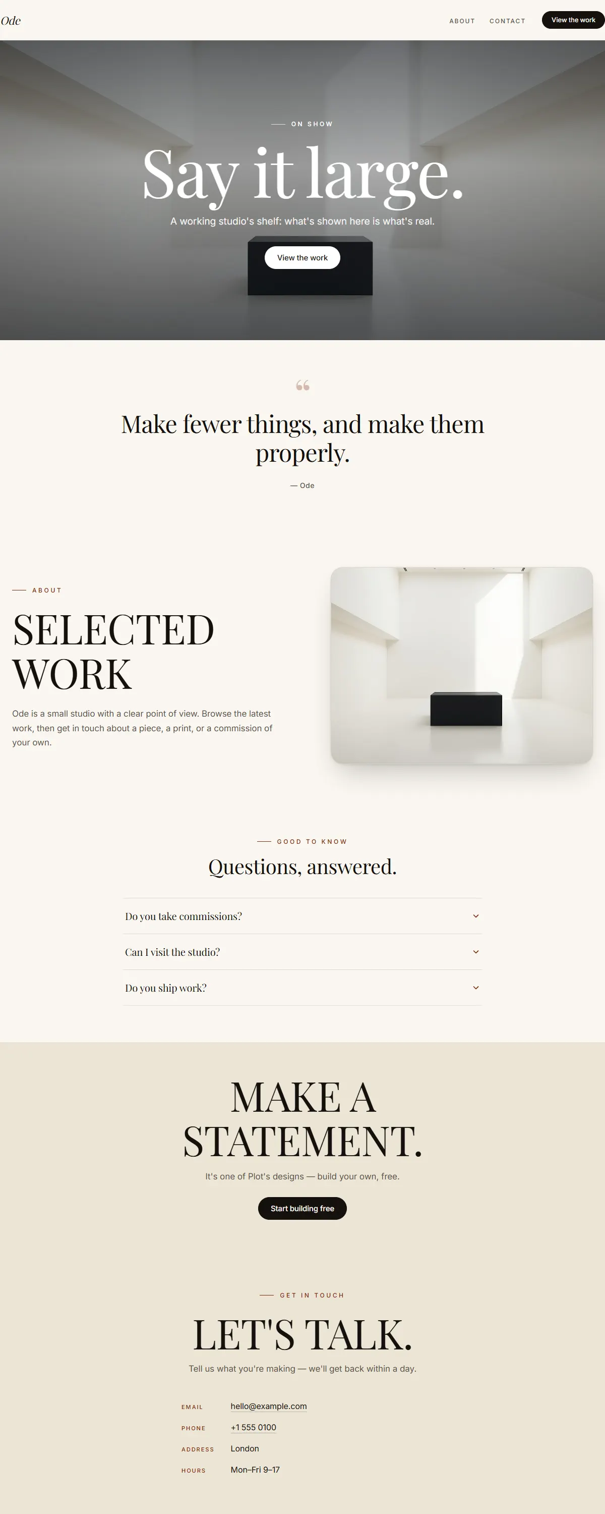
Ivory and black with an oversized Playfair serif. A typographic poster that says it large.
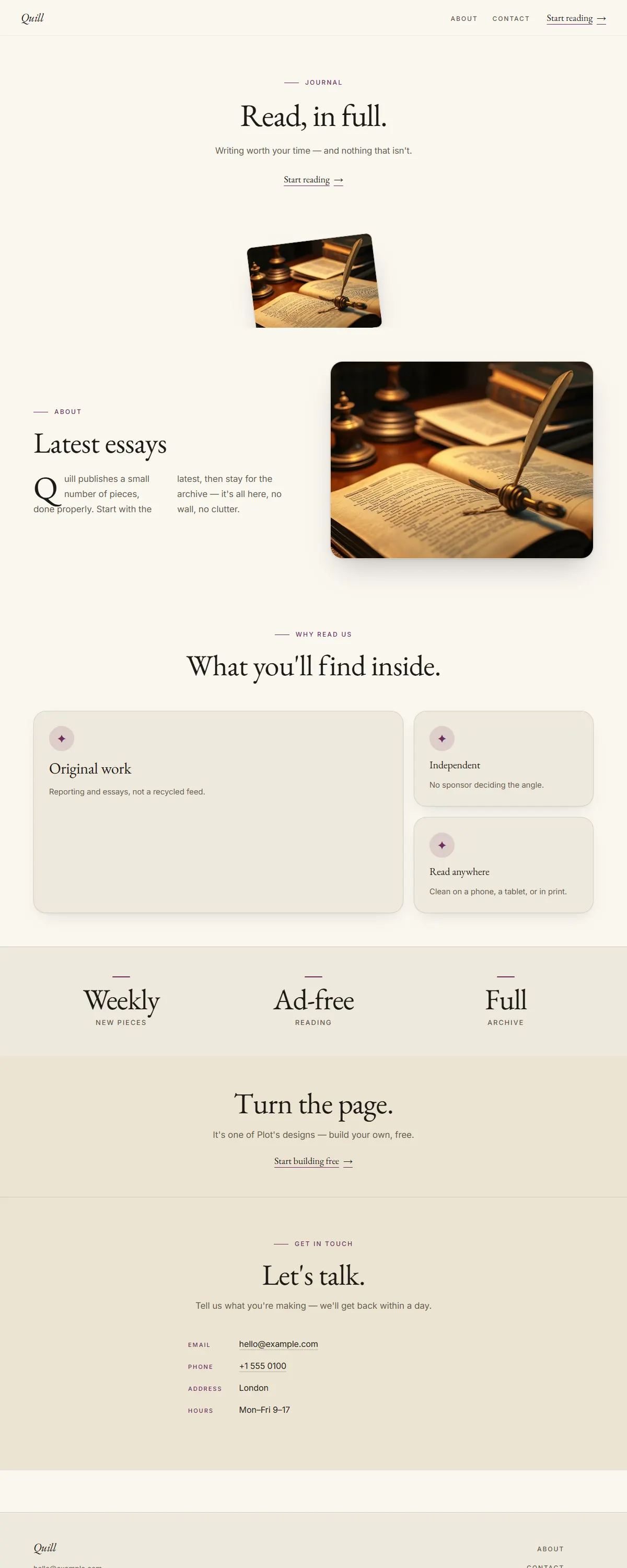
Warm cream and ink with a plum accent and a literary EB Garamond. Quiet, considered editorial.
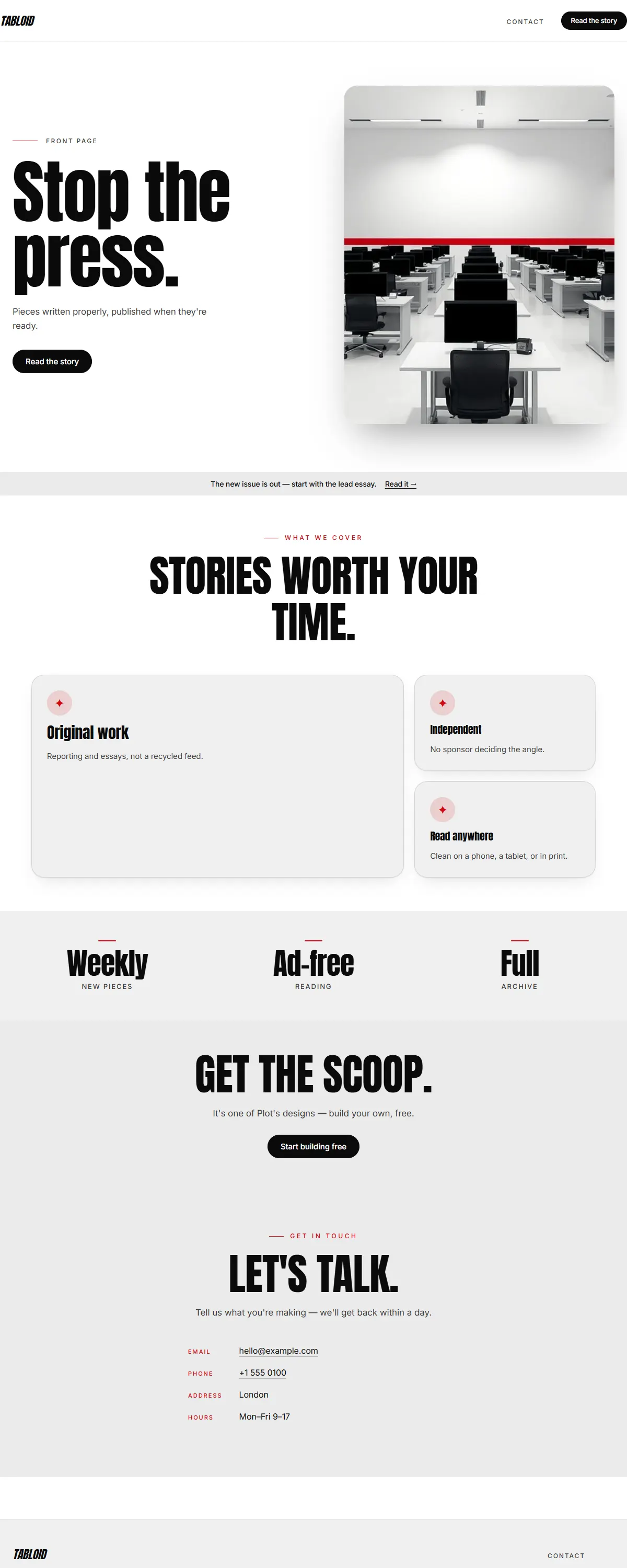
Pure black-on-white with one red and a heavy Anton poster face. Loud newsprint energy.
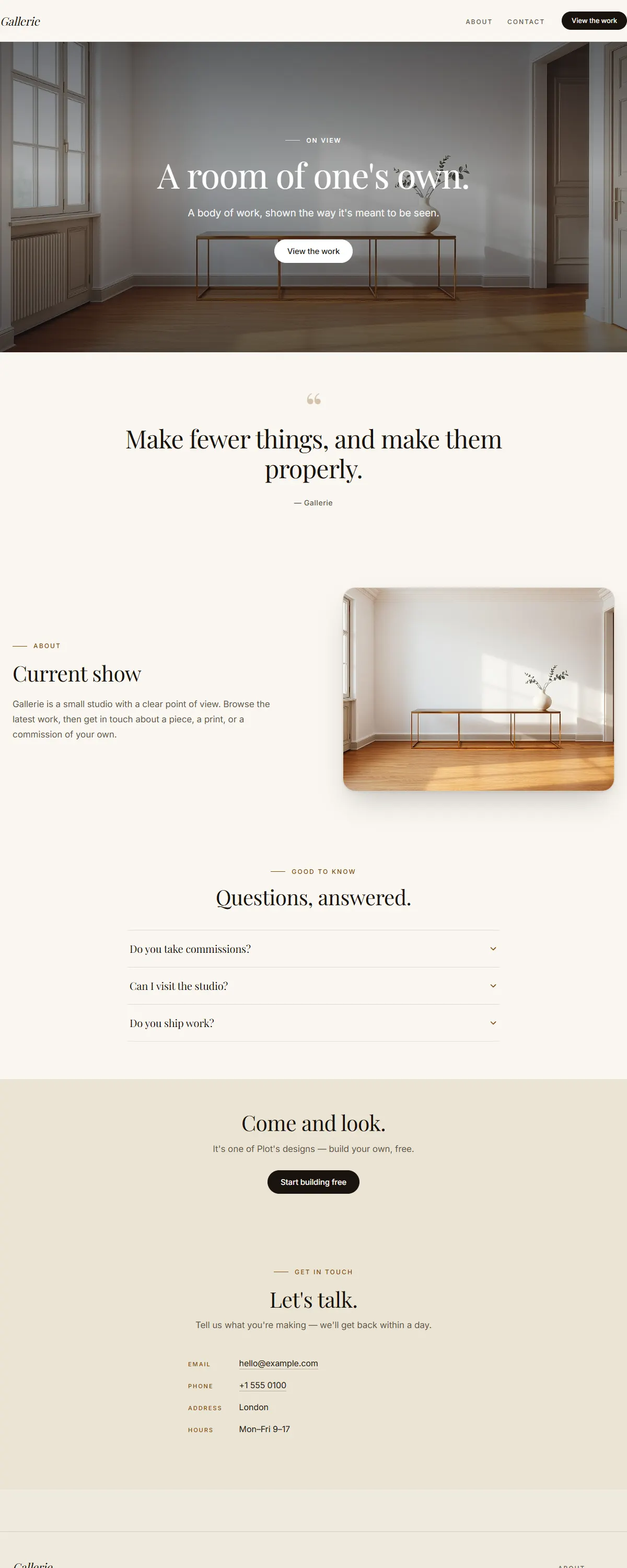
Warm white and ink with a brass accent and an oversized Playfair. Curated, gallery-grade calm.
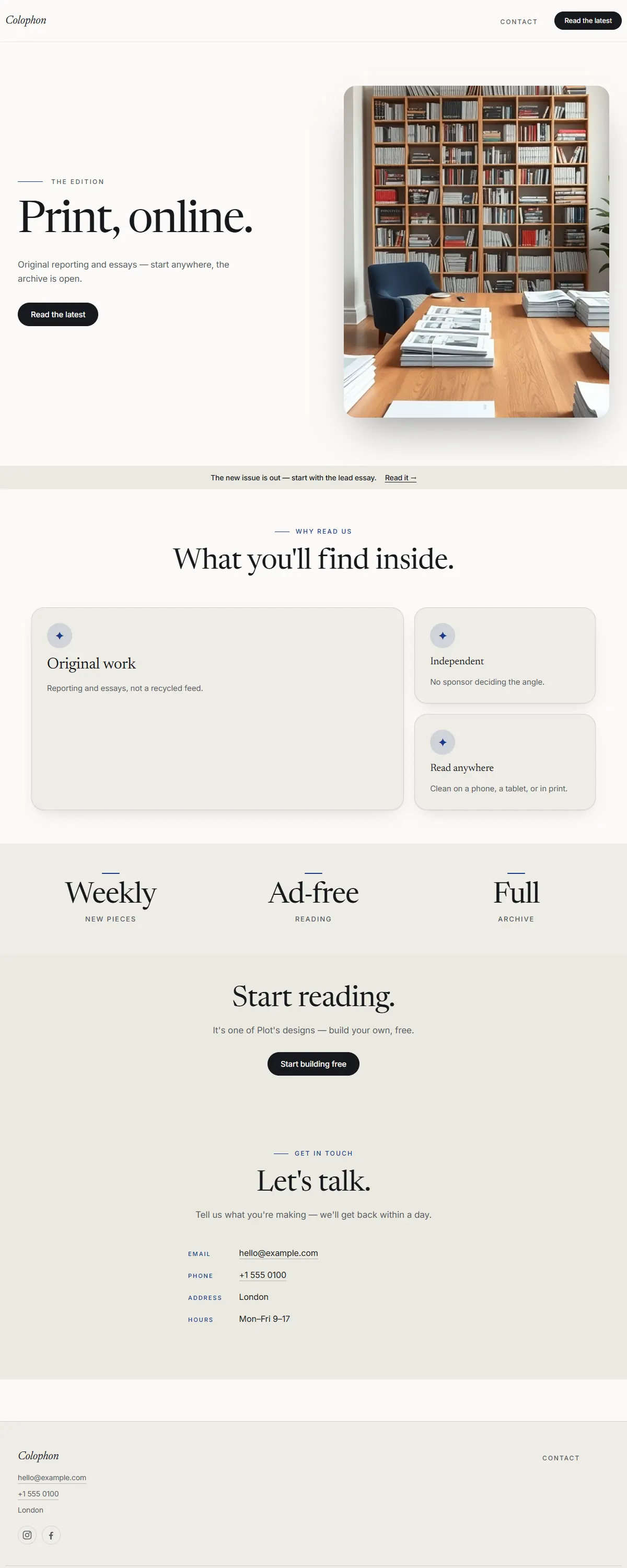
Warm white and ink with a royal-navy accent and a literary Newsreader. Modern publishing, set well.
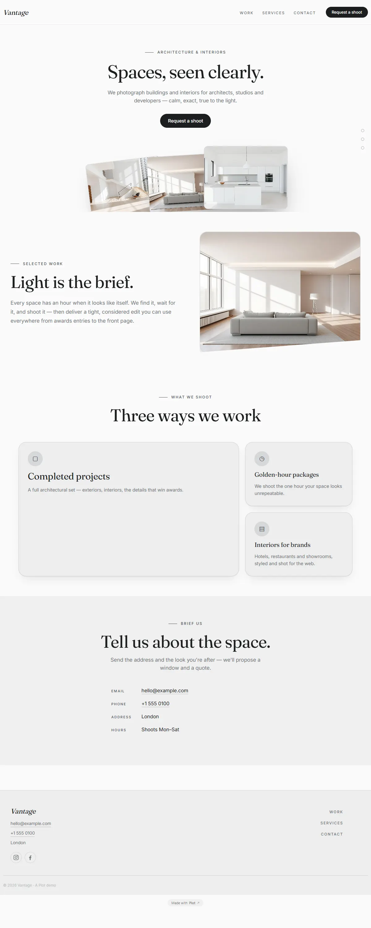
Crisp paper-white with a graphite accent and editorial type — a clean frame for photographers and studios.
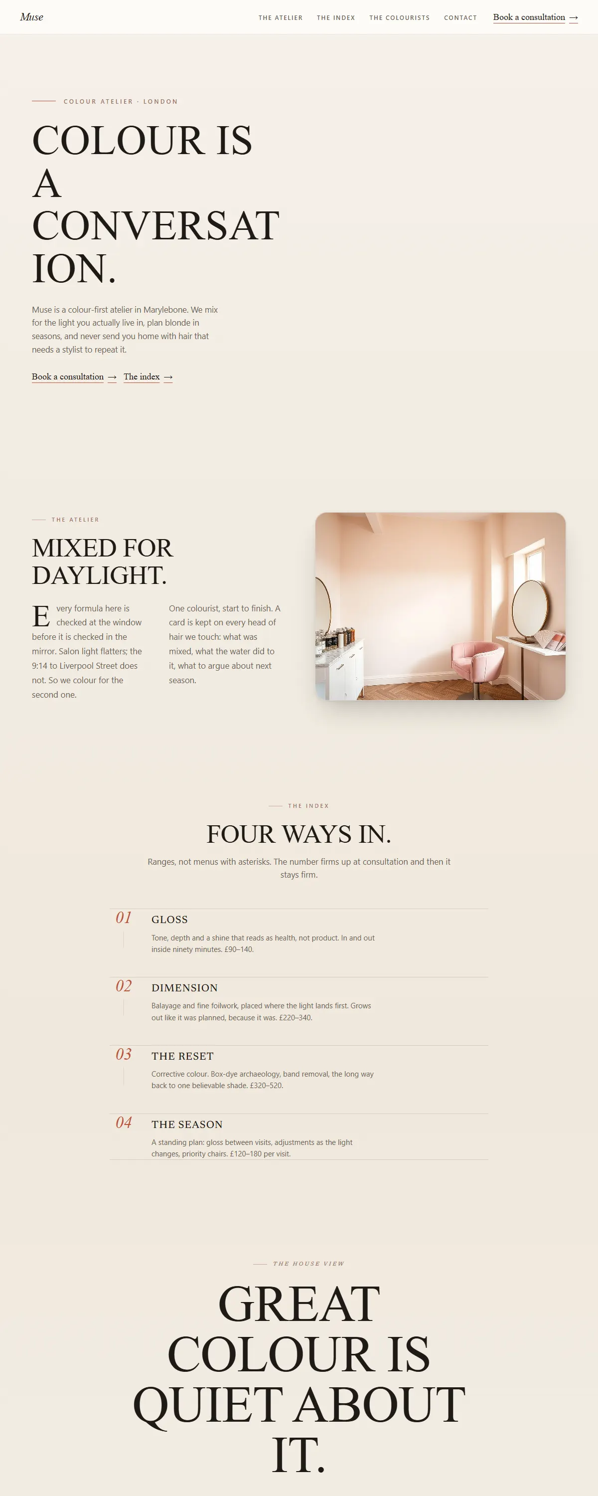
Warm ivory editorial with caps-and-italic magazine headlines and a numbered service index — a colour atelier set like a fashion page.
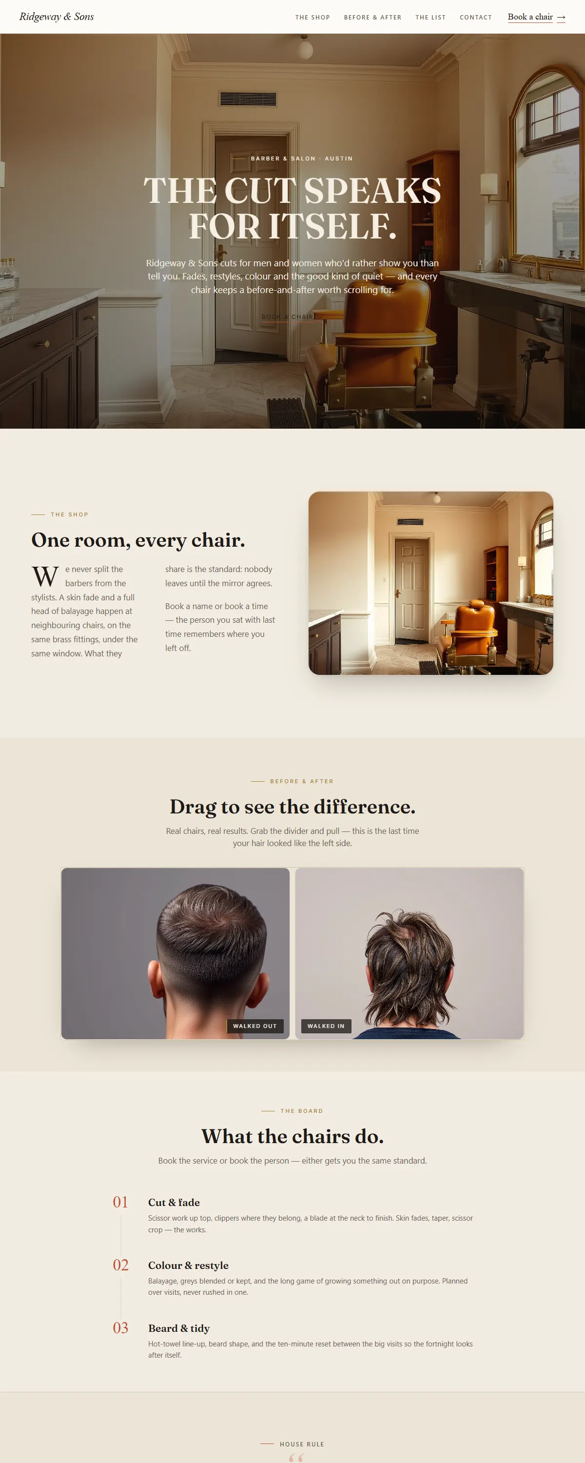
Warm ivory and brass with high-contrast editorial caps — a barber & salon that shows the cut, before and after.
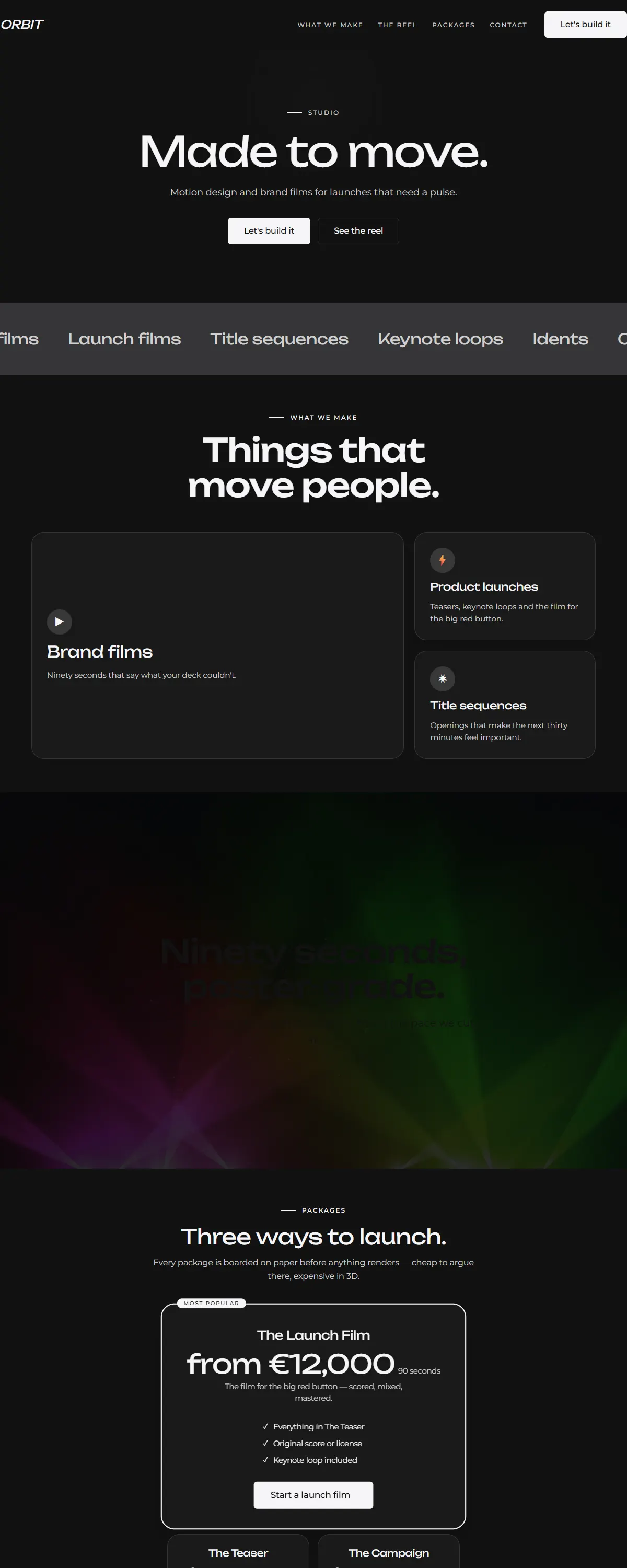
Deep-space dark canvas with sharp Unbounded typography. Confident and modern.
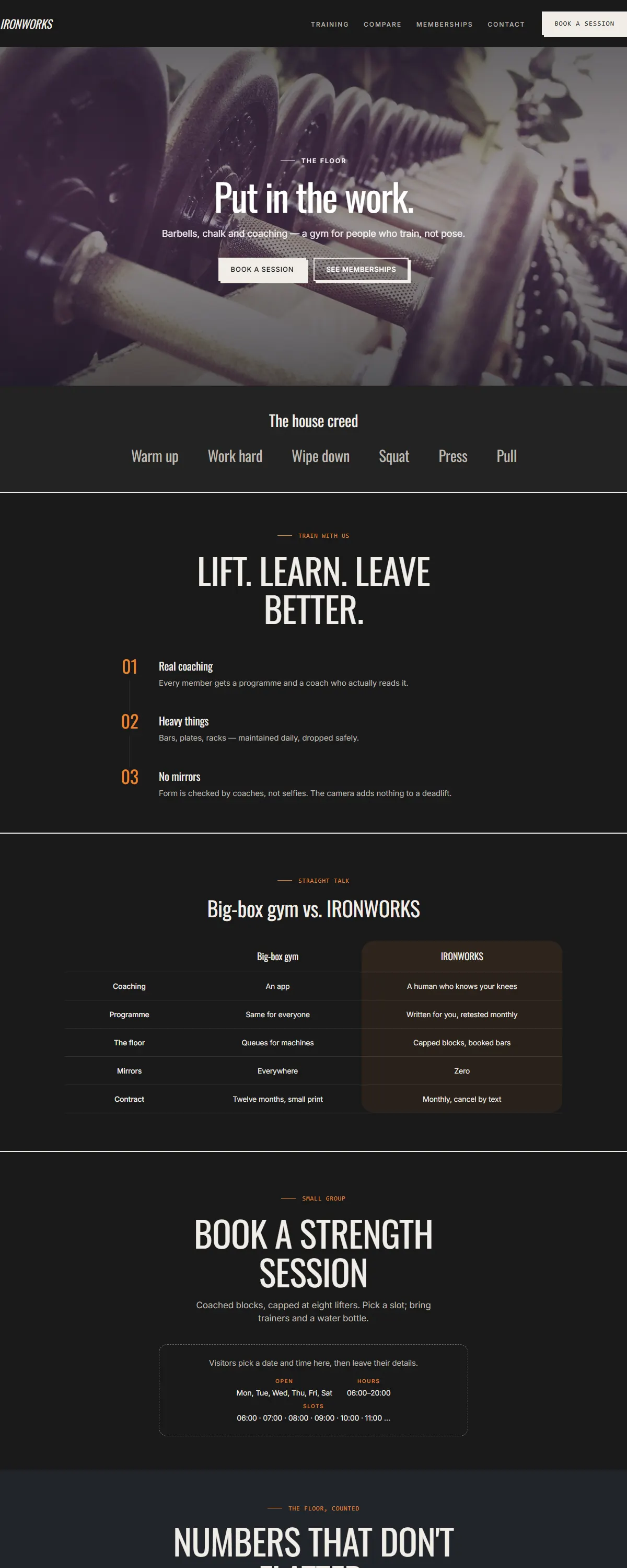
Charcoal and amber with condensed type. Strong and physical.
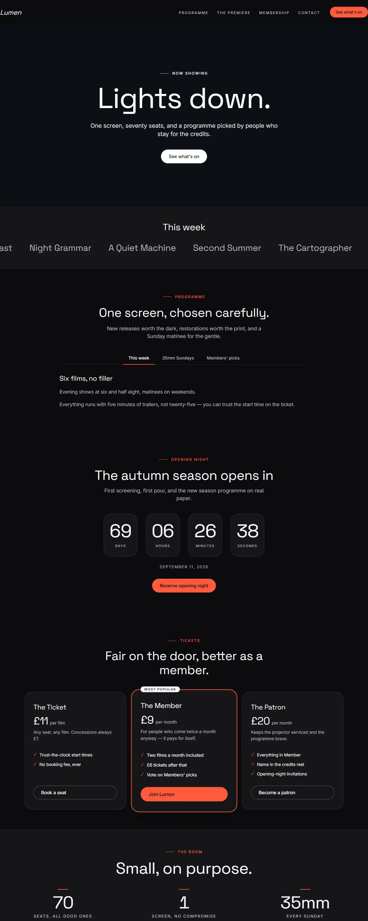
Near-black and cinematic, bold modern type with a vivid coral accent. Built for a video hero.
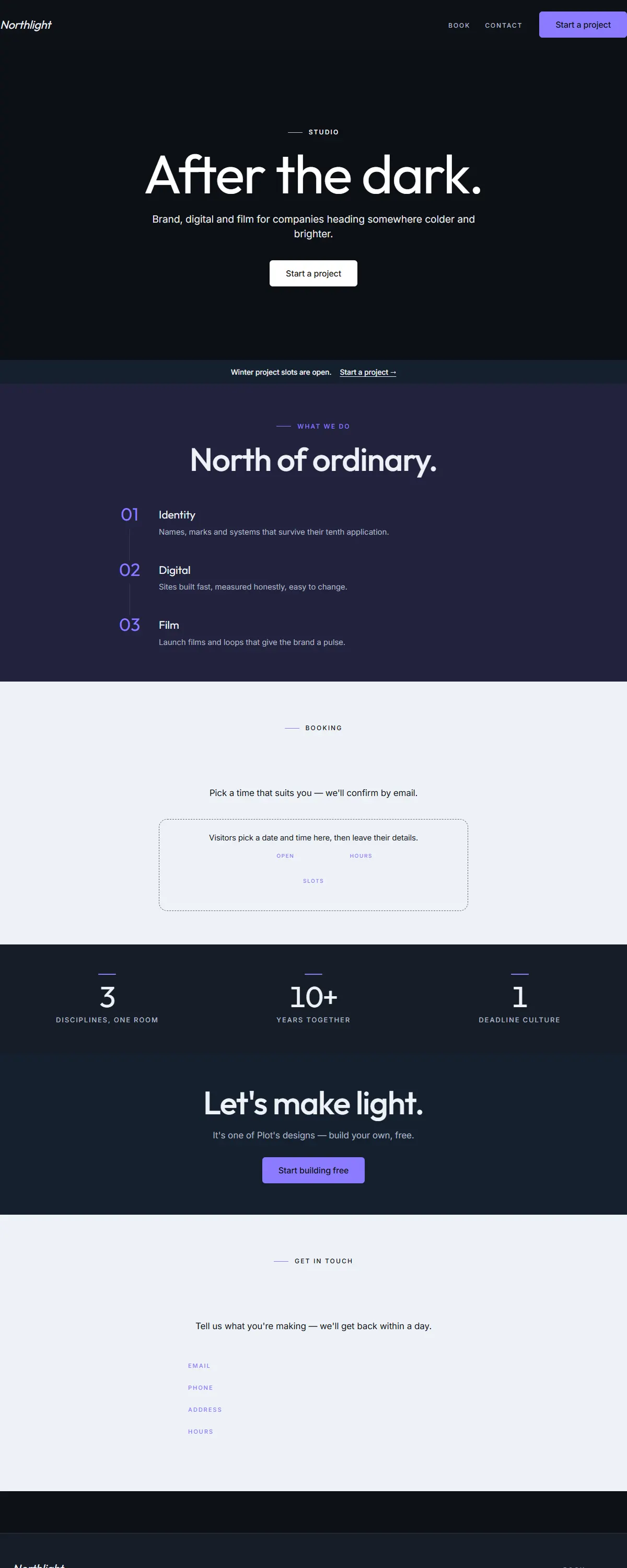
Deep slate-navy with a luminous violet accent and clean geometric type. The after-work training studio.
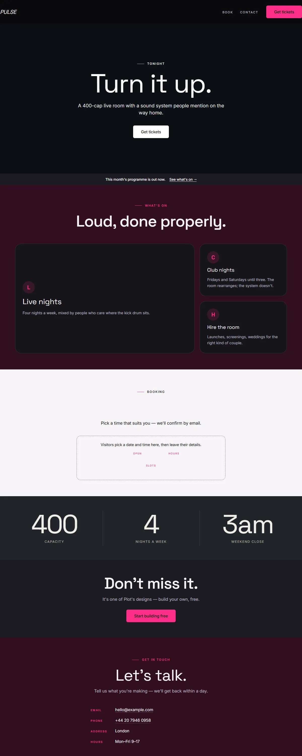
Near-black with electric magenta and bold type. High-energy and loud.
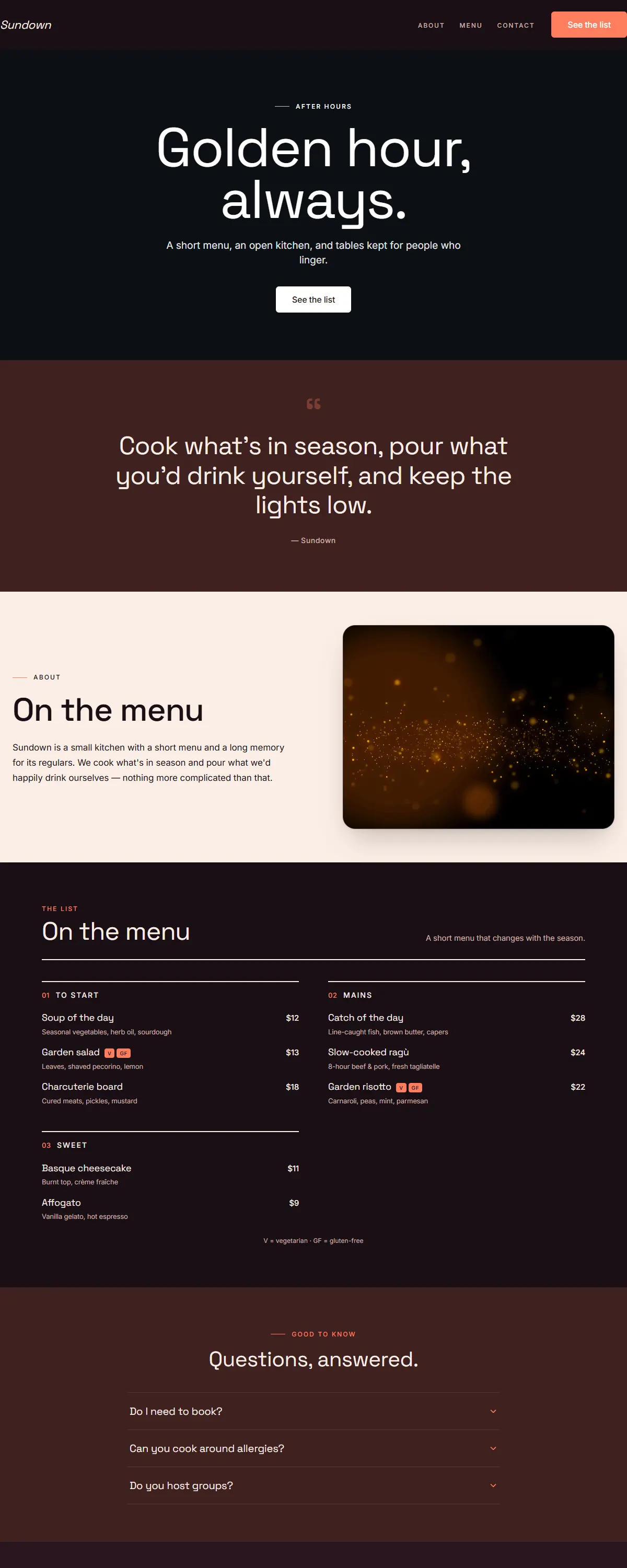
Warm plum and coral with bold Space Grotesk. Golden-hour warmth for the evening.
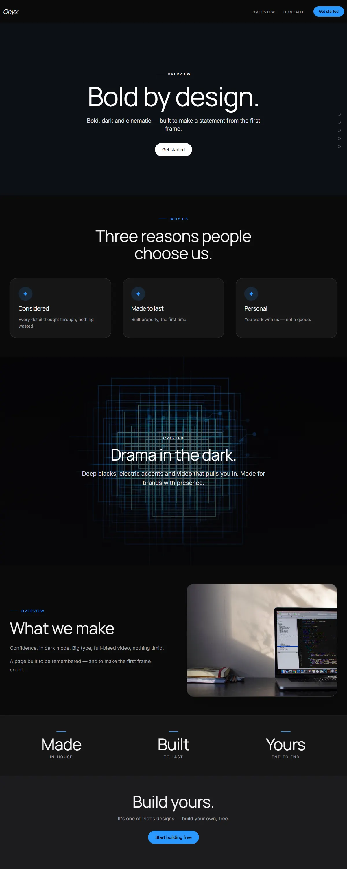
Near-black and cinematic with bold type. A product-launch keynote page.
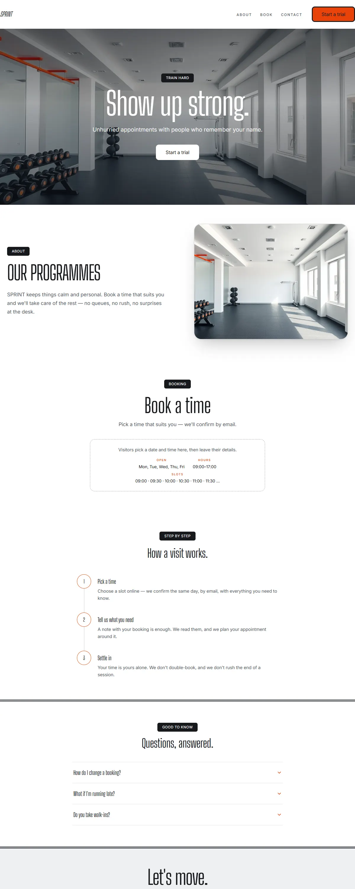
Bright, energetic fitness — clean white, charcoal and electric orange with bold condensed type.
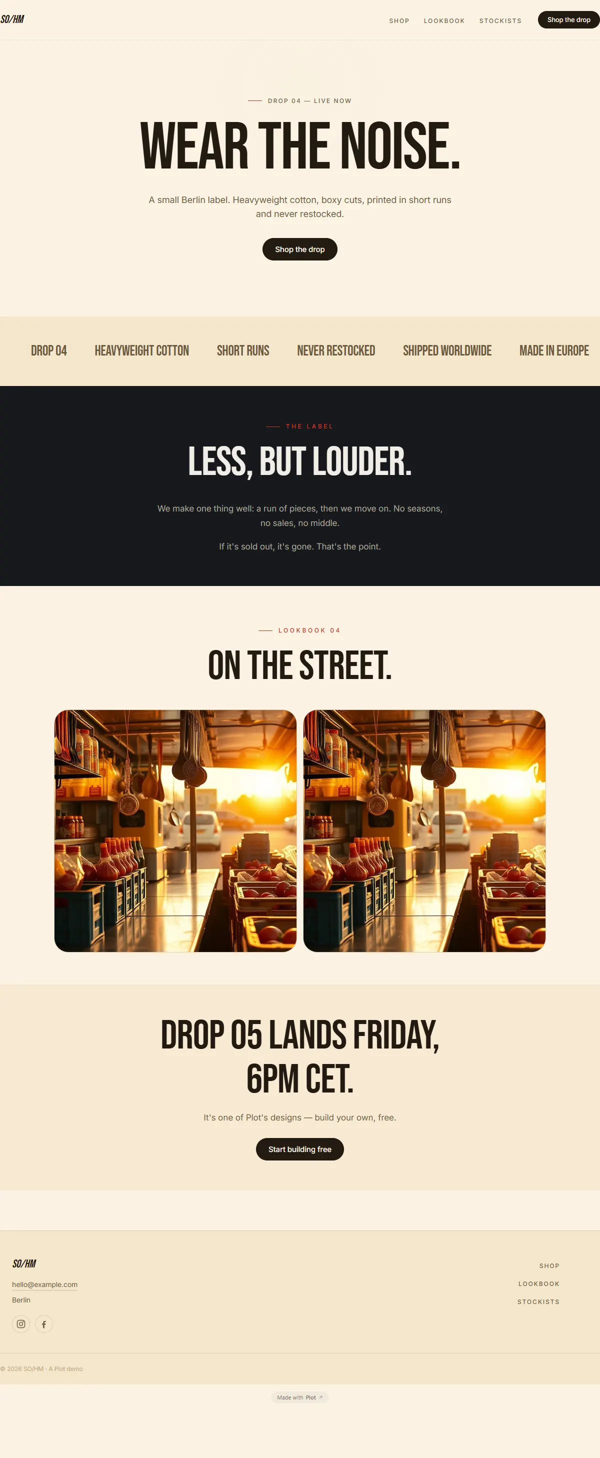
Bold street-food energy — warm cream, chili red and a tall condensed poster face.
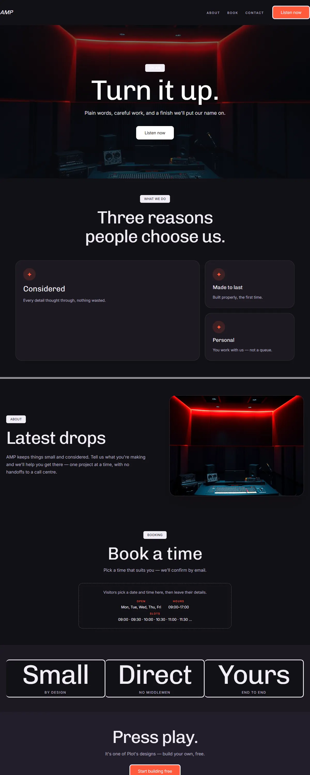
Bold dark stage for music and podcasts — near-black with an electric coral and Chivo.
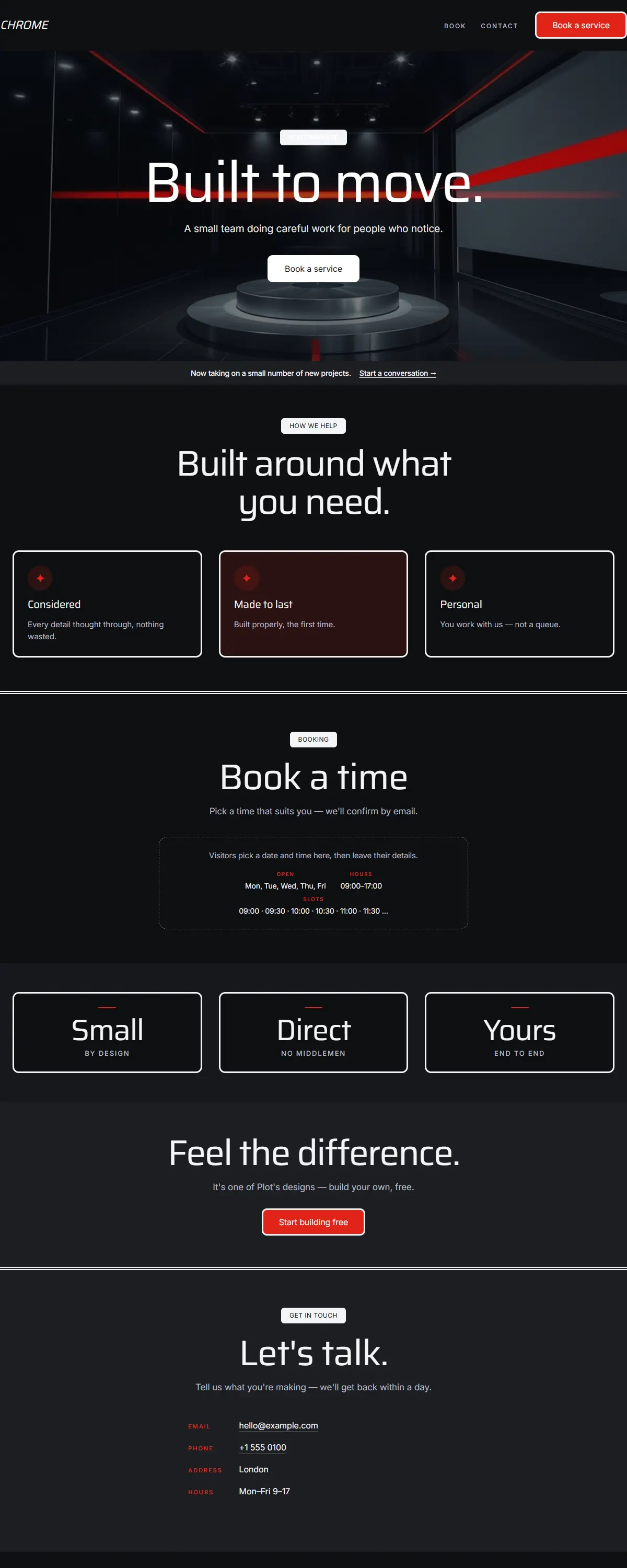
Sleek dark automotive — glossy black and chrome with a racing-red accent and Saira.
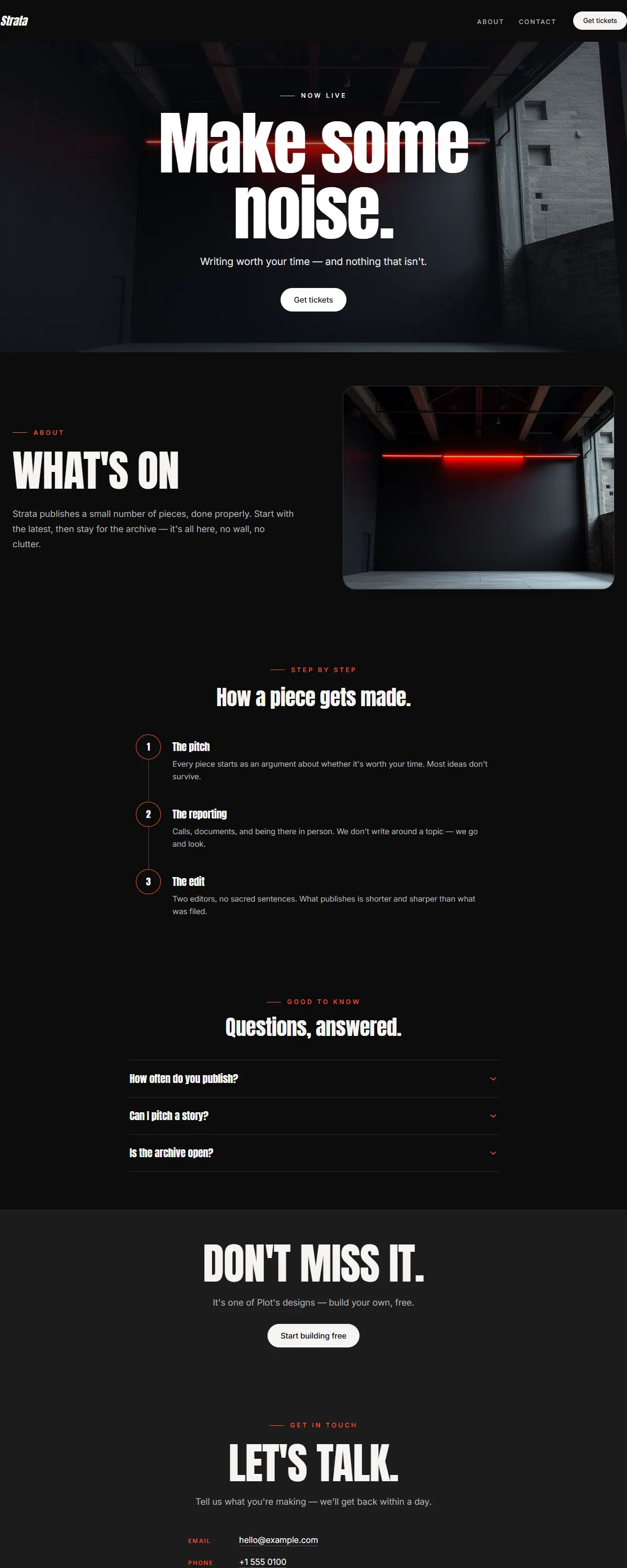
Near-black with a vivid coral and a heavy Anton poster face. Loud, bold, after-dark.
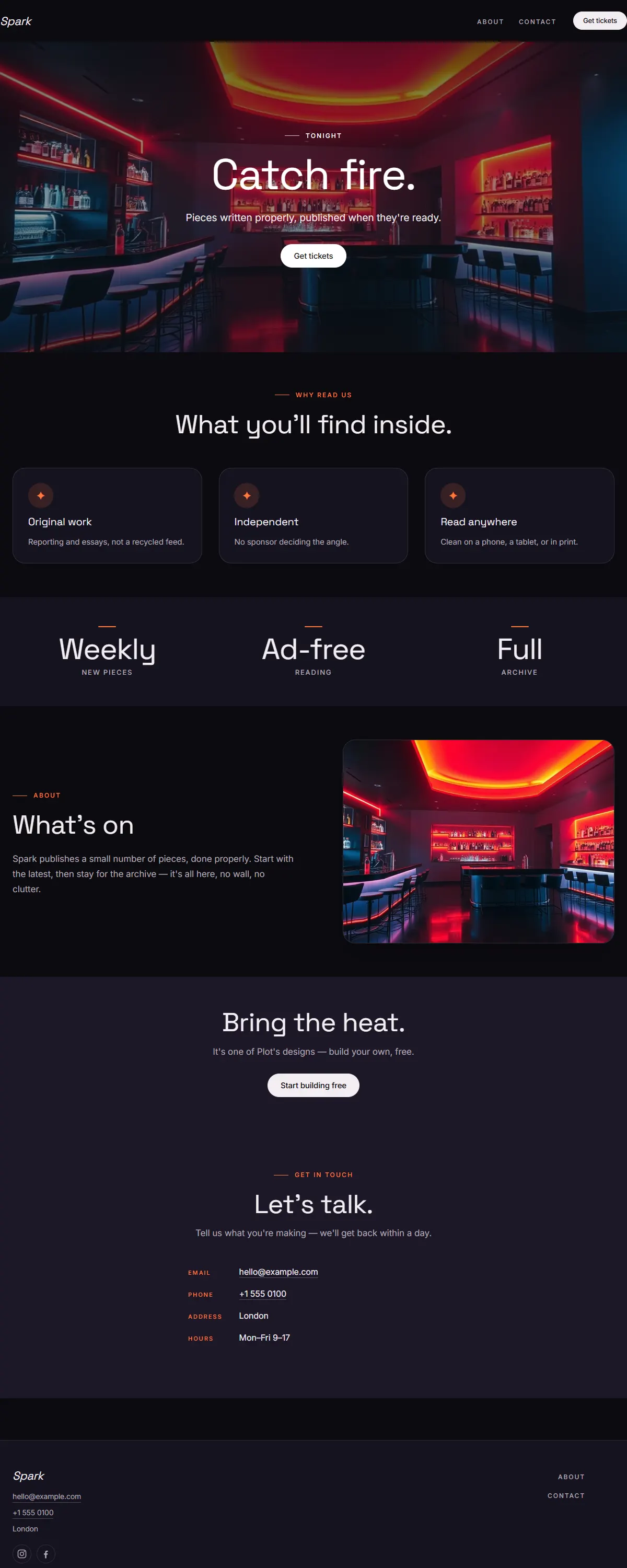
Near-black with a hot orange-pink gradient and bold Space Grotesk. High-energy nightlife.
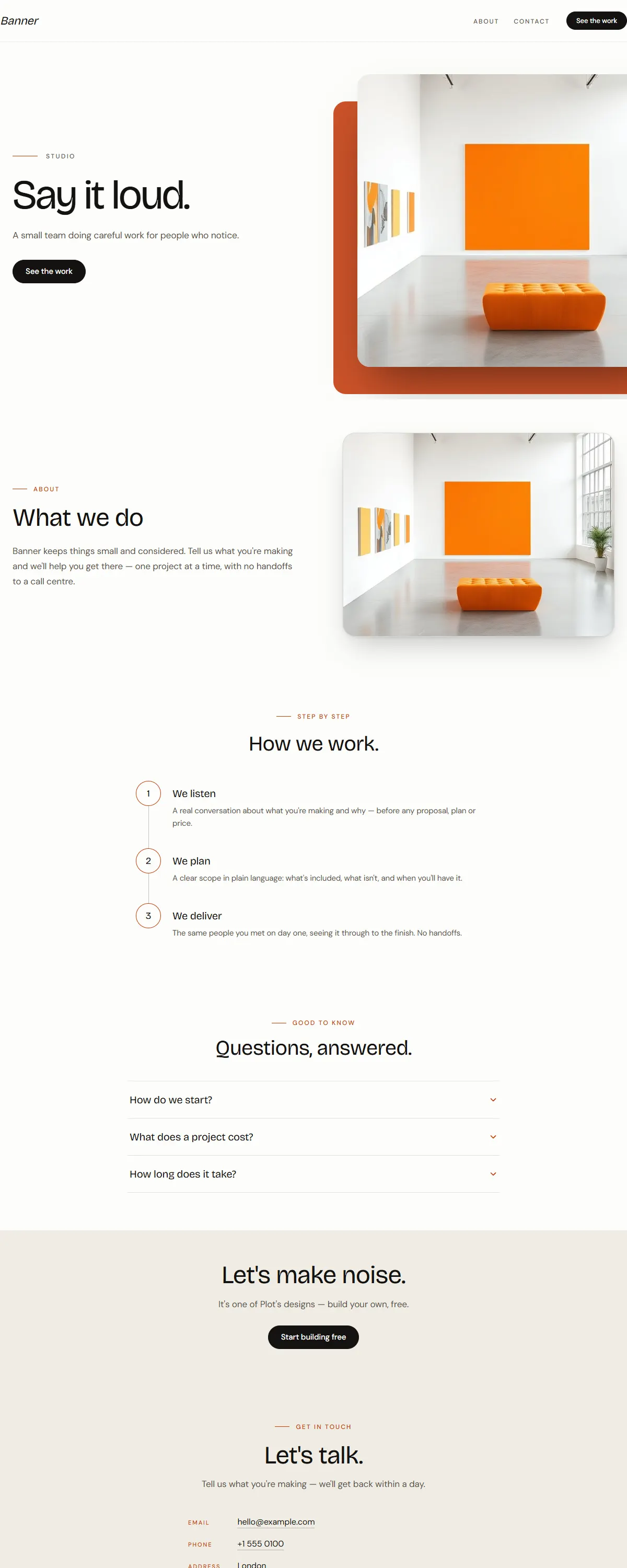
Bright white with a vivid tangerine accent and a bold Bricolage display. Loud, confident, made to be seen.
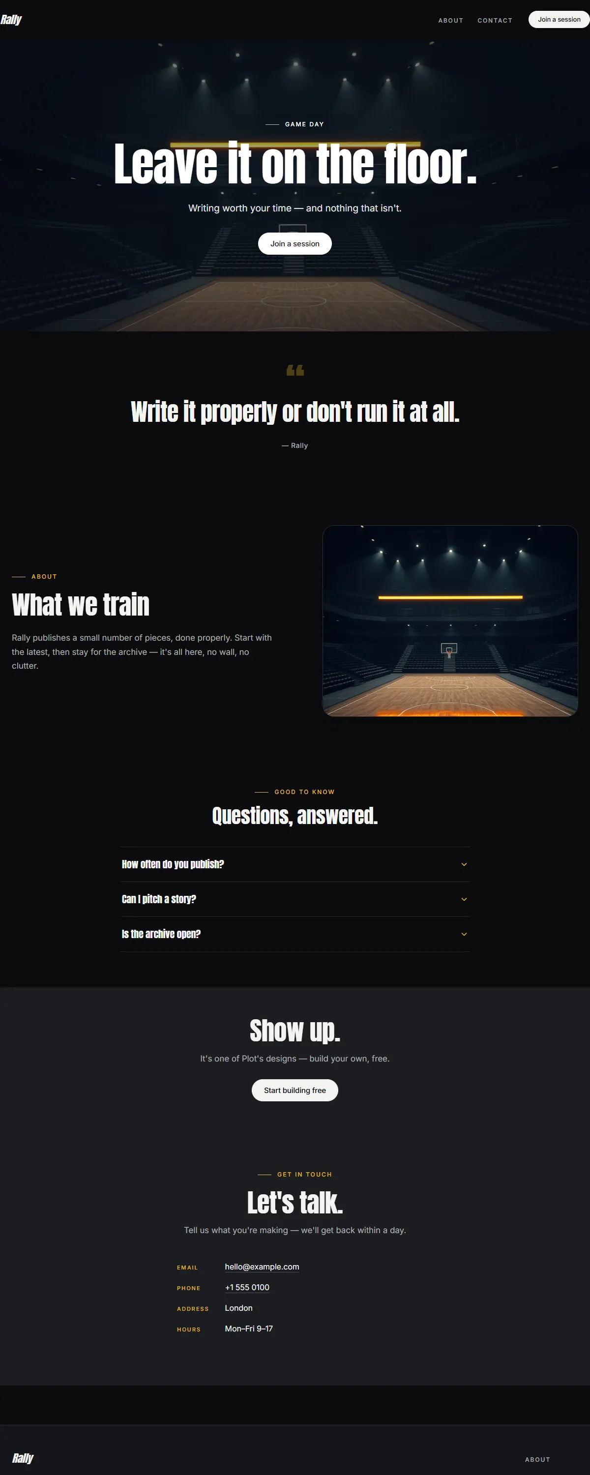
Near-black with a bold electric-gold accent and a heavy Anton. High-energy and competitive.
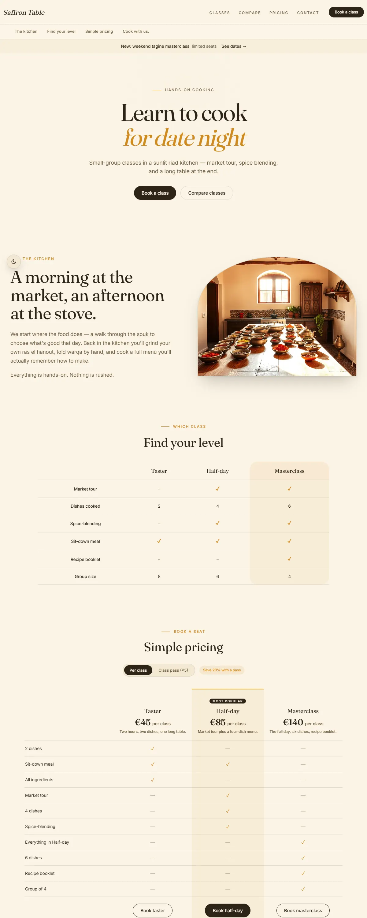
Sun-warmed cream with a bold saffron-gold accent — appetising and lively for food, classes and markets.
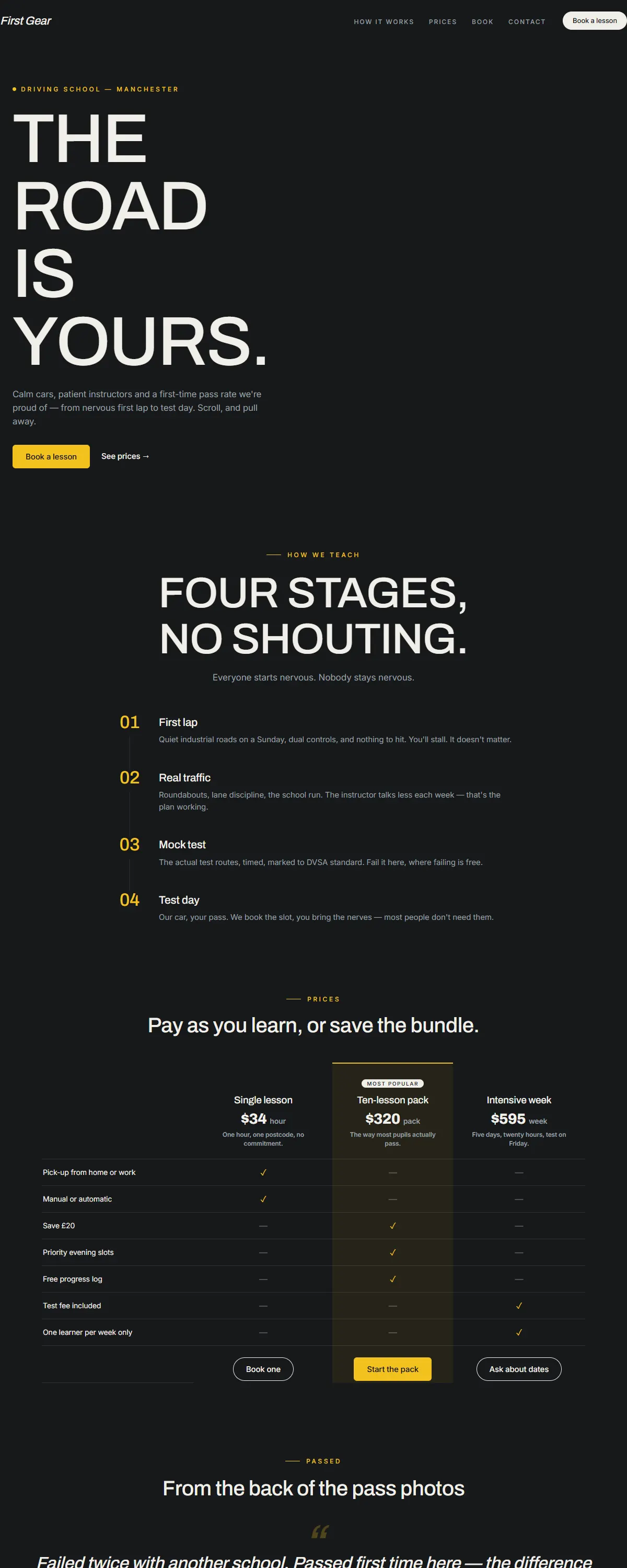
Asphalt dark with signal-yellow markings — scrolling drives you forward down the road.
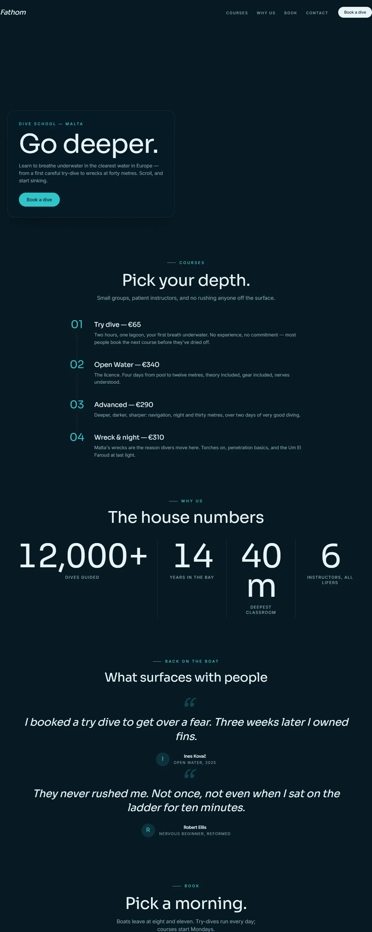
Abyss blue that darkens as you descend — scroll is a dive, from surface light to deep water.
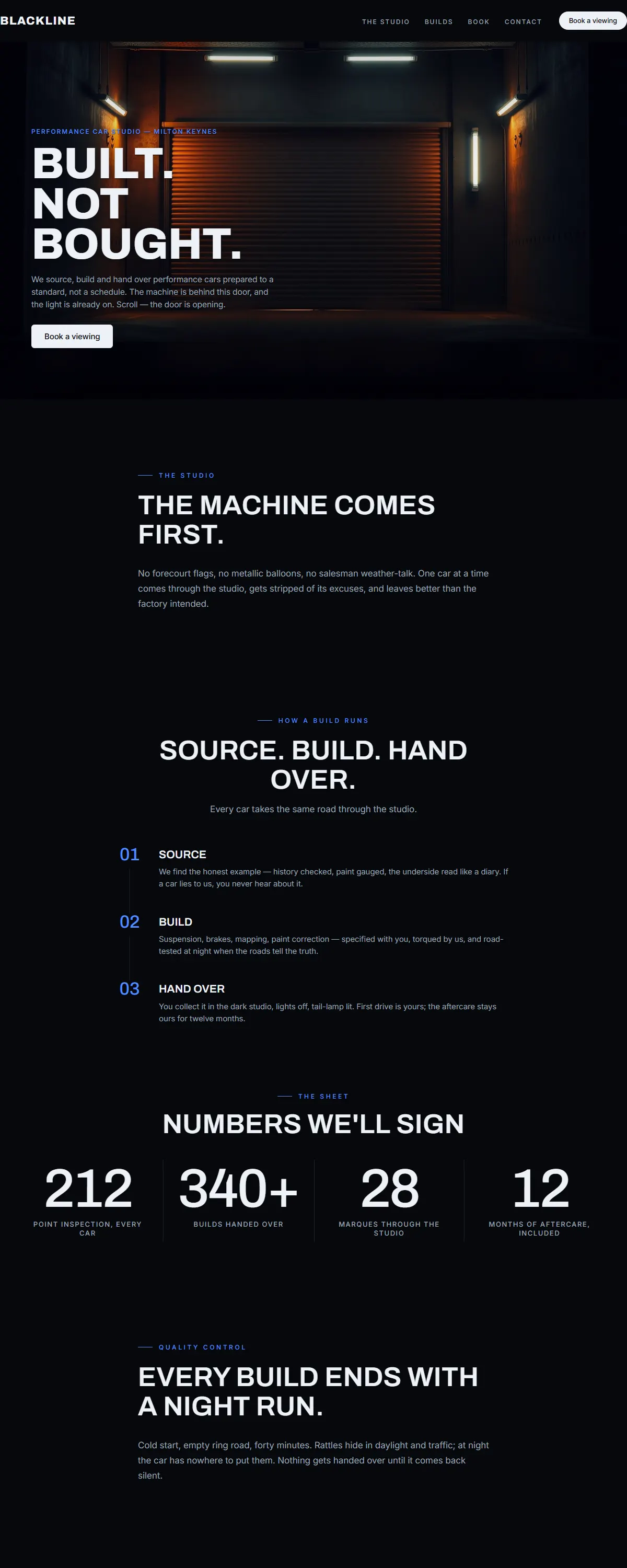
Garage black with a living machine — the roller door opens and scrolling walks you deeper inside.
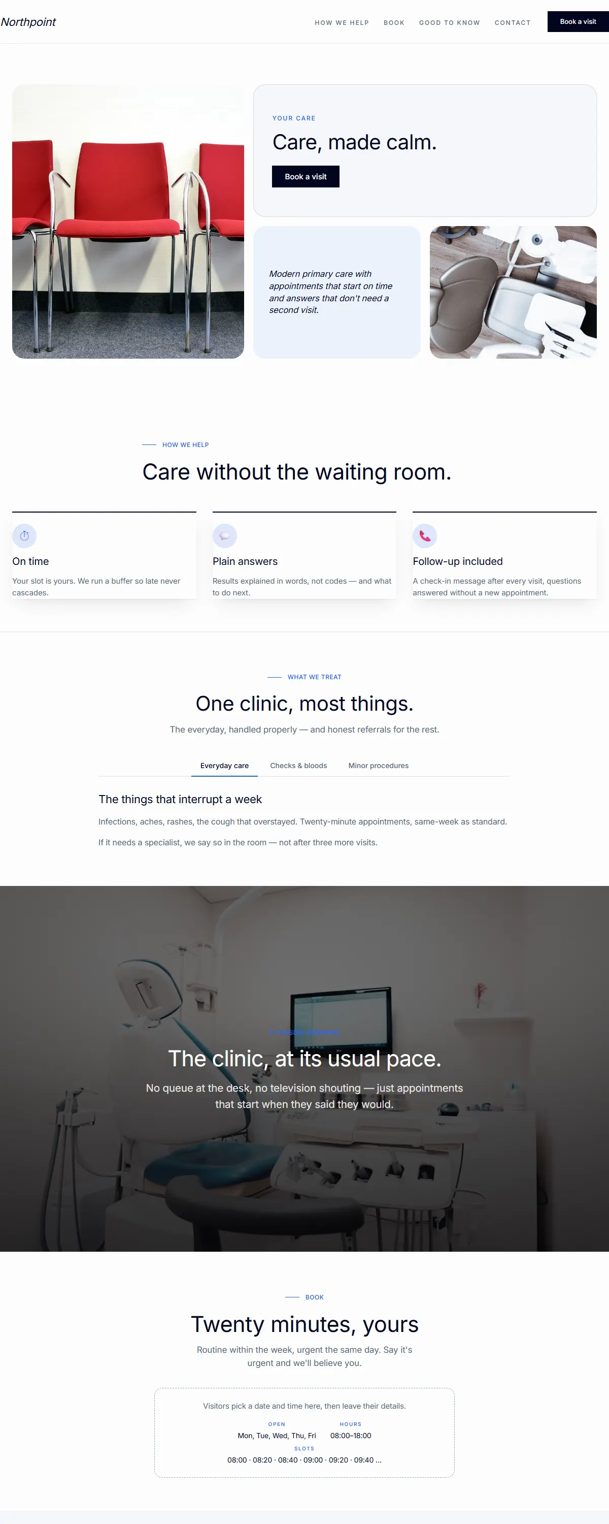
Calm, modern, all-sans look that signals reliability and care.
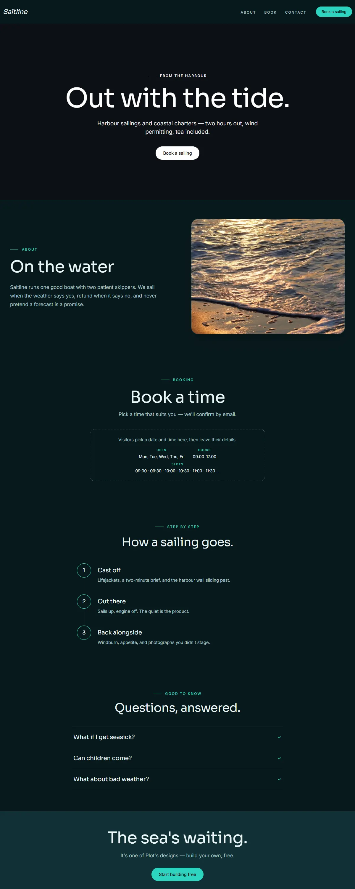
Deep ocean teal with a bright cyan accent. Calm, clean, modern — made for video.
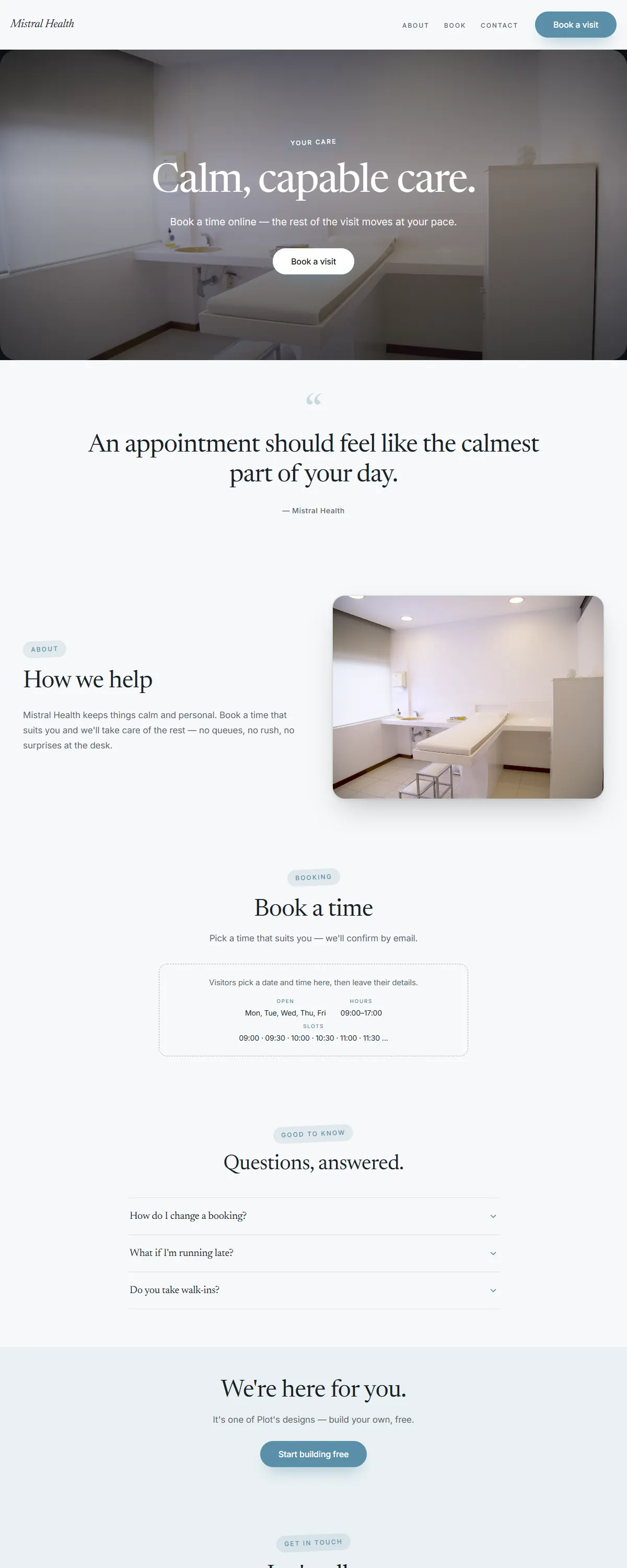
Soft blue-grey and dusty blue with a calm Newsreader serif. Quiet, capable care.
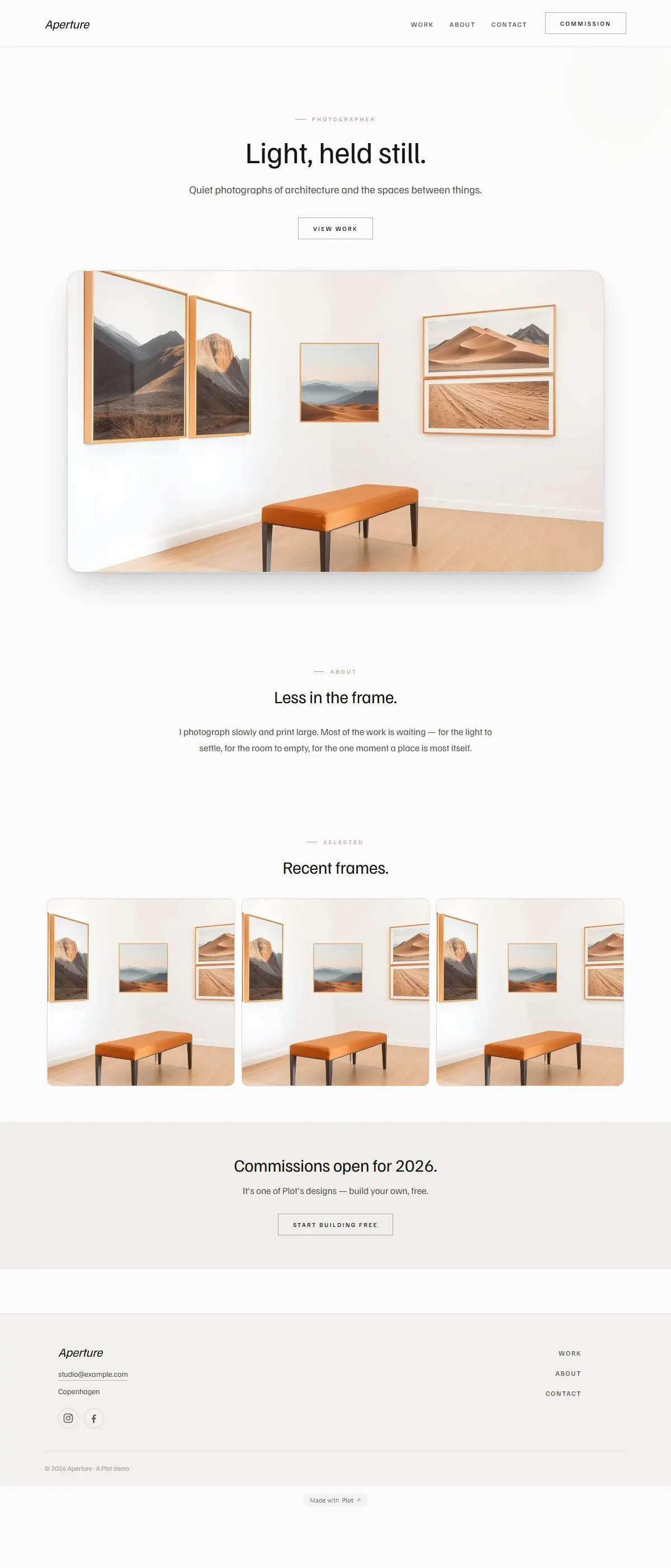
Airy, minimal gallery white with a clean grotesk. Made to frame photography.
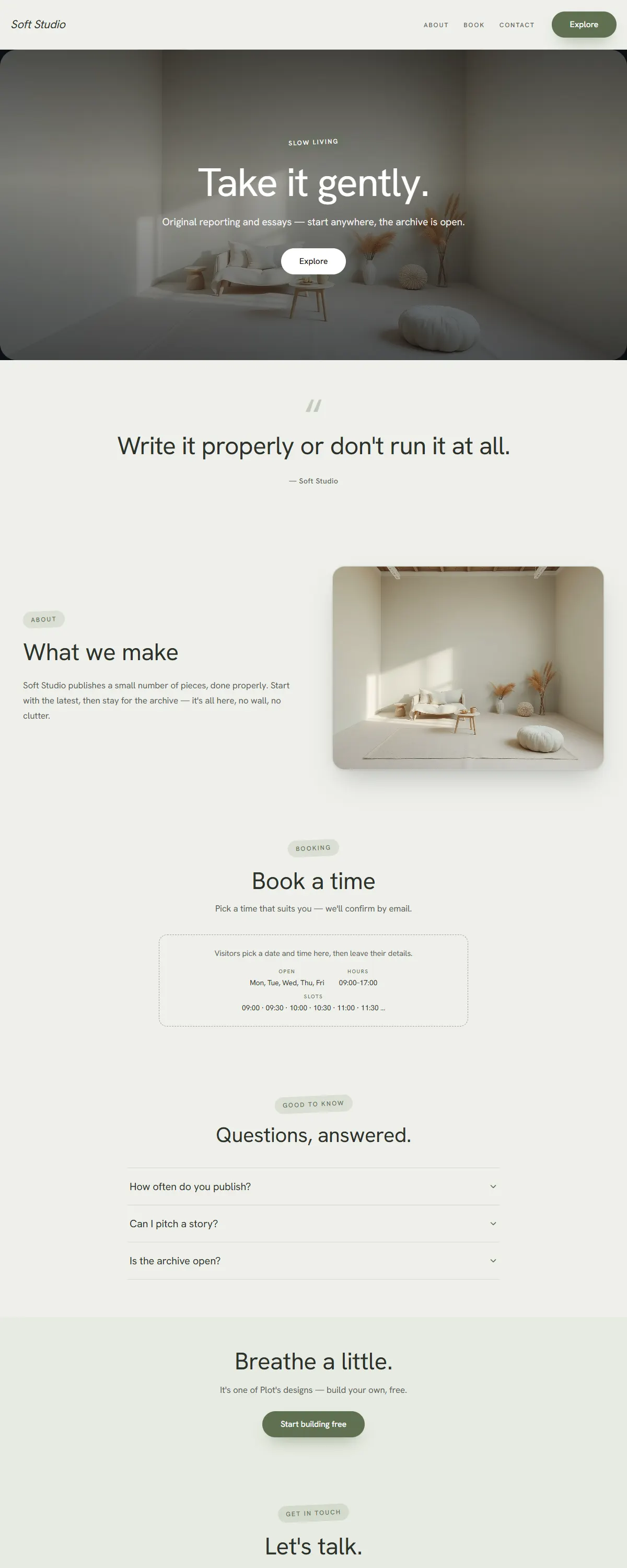
Muted dusty pastels on a grounded grotesk — soft sage and stone, never sugary.
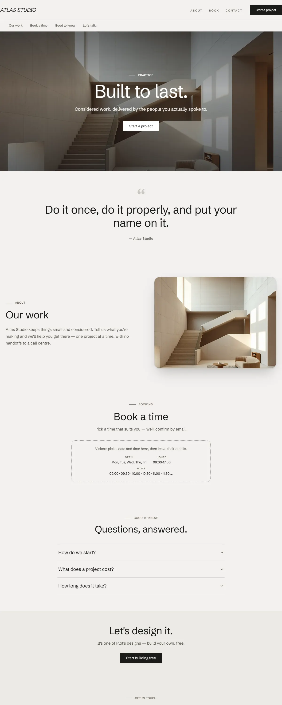
Monolithic architectural minimalism — off-white and stone with a clean Schibsted grotesk.
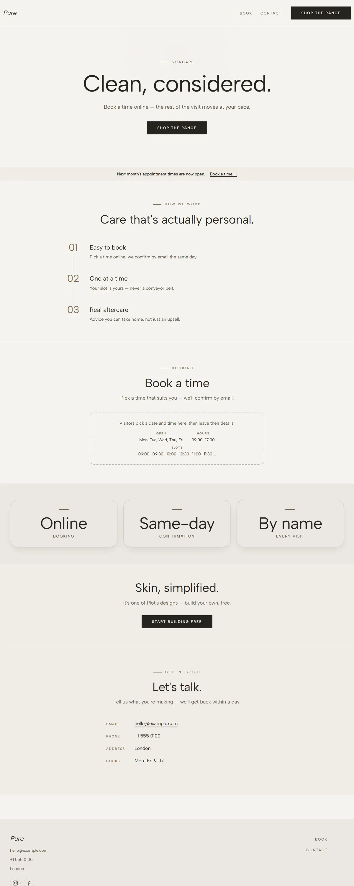
Clean, neutral skincare — soft off-white and warm taupe with a minimal Albert Sans.
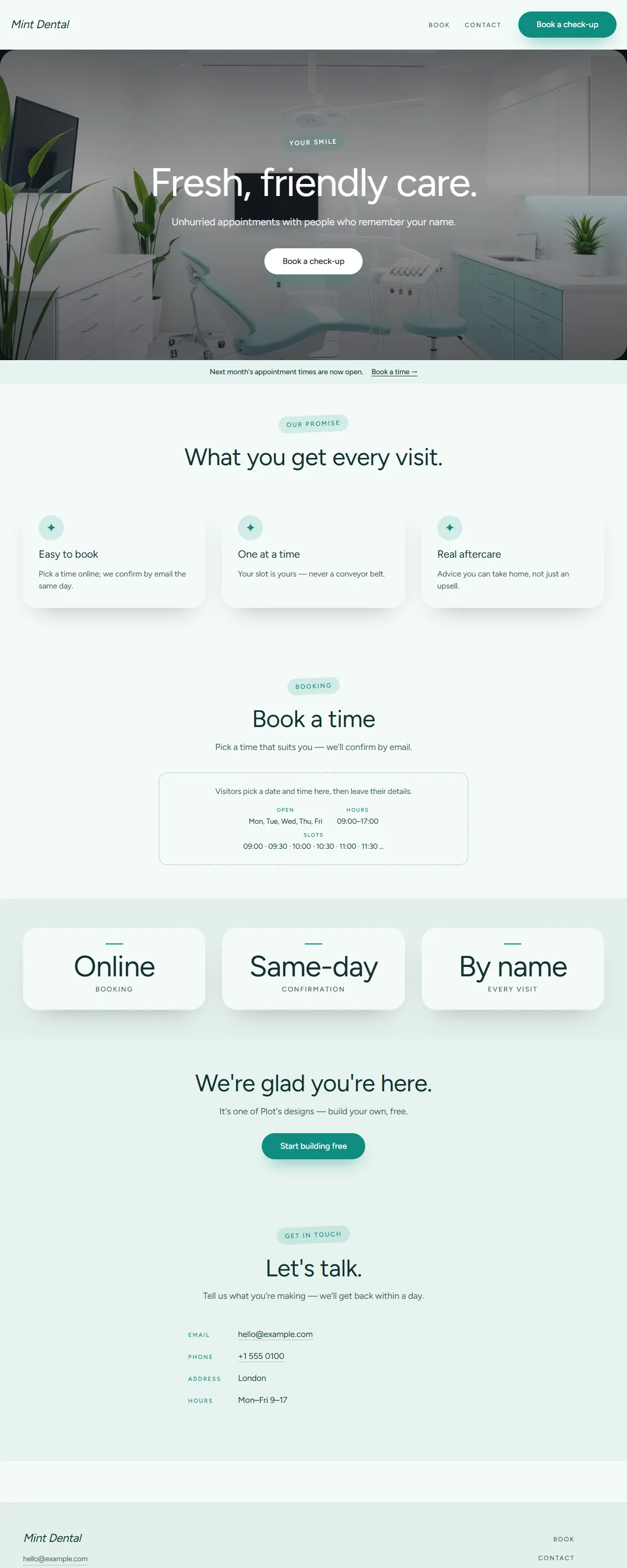
Fresh, friendly medical — crisp white and clean teal-mint with a rounded Figtree.
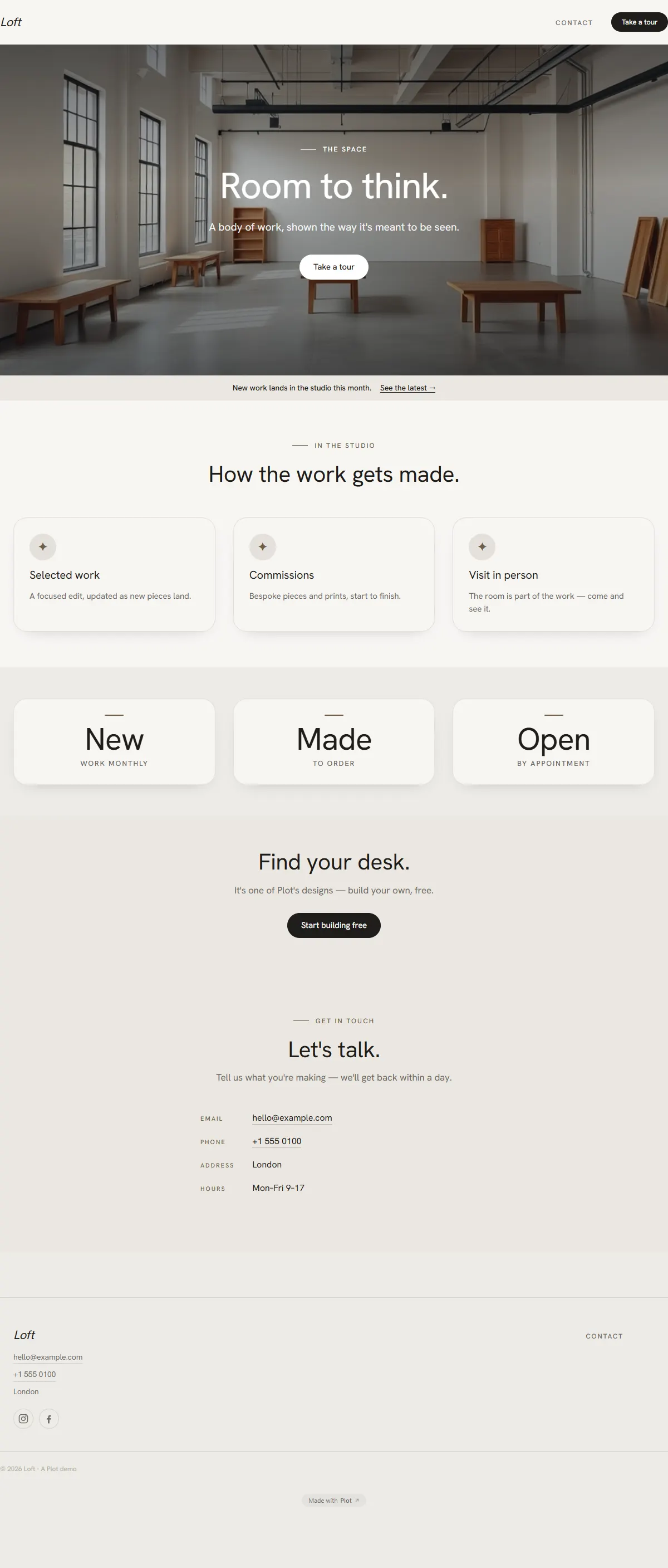
Warm white and pale taupe with an even Hanken grotesk. Minimal, roomy, considered.
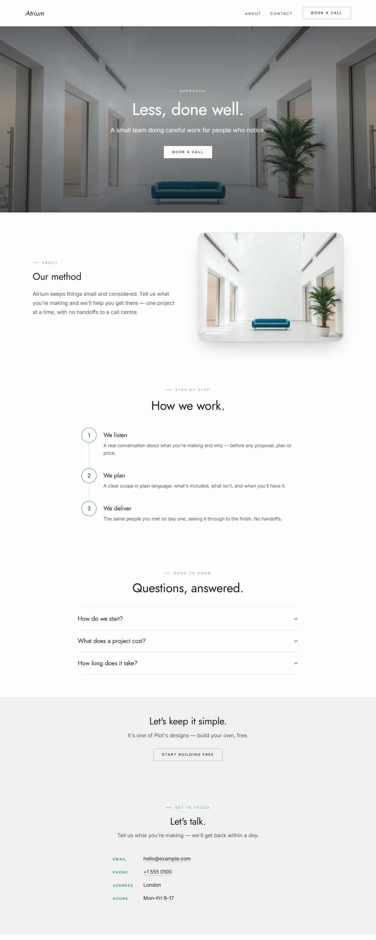
Bright white with a deep-teal accent and an airy geometric Jost. Whitespace doing the work.
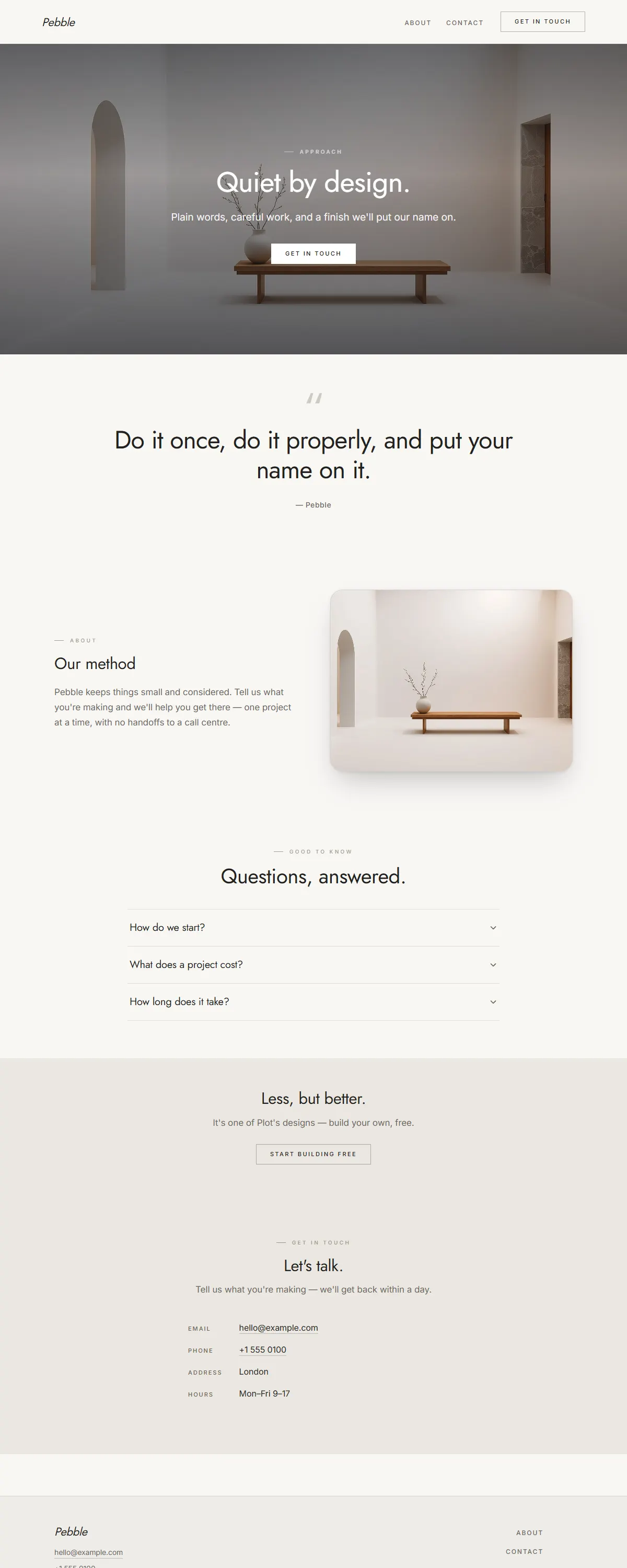
Warm off-white and stone with an airy geometric Jost. Whitespace-first, quietly refined.
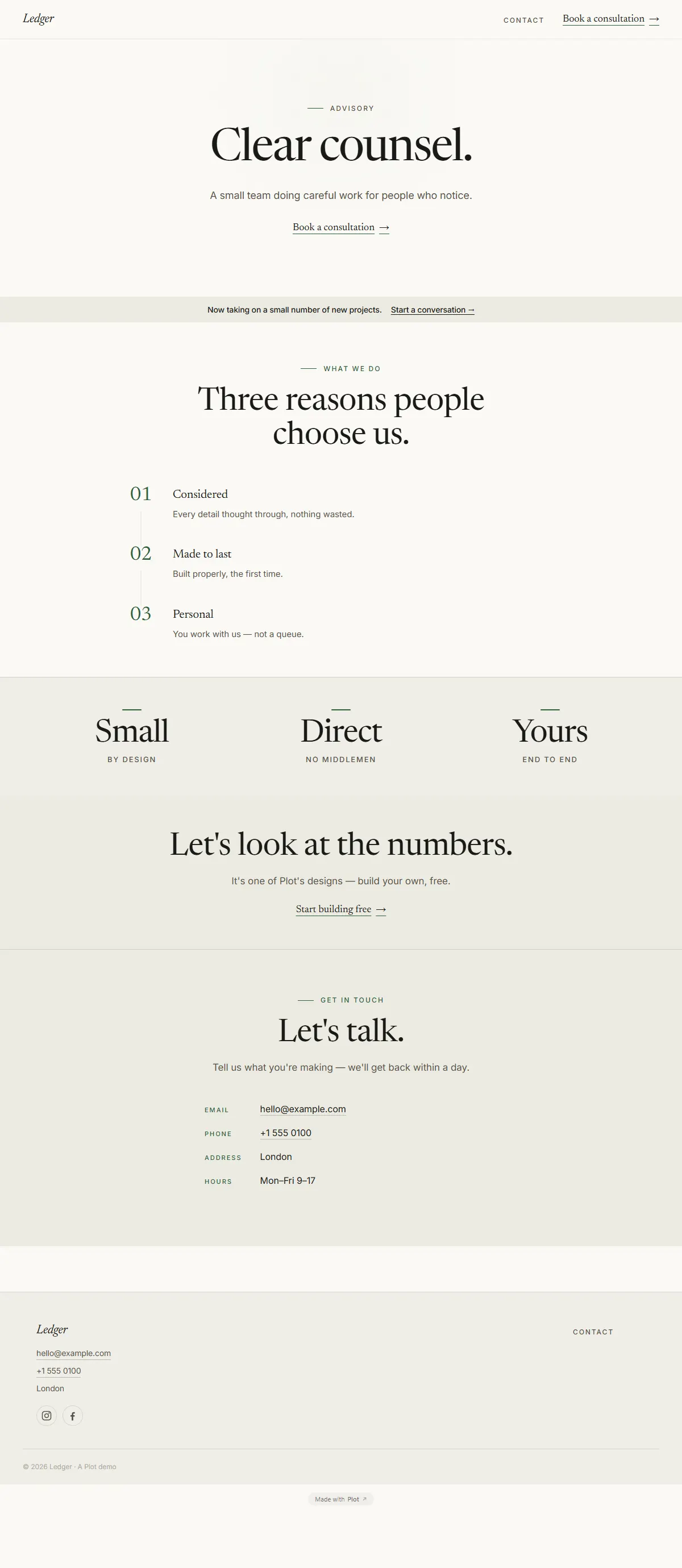
Bone white and ink with a forest-green accent and a literary Newsreader. Considered and exact.
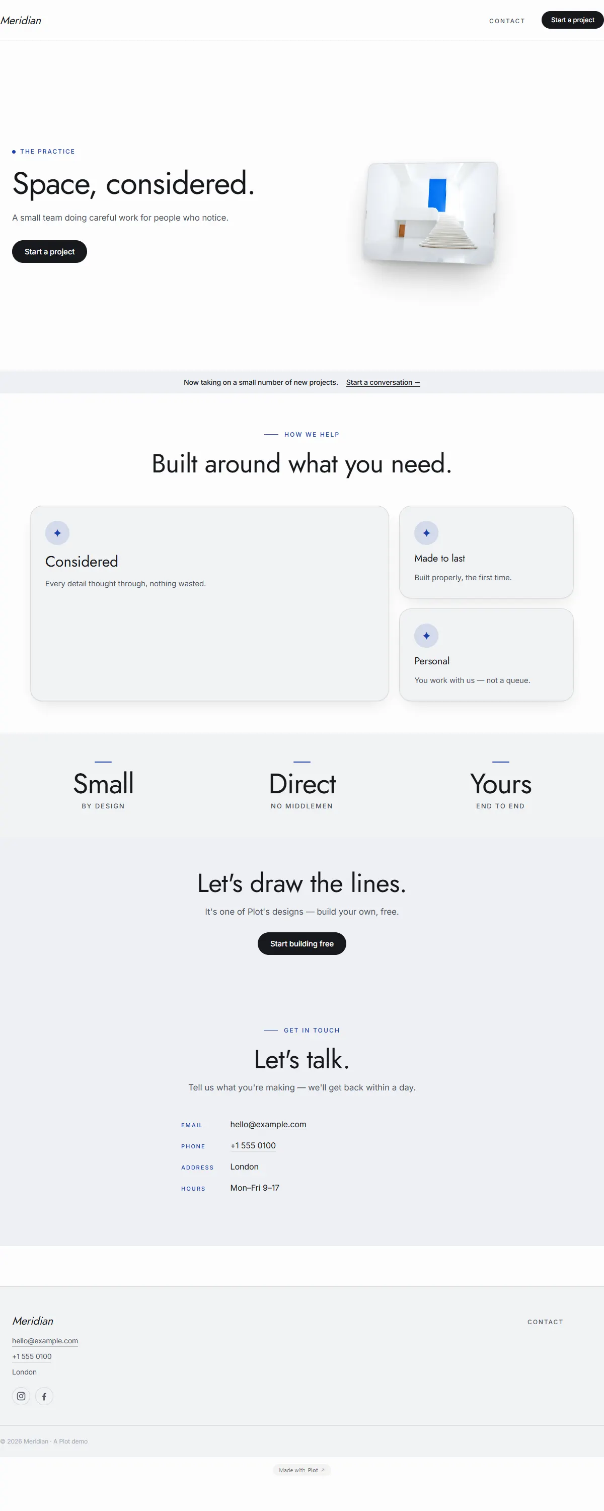
Bright white with a single cobalt panel and an airy geometric Jost. Architectural and exact.
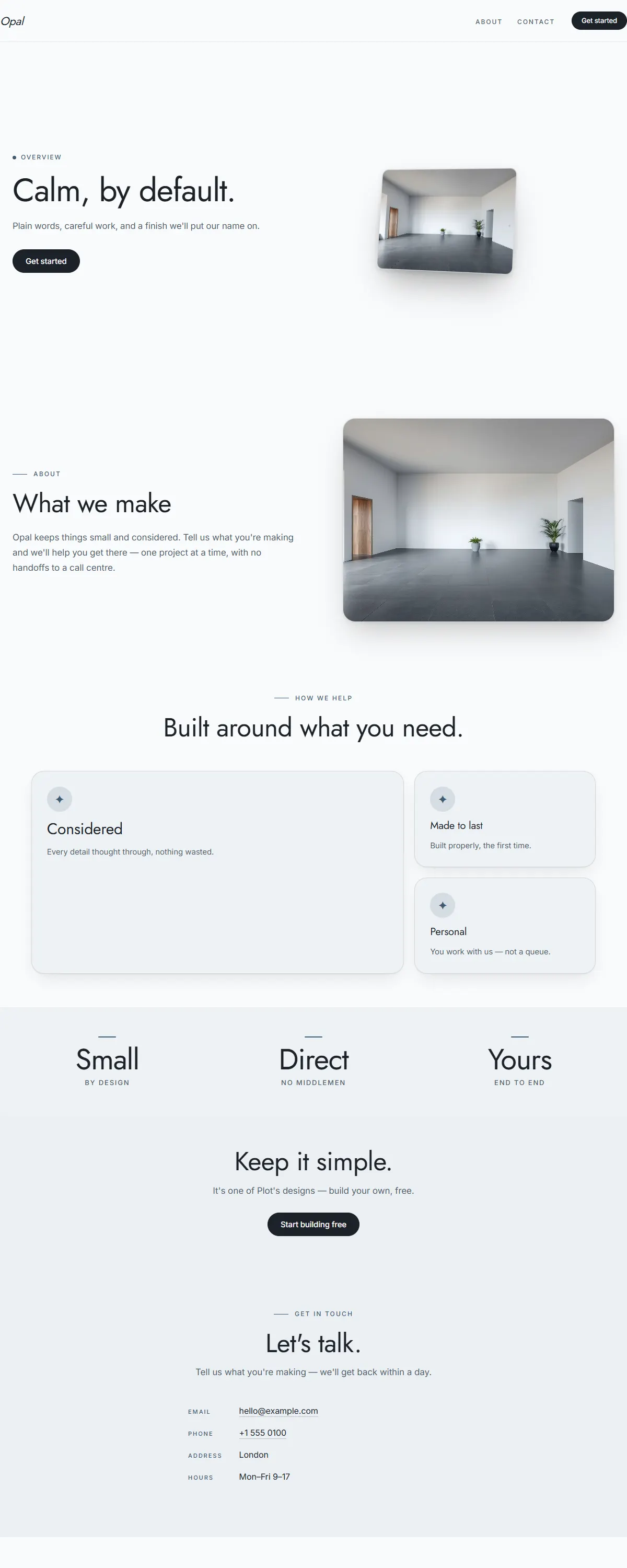
A soft pearl-grey to ice-blue gradient with a slate accent and an airy Jost. Quiet, modern, calm.
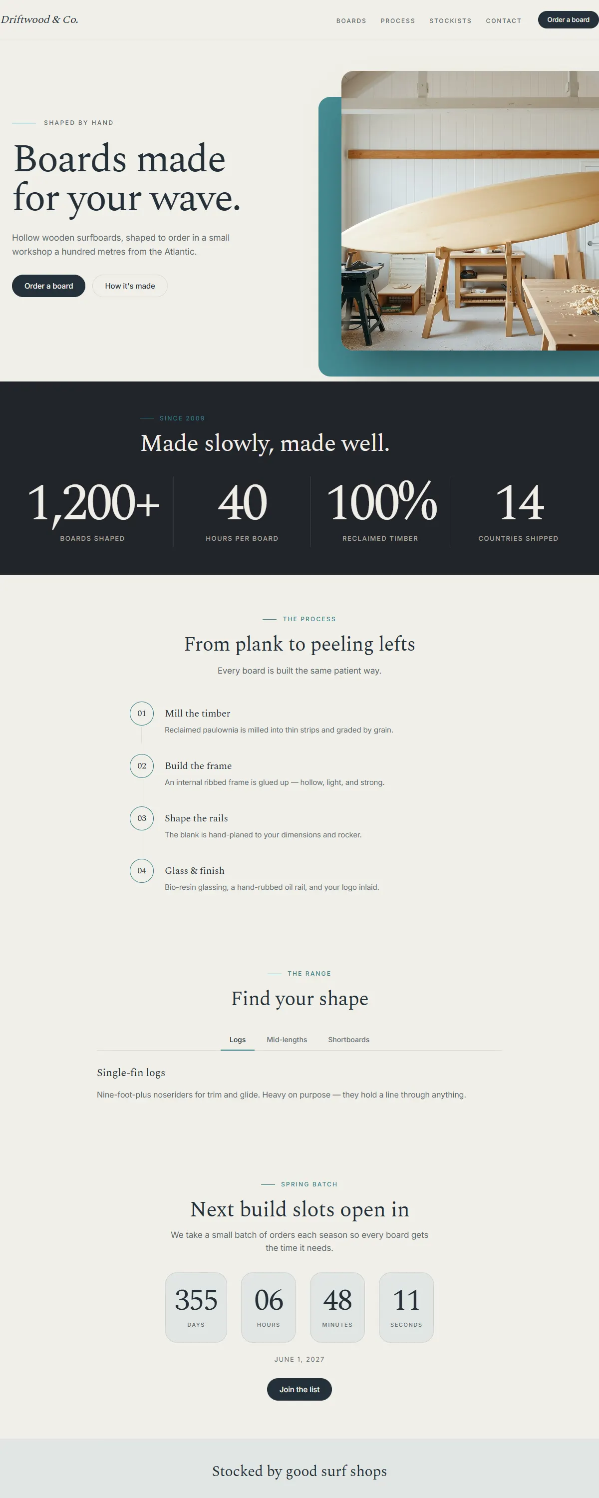
Sea-glass and warm sand with a deep ocean accent — relaxed coastal craft for makers near the water.
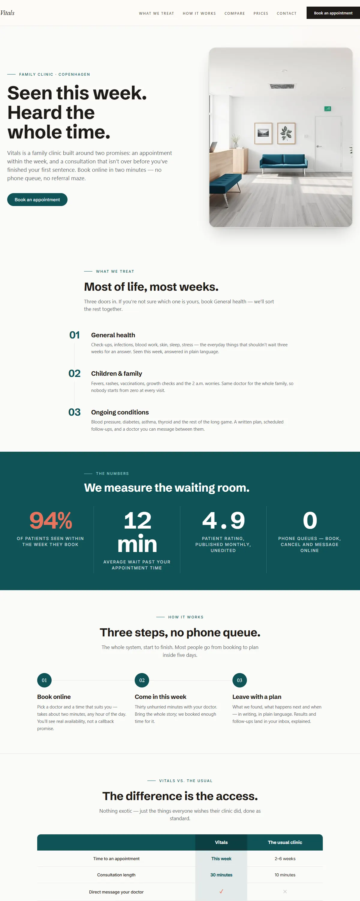
White field, petrol and one coral stat — a clinic that promises this week and proves it with numbers.
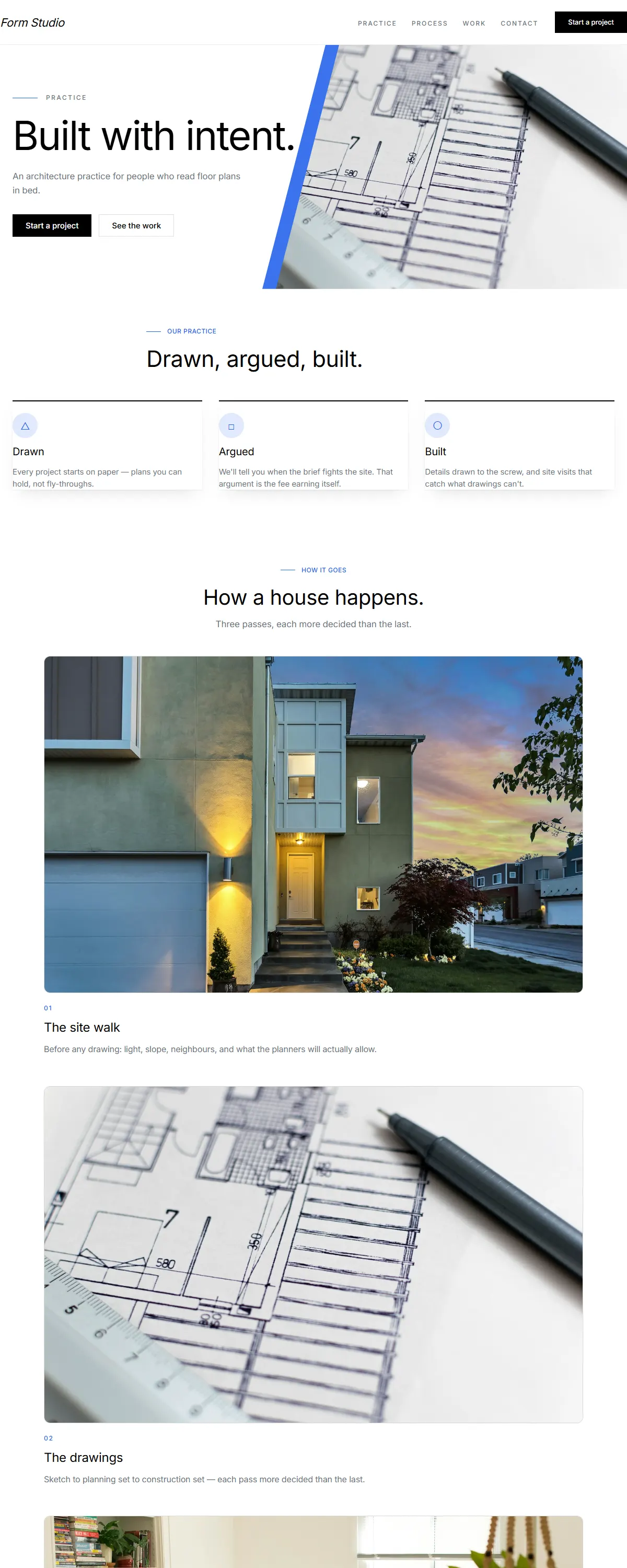
Architectural precision — hard edges, light type, single azure accent.
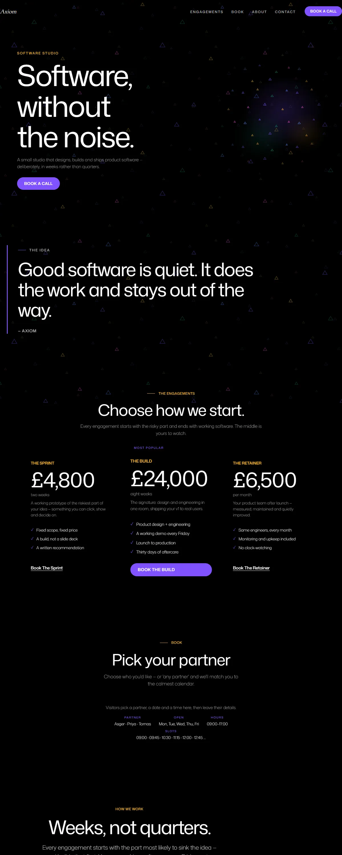
Umber and ochre on a deep-ink stage, with a living orb. Calm, focused tech — grounded, never loud.
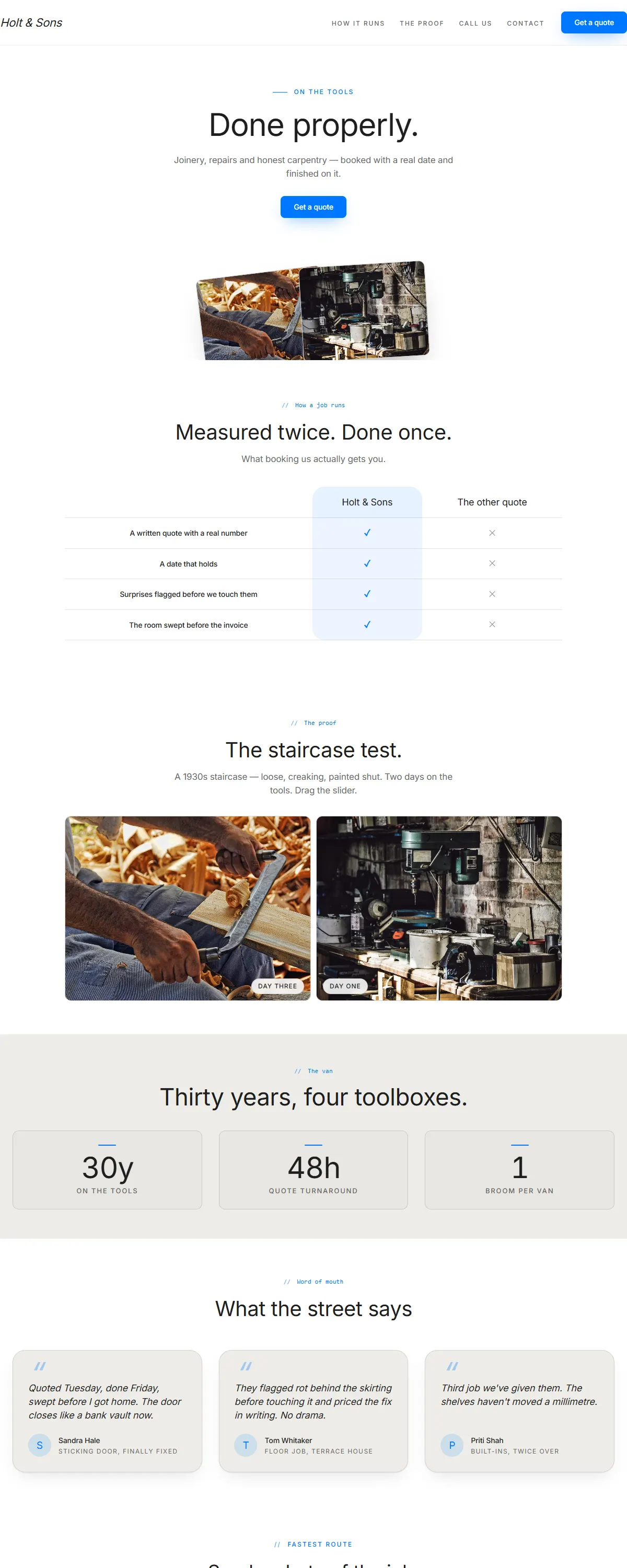
Monochromatic workwear utility with a single vivid blue accent for clear CTAs.
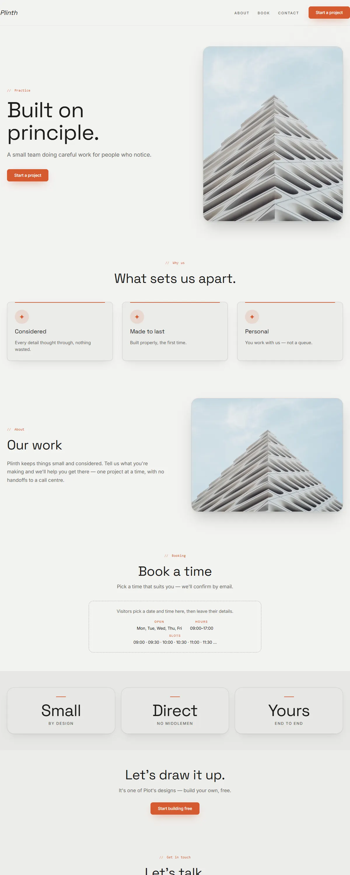
Concrete grey and burnt orange with Space Grotesk. Architectural and exact.
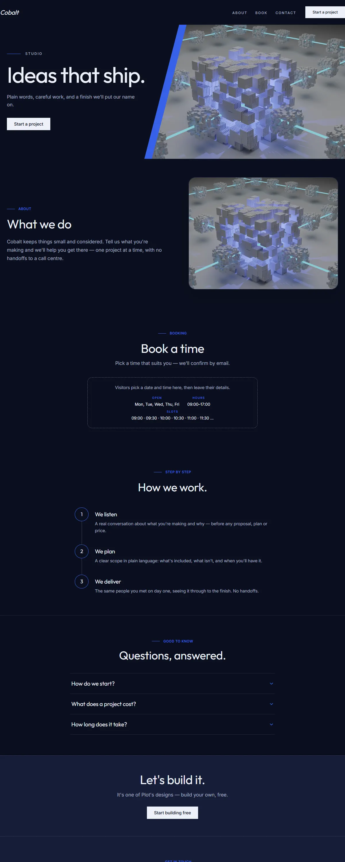
Deep blue with a bright azure accent and geometric Outfit. Modern and confident.
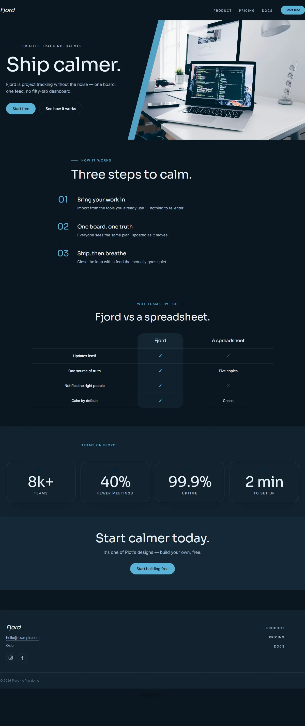
Deep slate-blue with an ice-cyan accent and clean Sora. Cool, precise, modern.
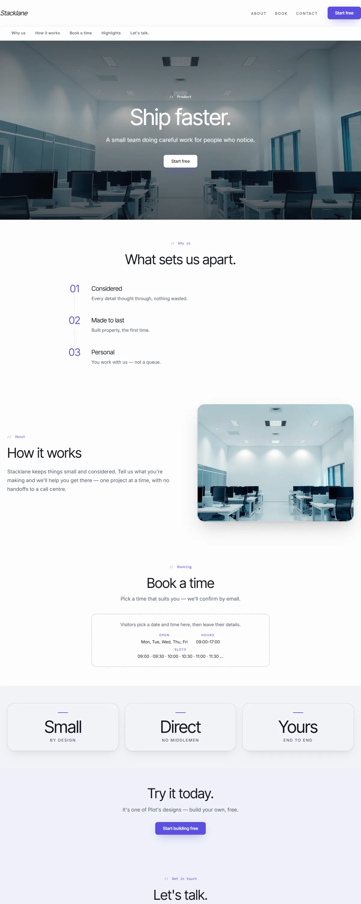
Clean, bright product look — crisp white with an indigo accent and tight Inter Tight.
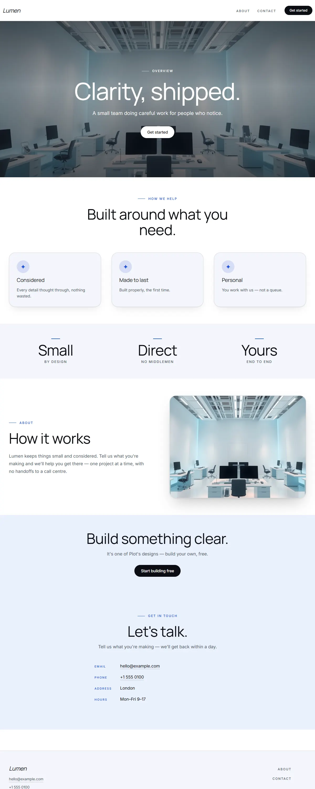
Crisp product-led white with an electric-blue accent and big, clean type. Made to feel effortless.
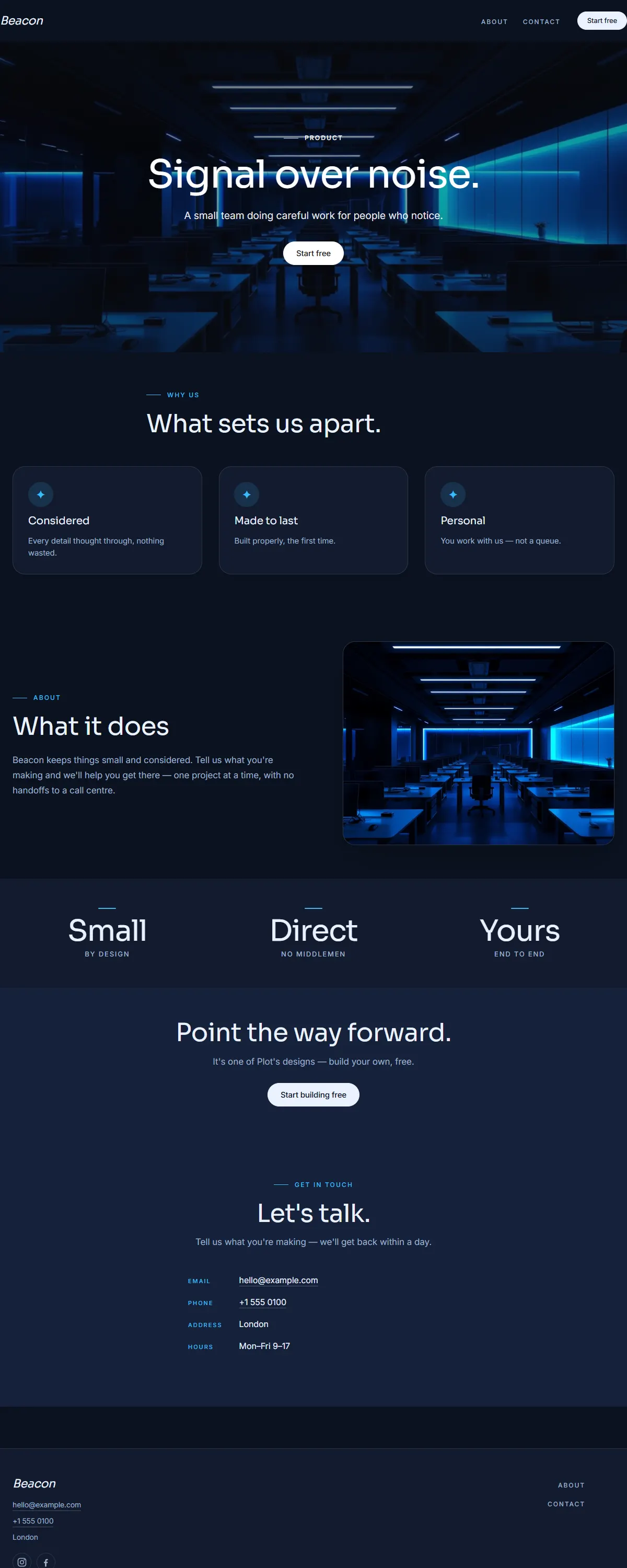
Deep navy with a bright cyan accent and clean Sora. Modern, confident, product-first.
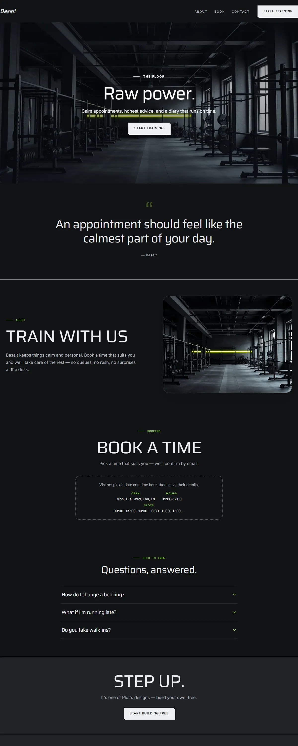
Graphite and electric lime with condensed Saira. Industrial, high-energy, built to work.
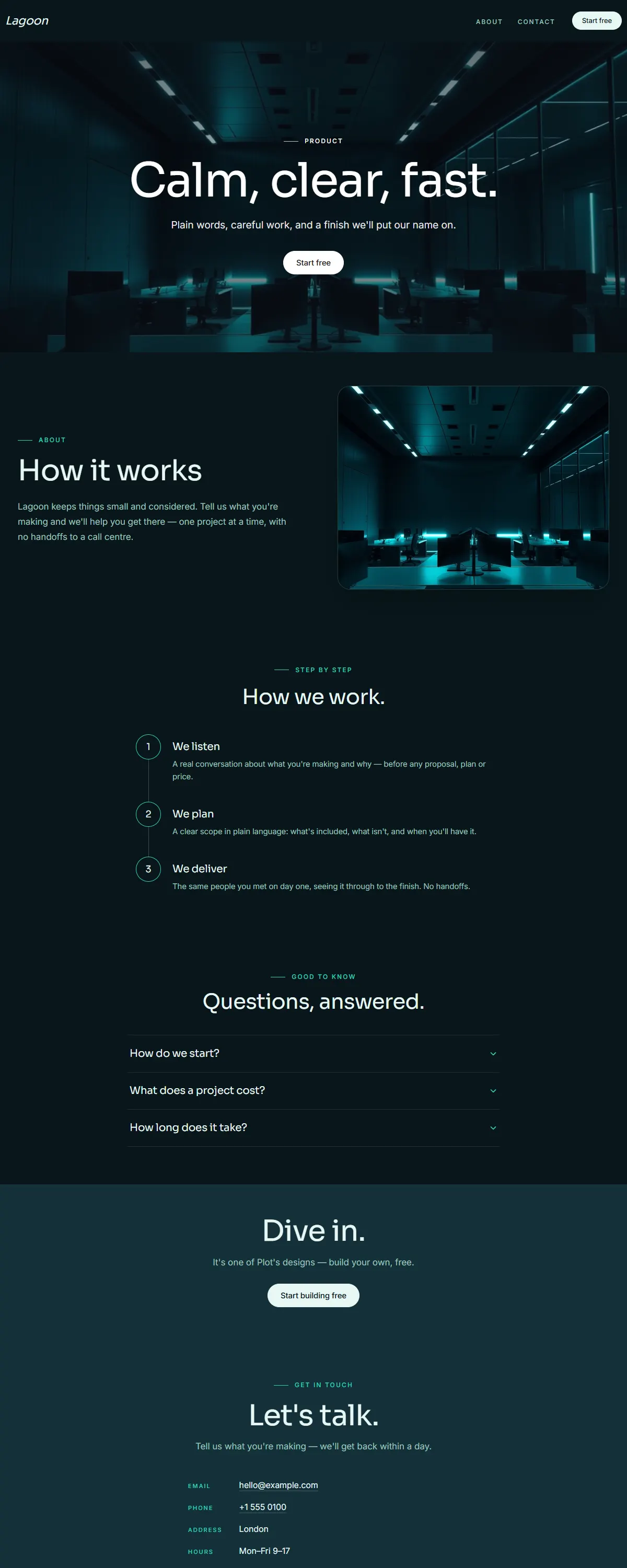
Deep teal-black with a luminous aqua accent and clean Sora. Calm, modern, product-led.
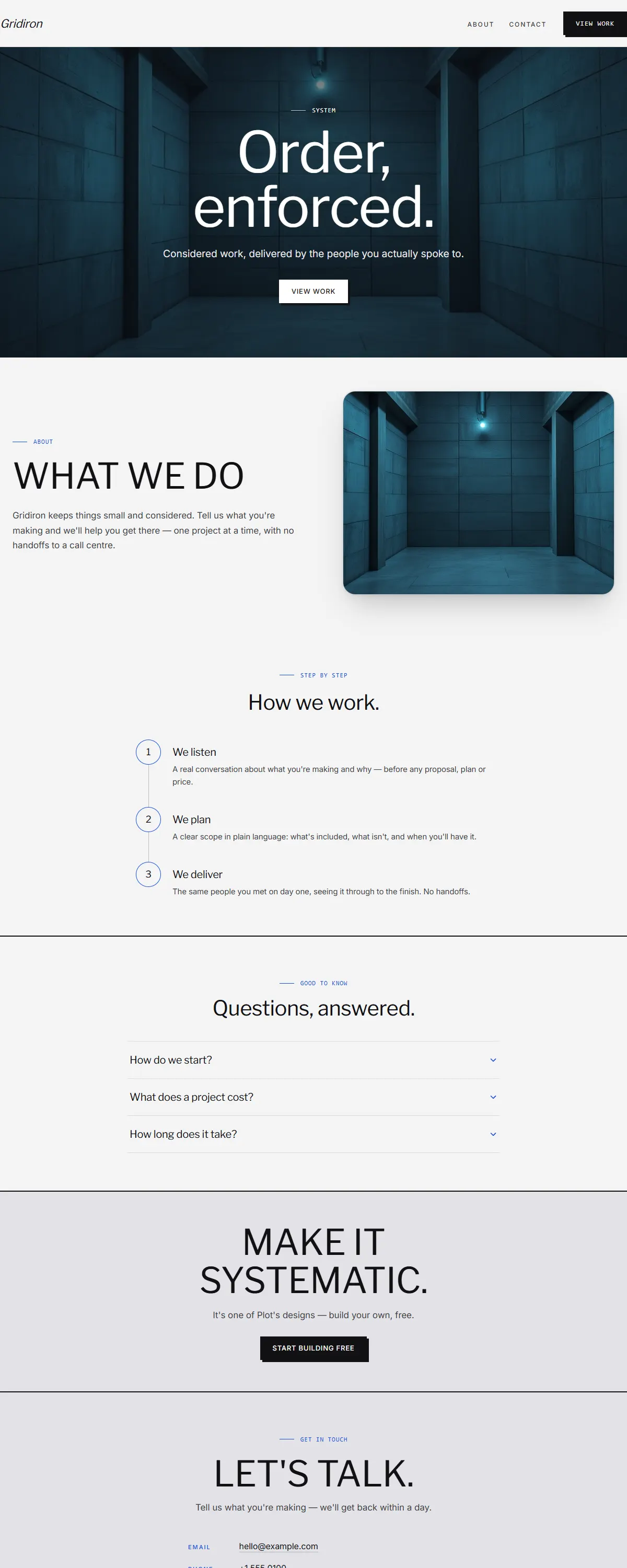
Concrete grey with an electric-blue line and precise Libre Franklin. Brutalist, systematic, exact.
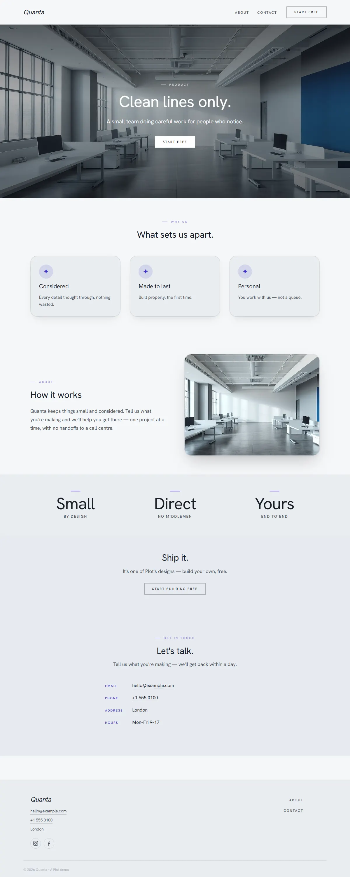
Cool grey with an indigo accent and even Hanken grotesk. Minimal, modern, product-first.
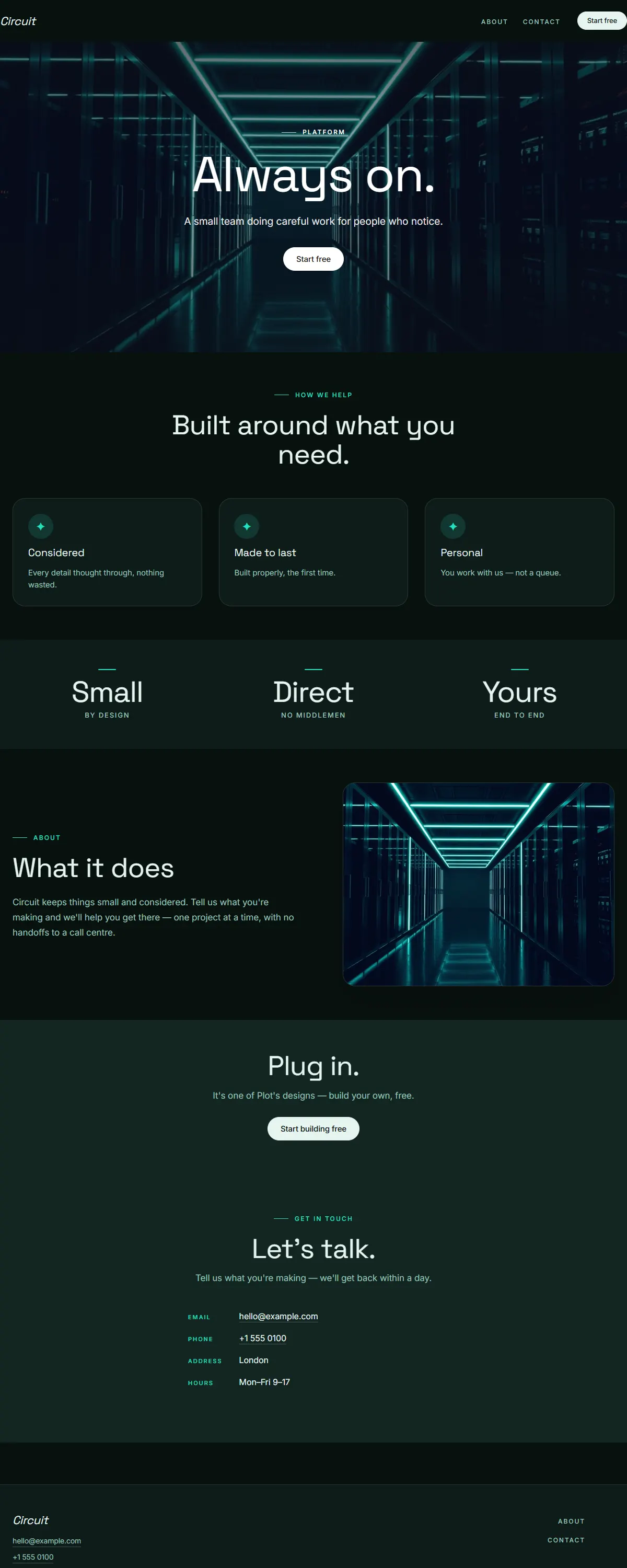
Near-black with an electric spring-teal accent and Space Grotesk. Built for always-on infrastructure.
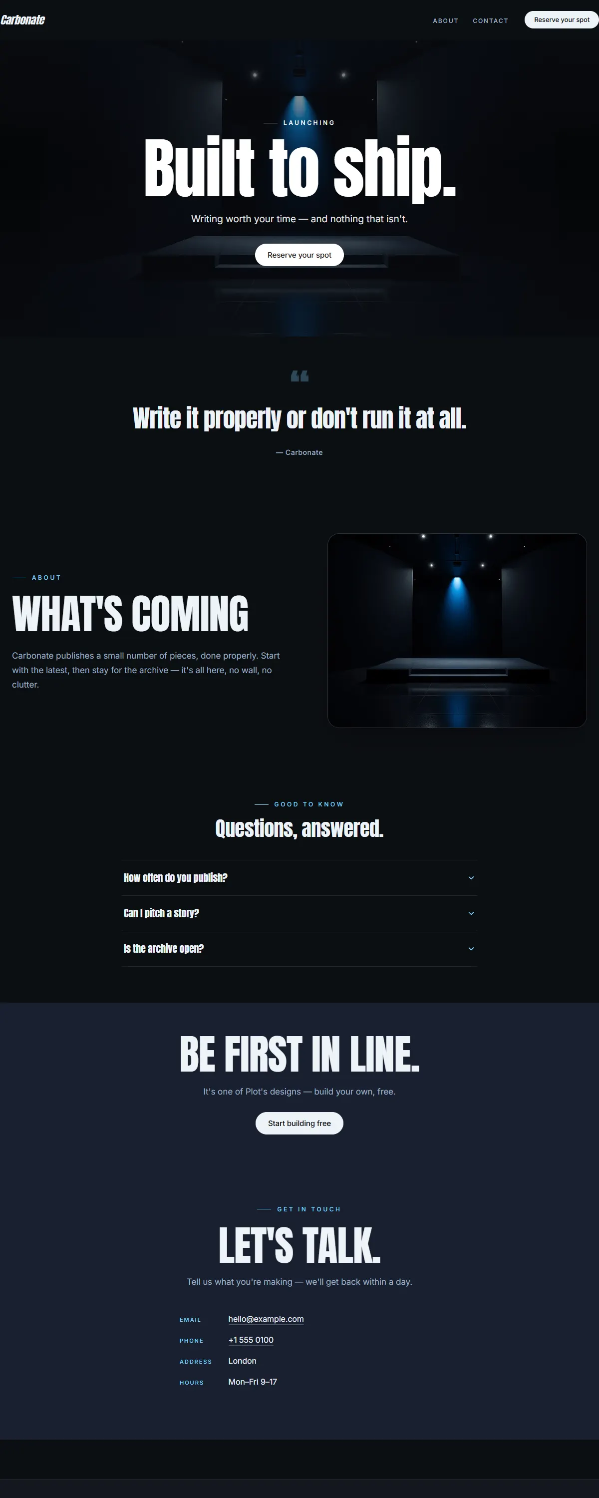
Pure black with an ice-blue accent and a heavy Anton poster face. Loud, modern launch energy.
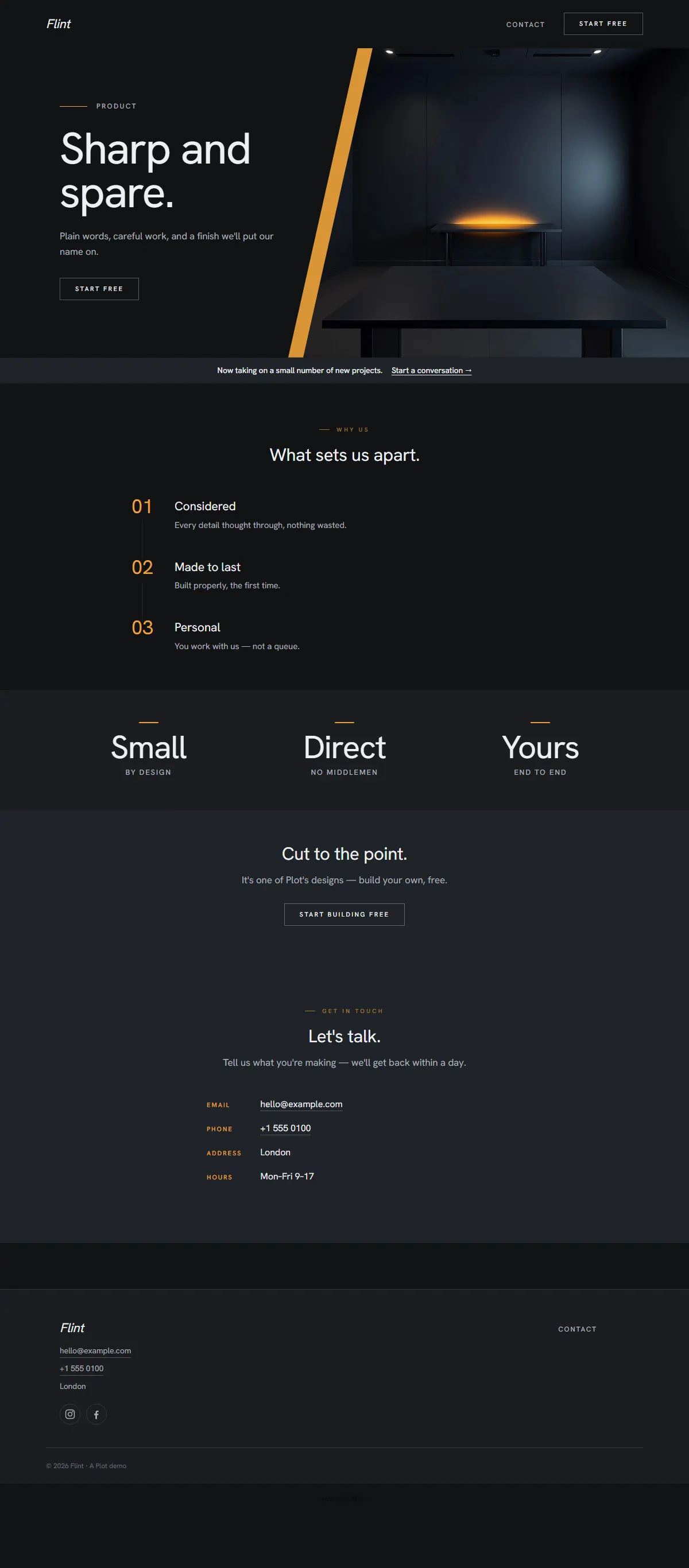
Graphite dark with a single warm amber accent and an even Hanken grotesk. Minimal, modern, focused.
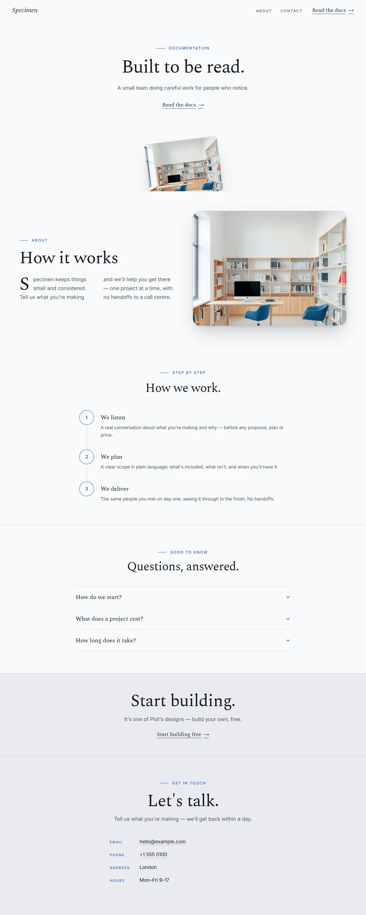
Cool white with a clean blue accent and a serif Spectral. Considered, technical, made to be read.
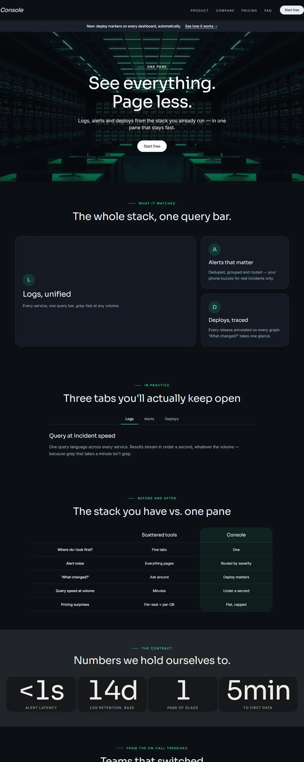
Near-black with an emerald accent and a clean Sora. Built for dashboards and always-on tools.
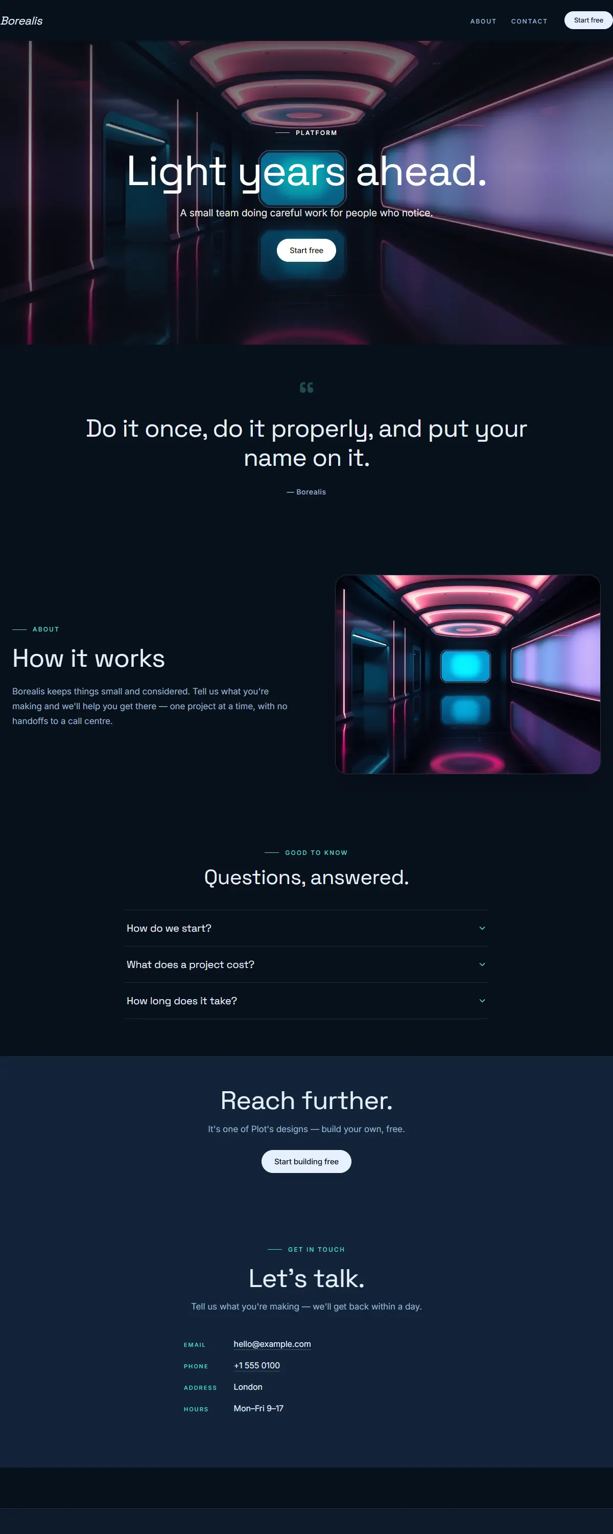
Deep navy with a soft aurora-aqua gradient and bold Space Grotesk. Futuristic and far-reaching.
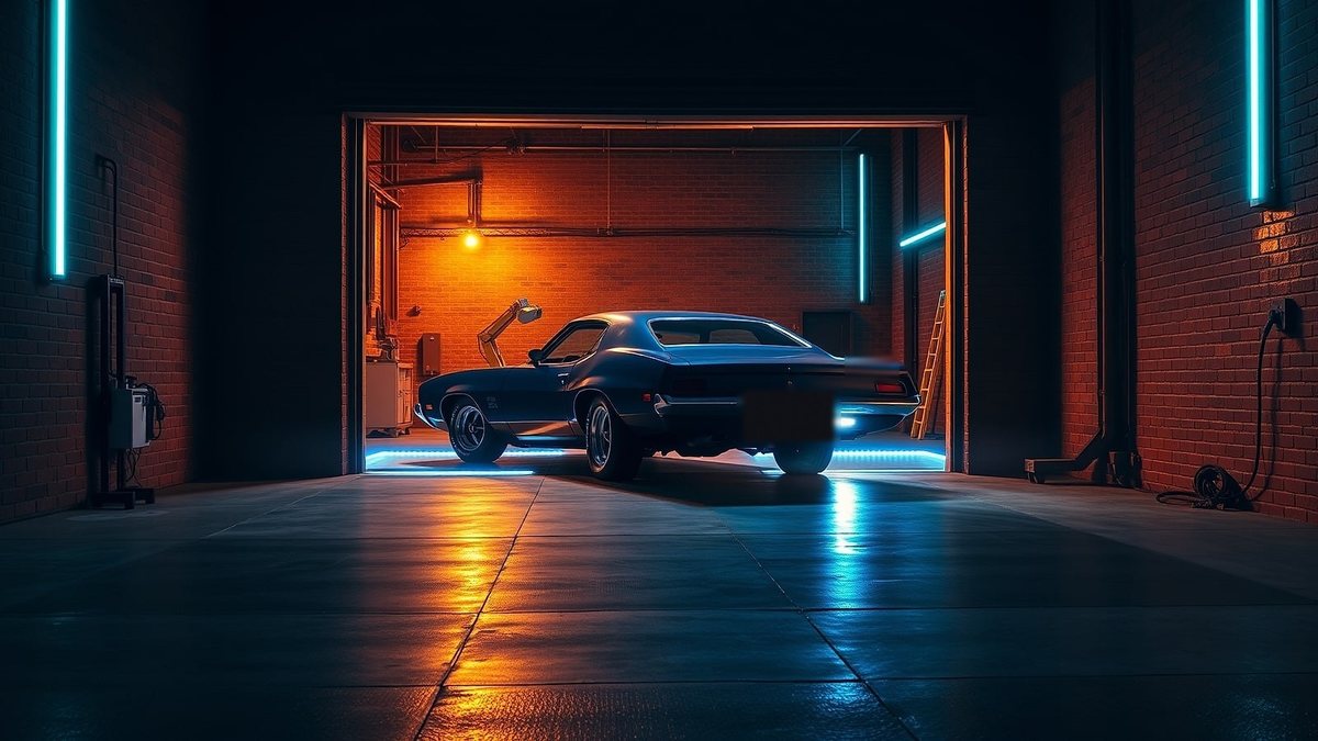 Creative workshop Made of pixels. Built like machinery. Start a build
 A real-time 3D night workshop — scrolling walks the camera through the room, from the roller door to the machine.
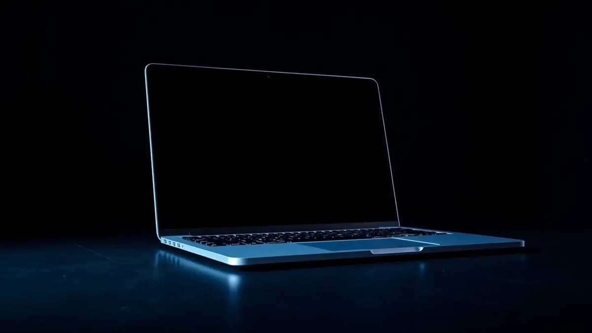 Workspace intelligence Your whole workspace, watching itself. Start free
 A sleek laptop rotates to face you, its screen wakes, and the camera dives into the display until the product's live dashboard fills the page.
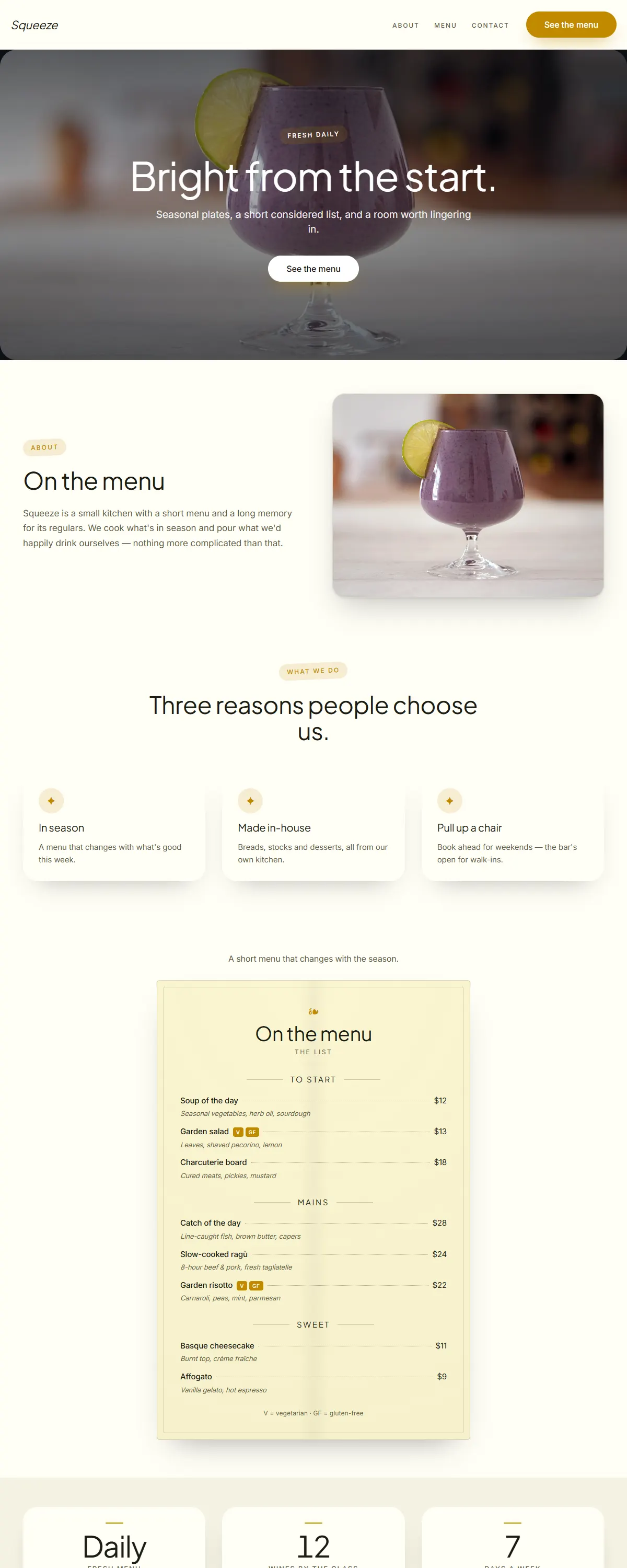
Bright white and golden yellow with bold Jakarta Sans. Fresh and energetic.
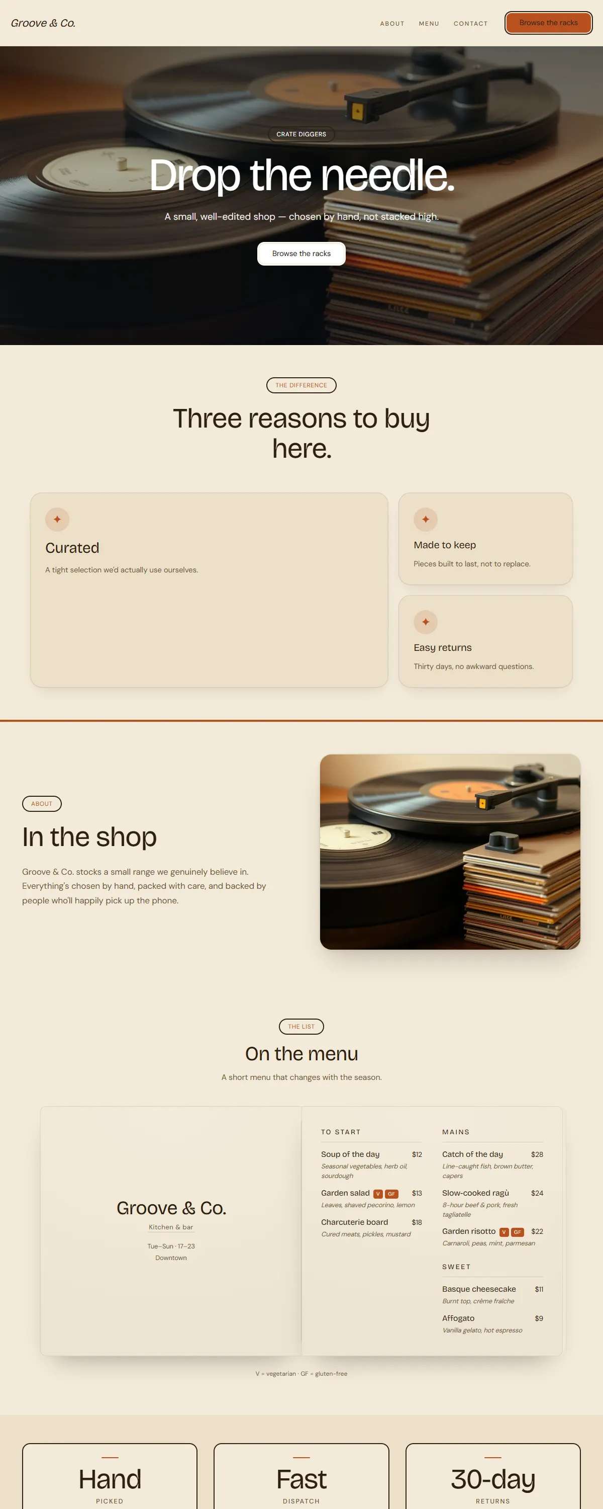
Warm 1970s retro with a groovy display face. Burnt orange, mustard and cream.
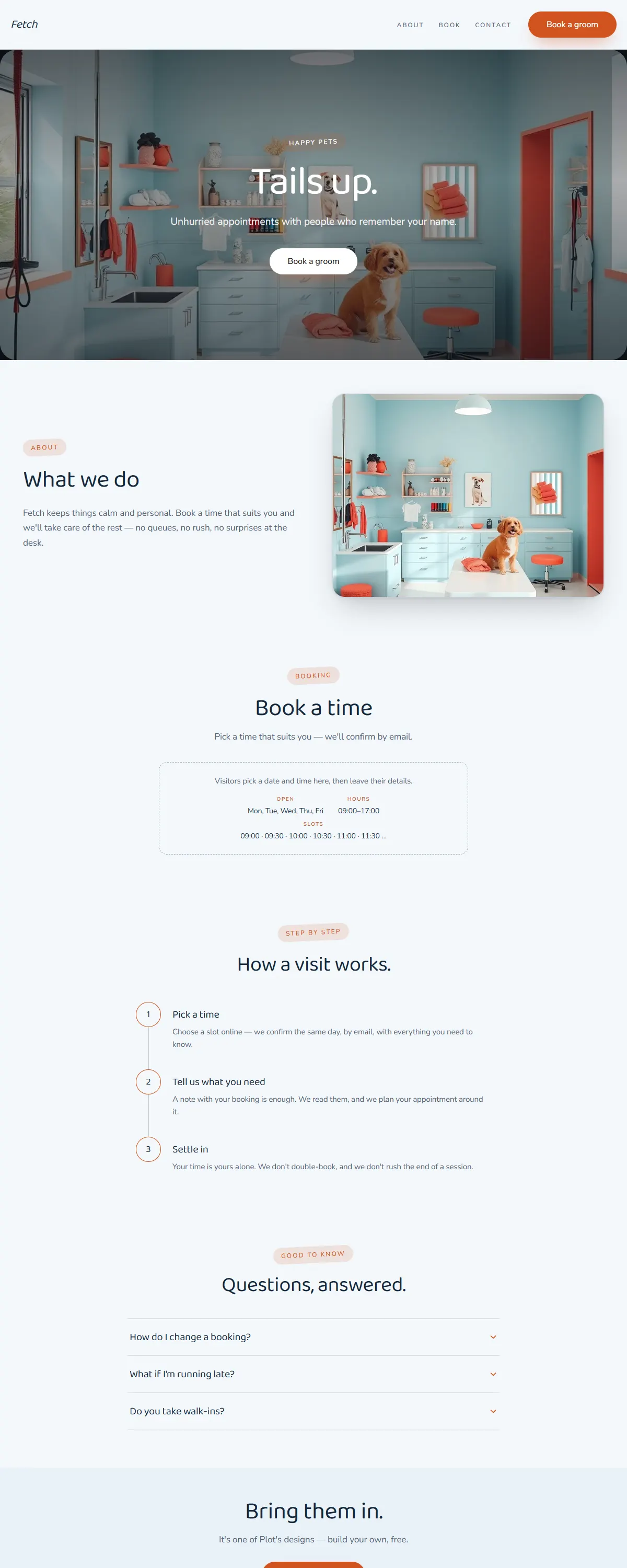
Friendly sky-blue and coral with a rounded, cheerful type. Built for pet care.
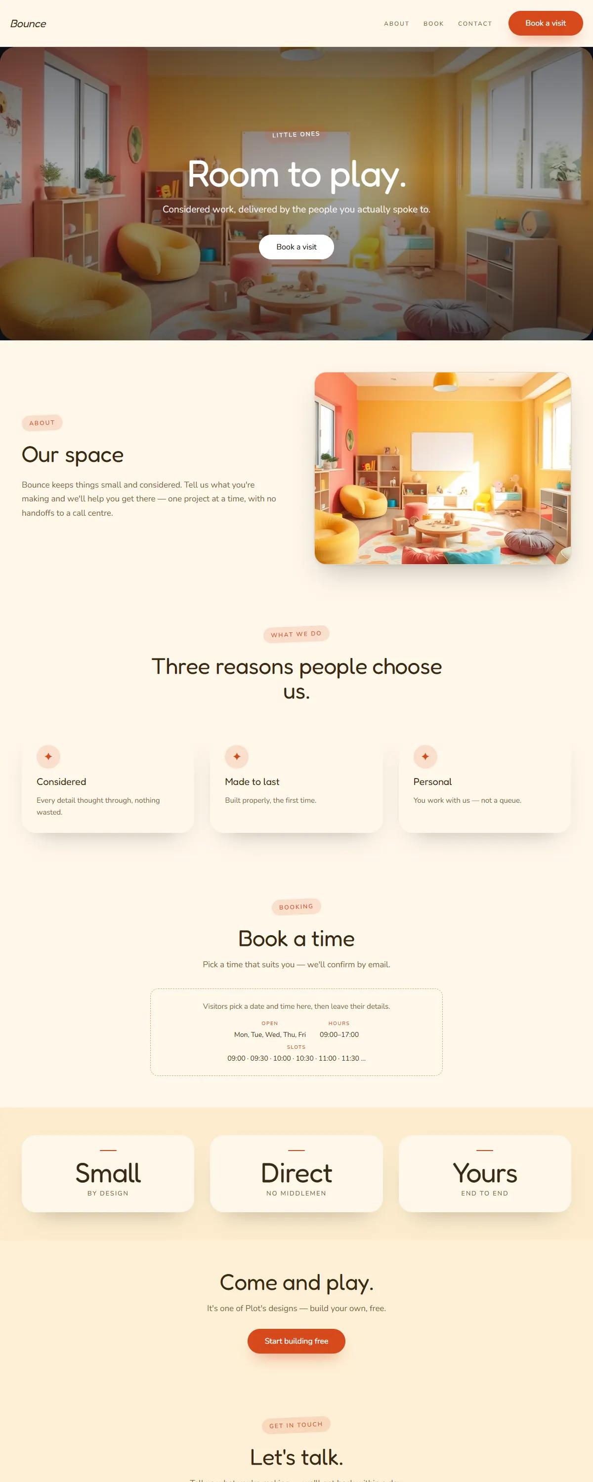
Sunny, playful and rounded — cheerful yellow and coral for little ones.
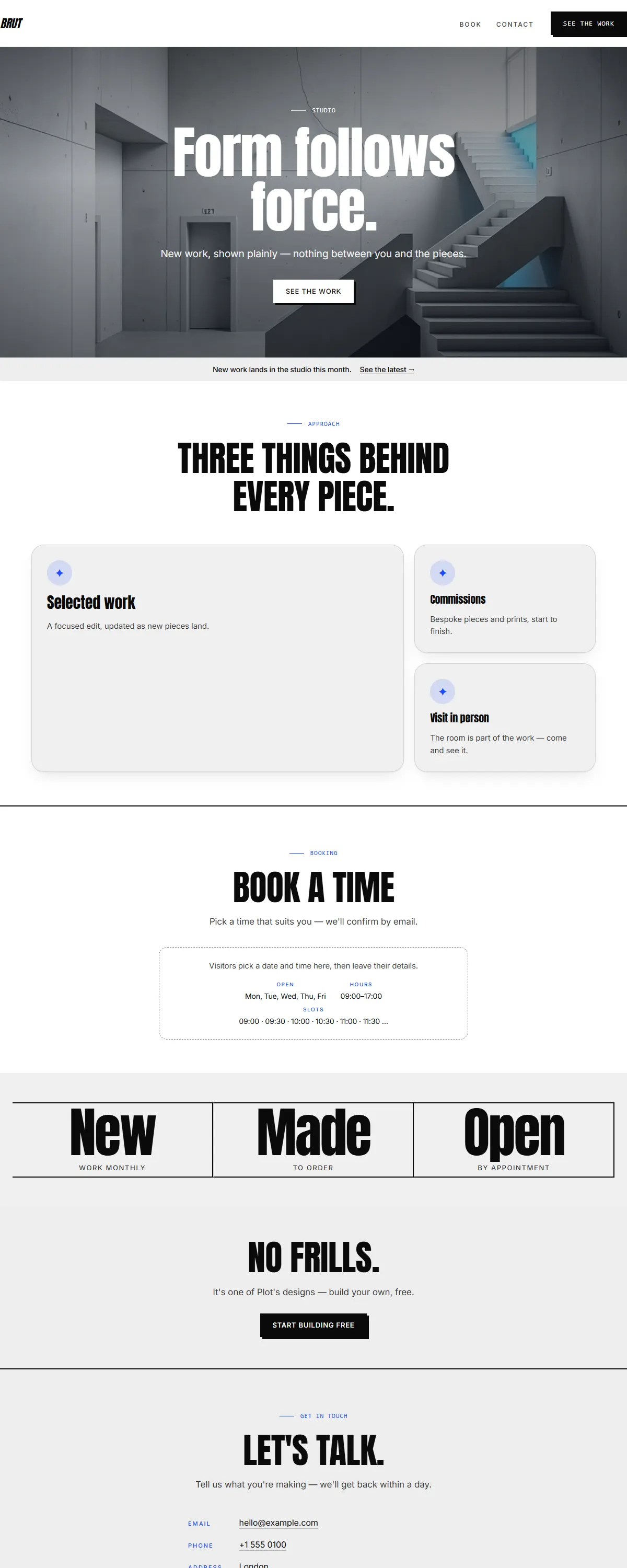
Raw brutalist black-on-white with a heavy poster face and one electric-blue accent.
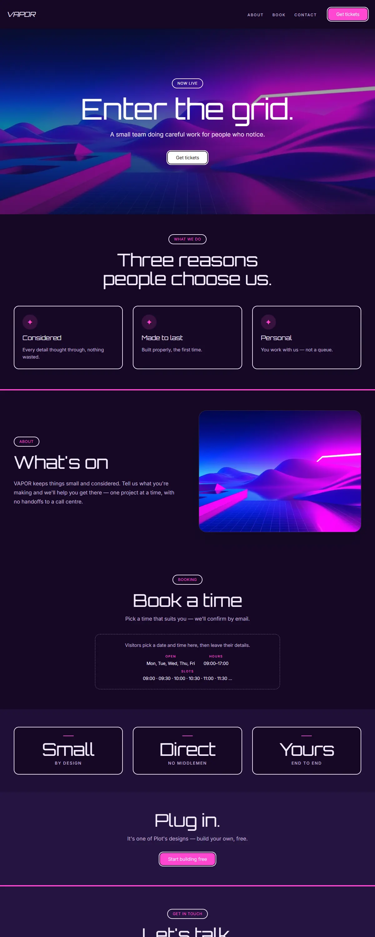
Y2K vaporwave — deep indigo with hot magenta and a retro-futuristic display.
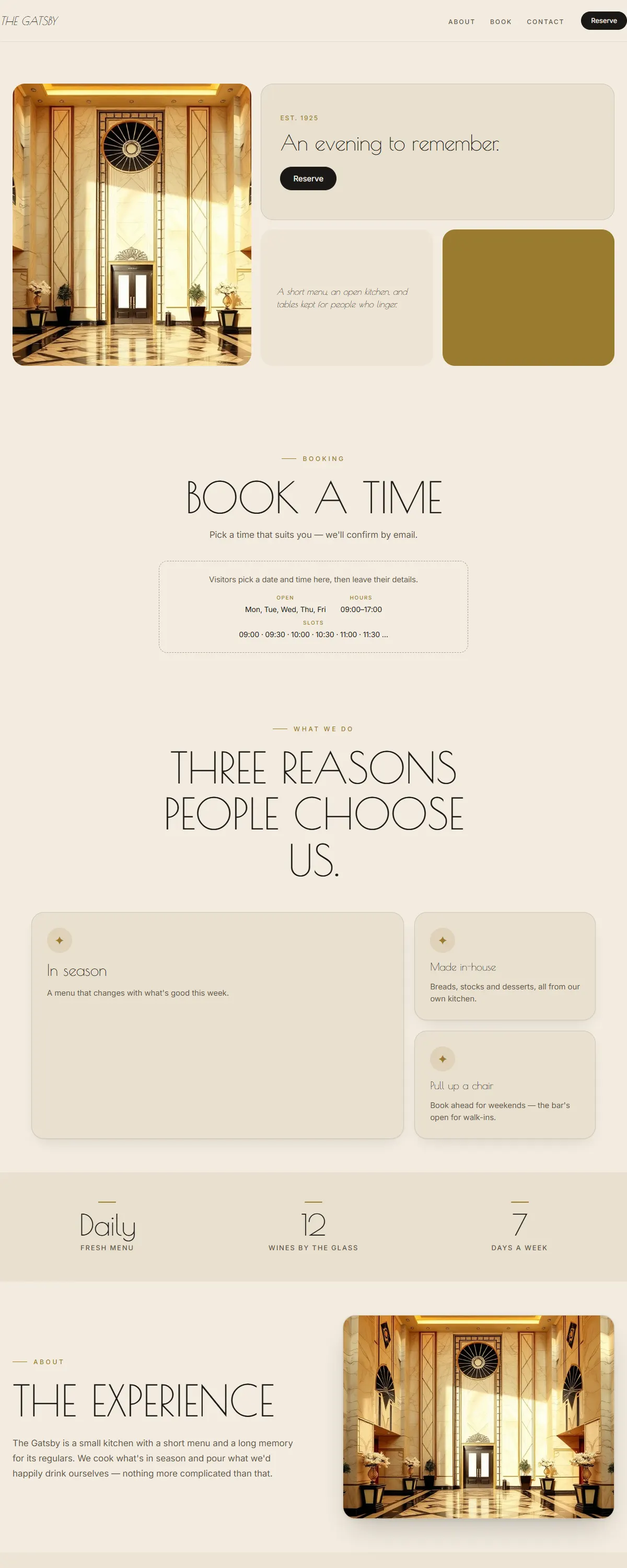
Art-deco glamour — cream and black with brass and a geometric Poiret display.
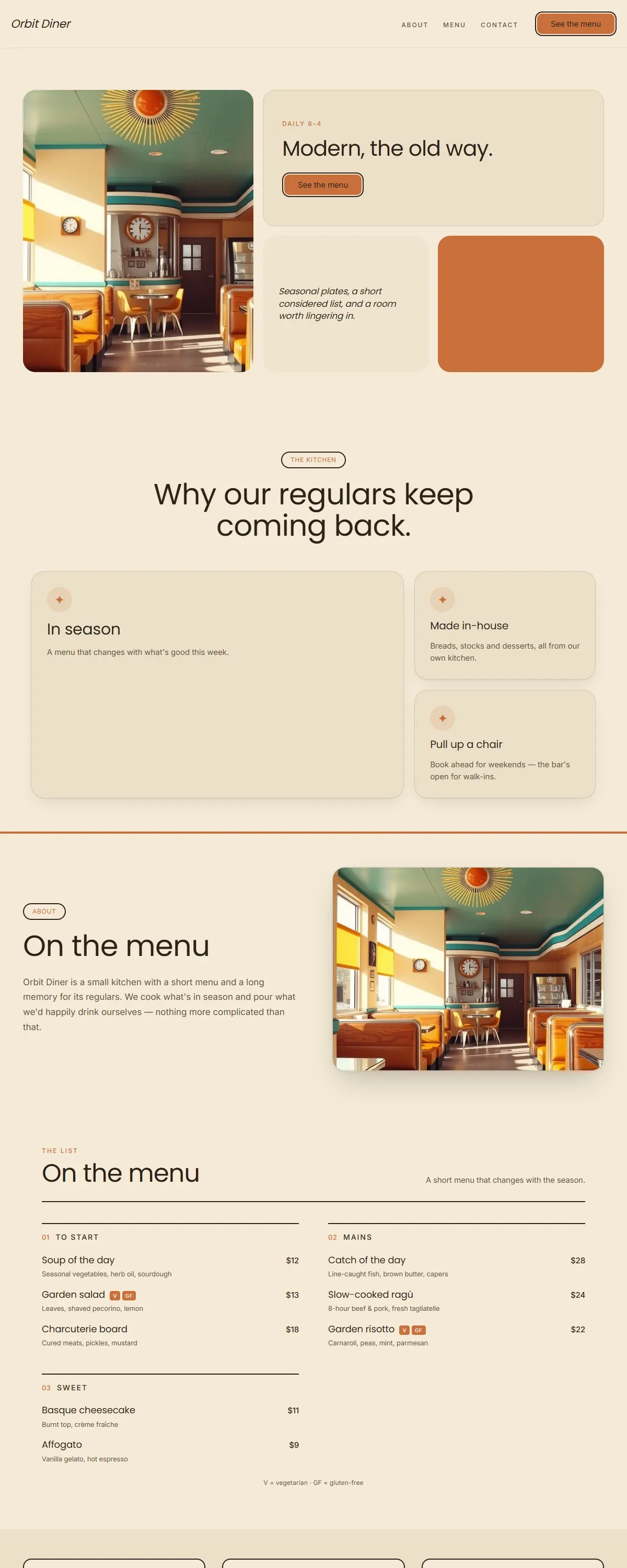
Mid-century modern — warm cream, teal and mustard with friendly geometric Poppins.
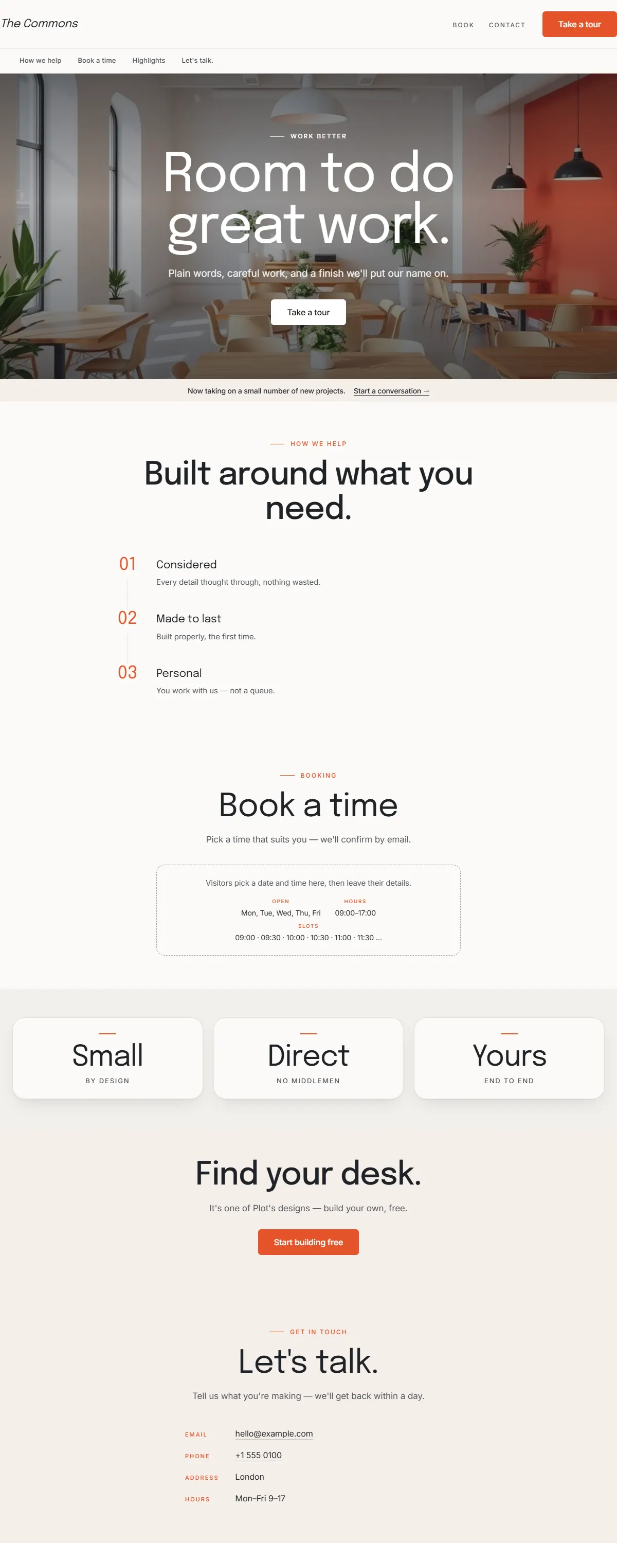
Friendly, optimistic and modern — warm white with a bright coral accent and Epilogue.
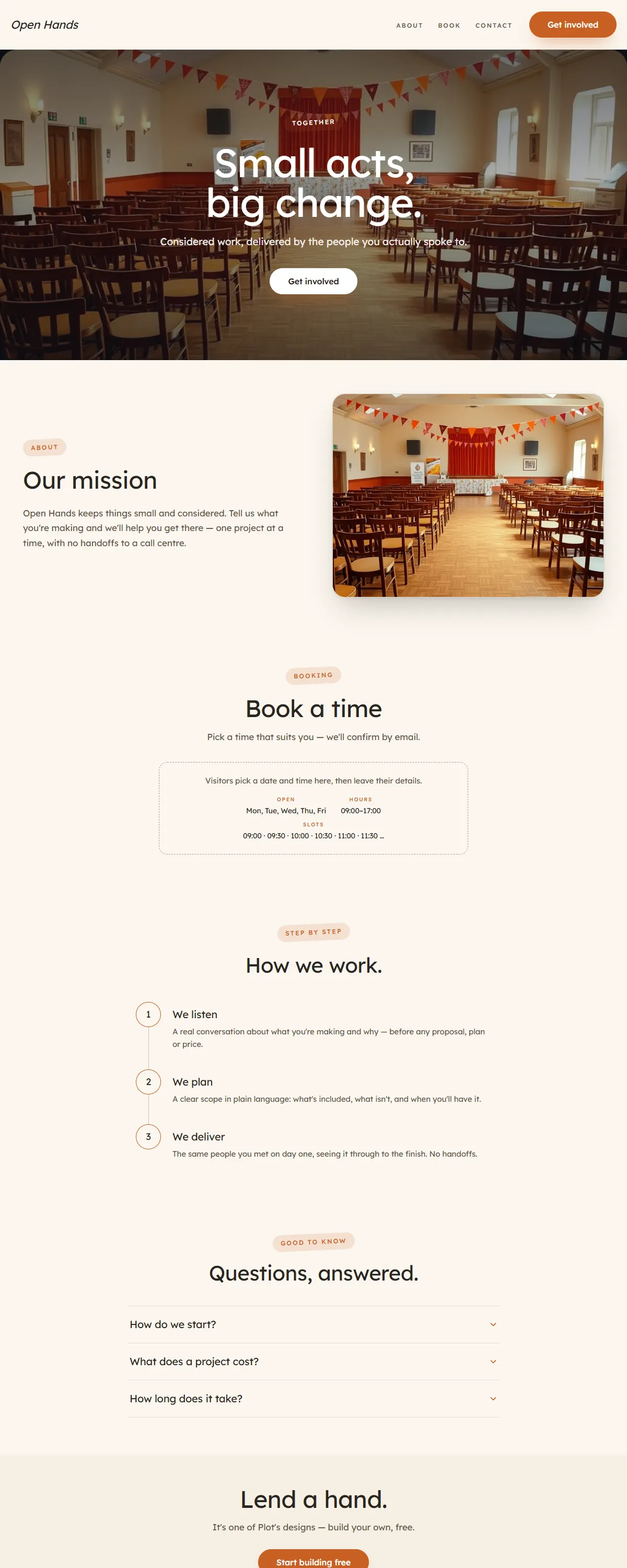
Warm, optimistic and human — cream with a hopeful orange accent and friendly Lexend.
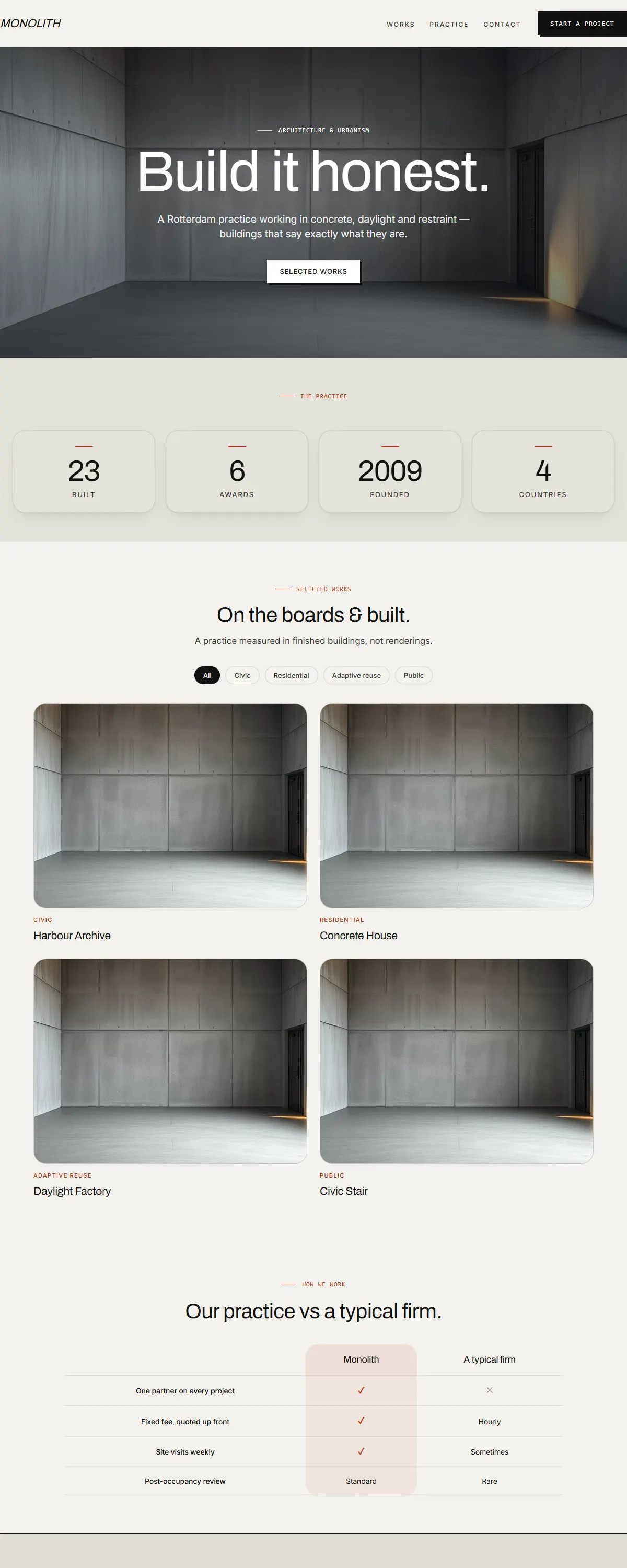
Raw concrete grey with one blunt red-orange accent and heavy Archivo. Brutalist and structural.
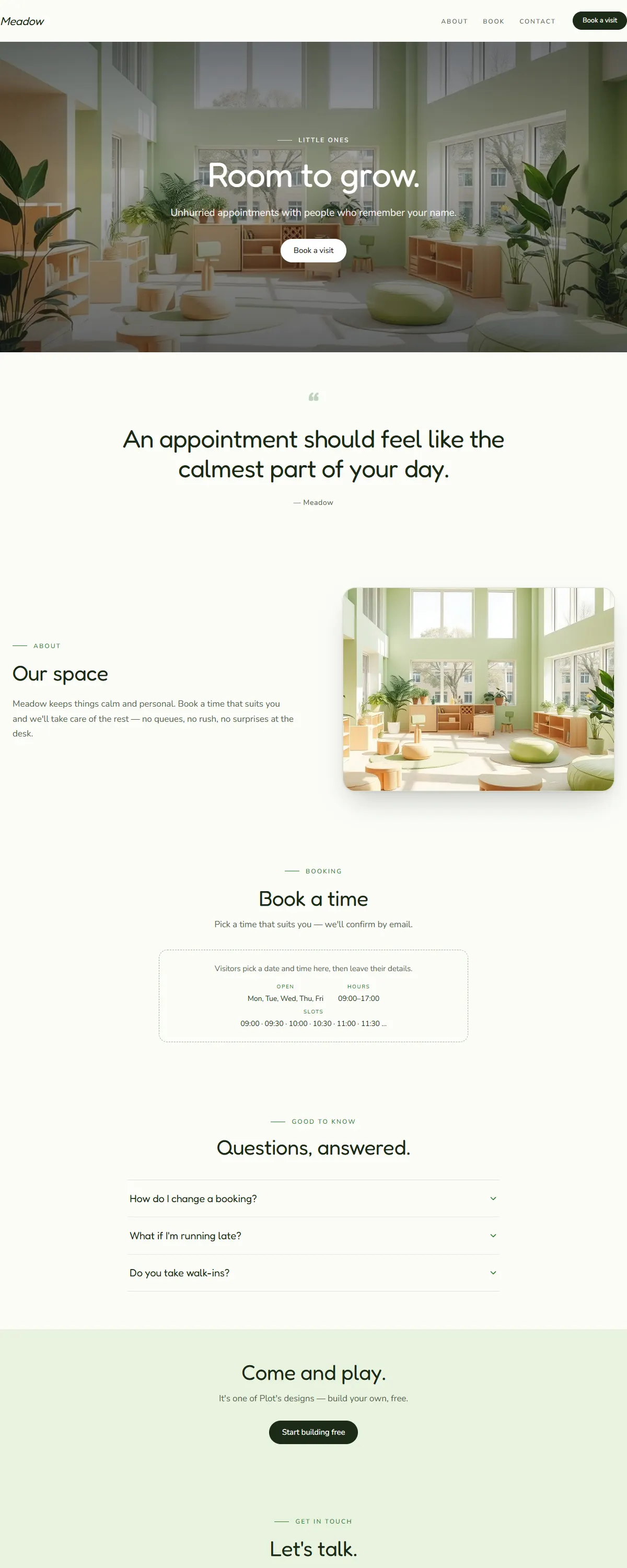
Fresh leaf-green on soft cream with a rounded, friendly Fredoka. Bright and playful.
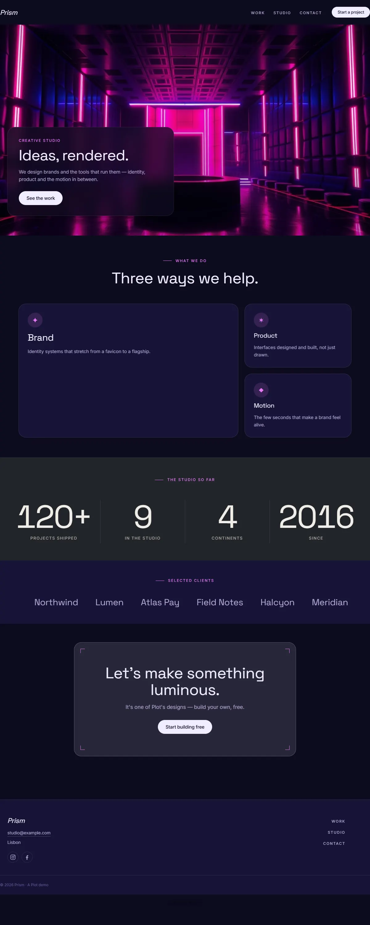
Indigo-to-magenta gradient on near-black with bold Space Grotesk. Y2K-leaning and luminous.
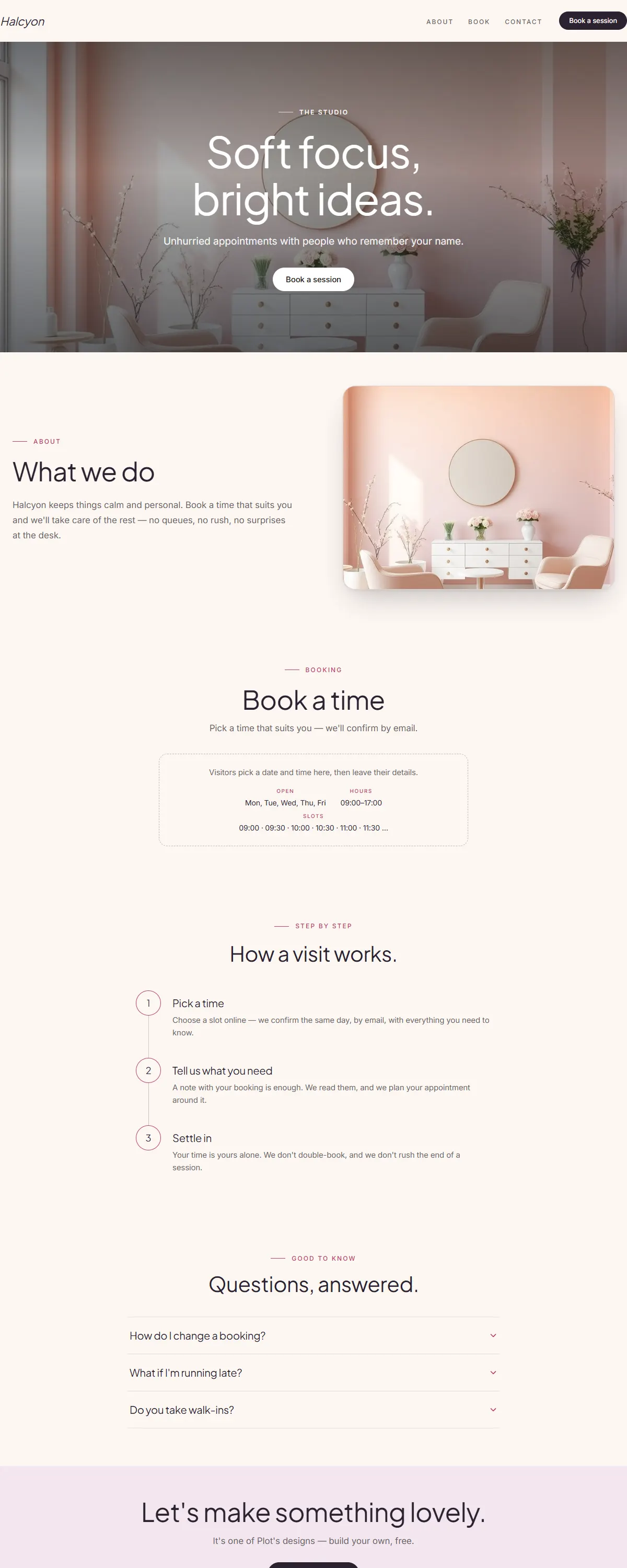
Soft peach-to-lilac gradient with a friendly Jakarta sans. Bright, lovely, playful.
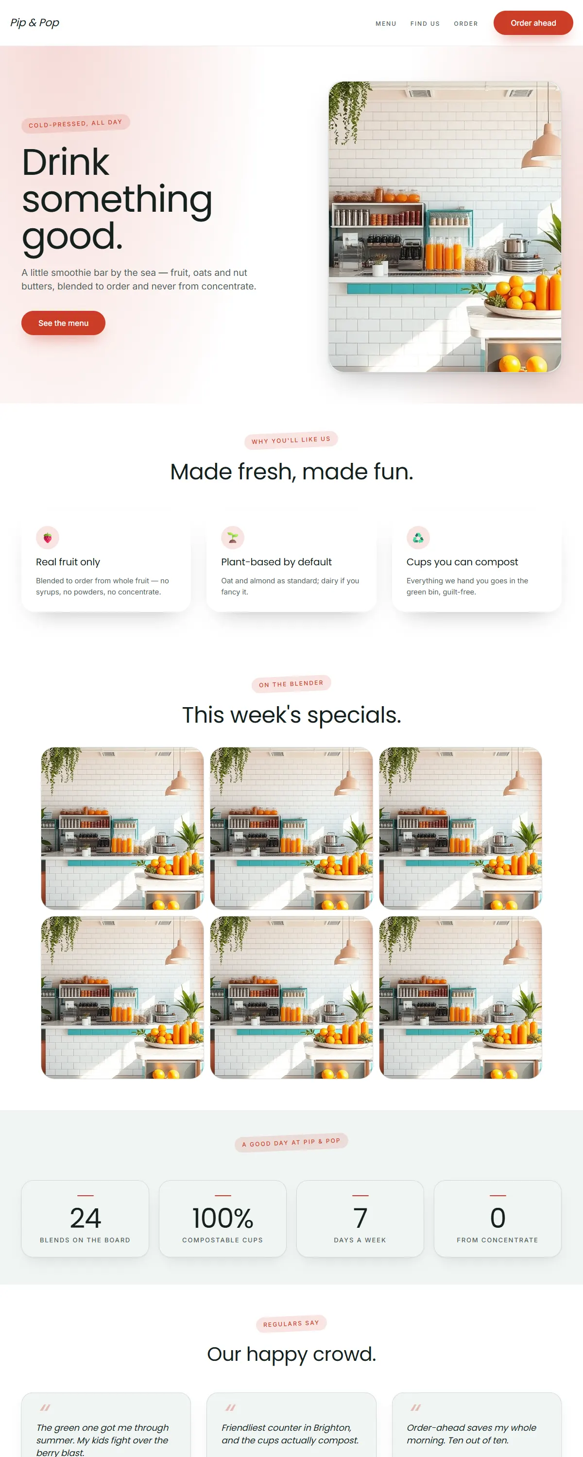
Crisp white with coral and teal and a rounded Poppins. Fresh, energetic, good-for-you.
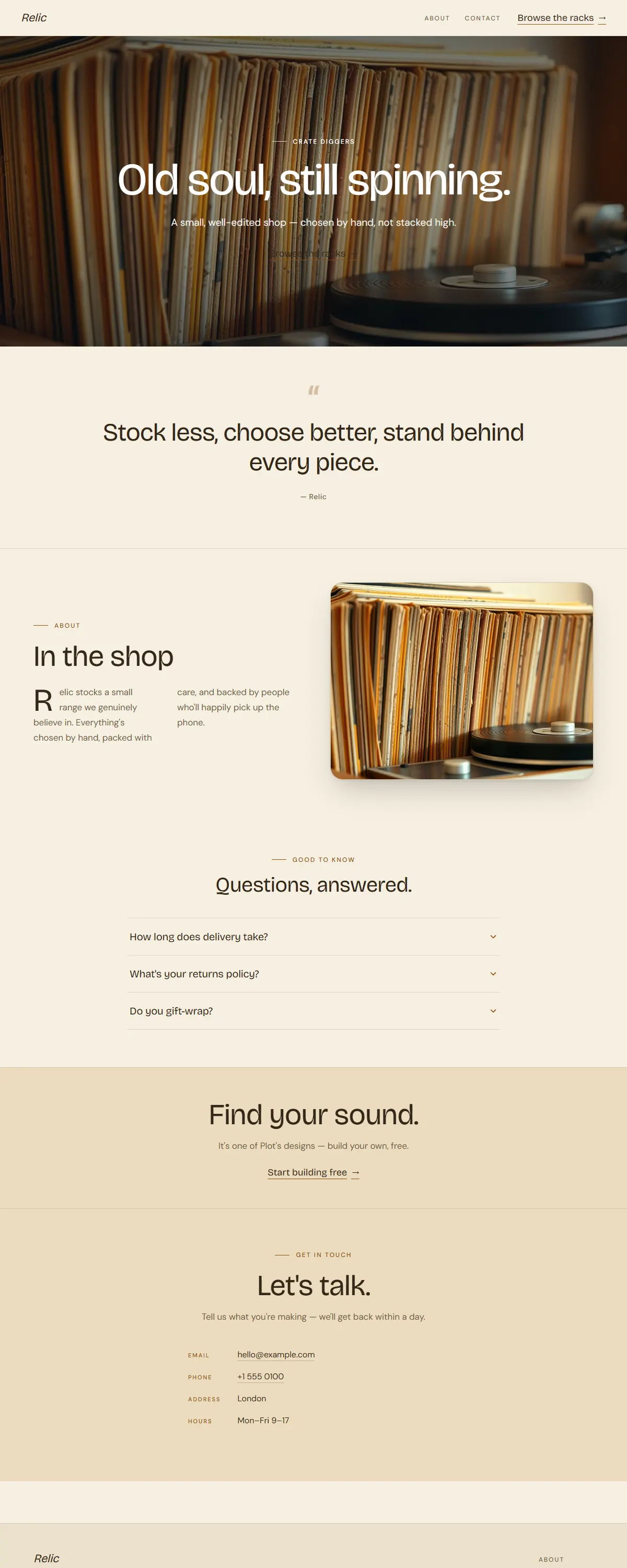
Warm 1970s mustard and brown with a groovy display face. Vintage soul, still spinning.
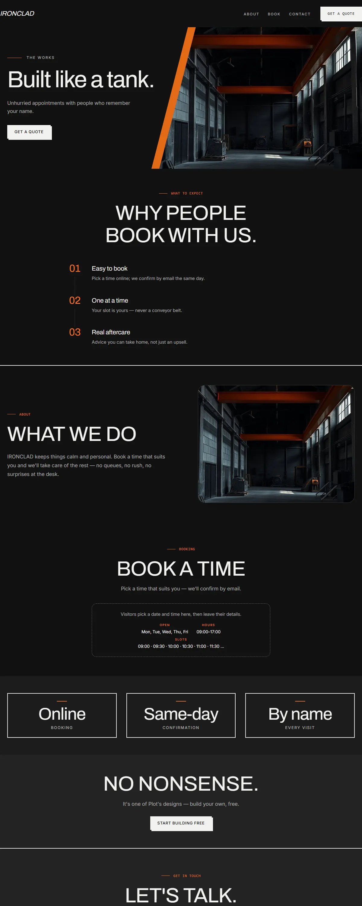
Black concrete and safety orange with heavy Archivo. Raw, industrial, built to last.
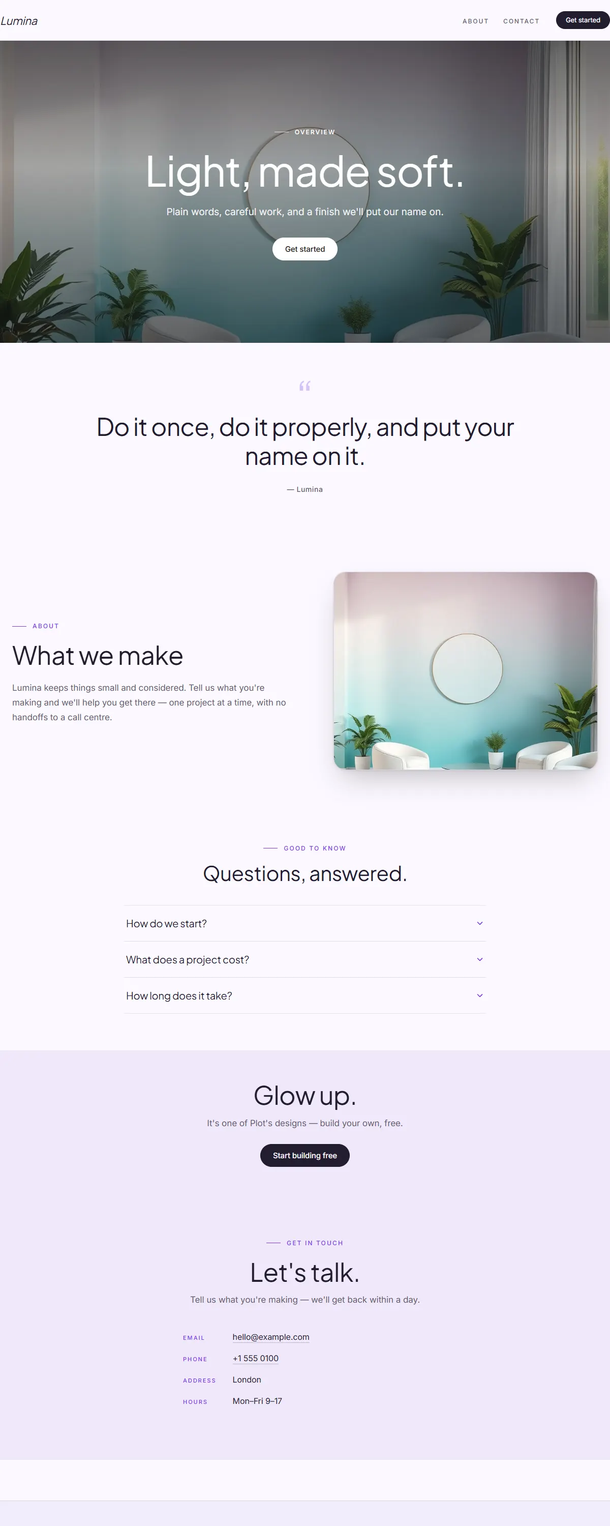
Soft aqua-to-lavender gradient with a violet accent and rounded Jakarta sans. Bright and contemporary.
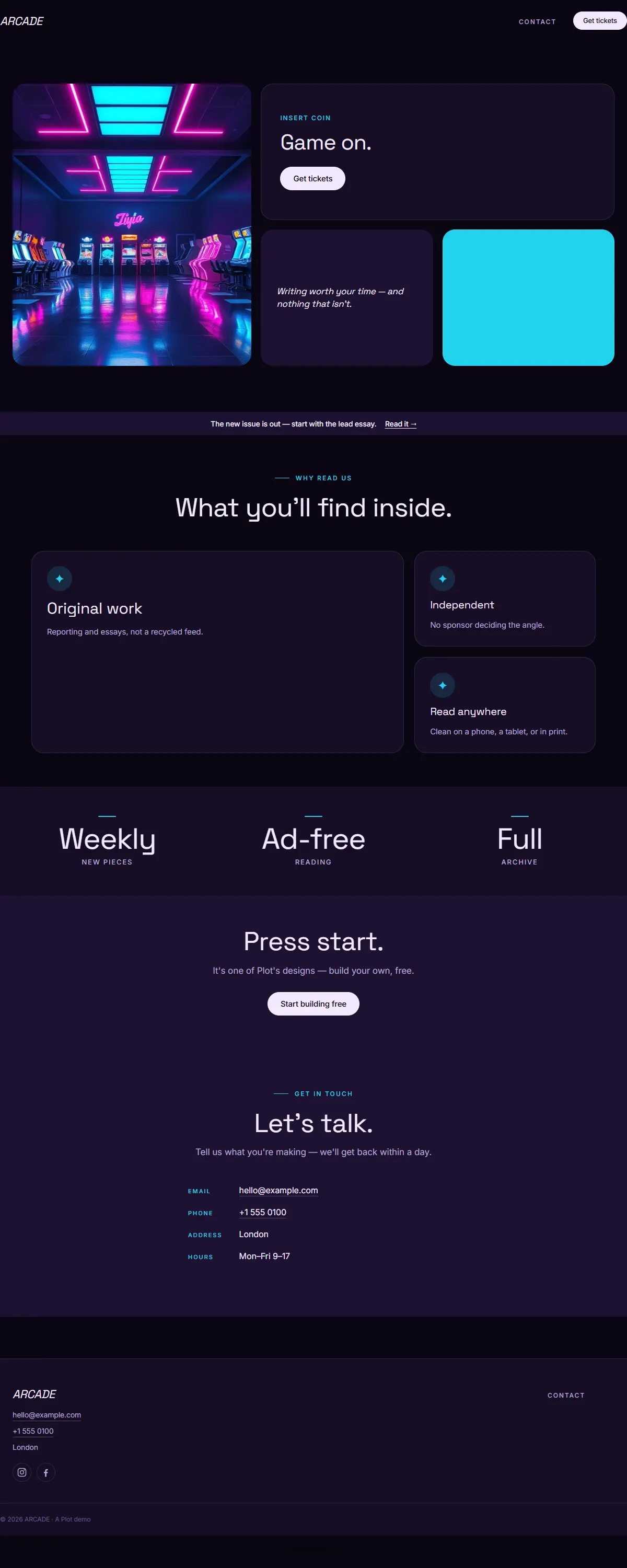
Near-black with cyan-and-magenta Y2K neon and bold Space Grotesk. Retro-futuristic arcade energy.
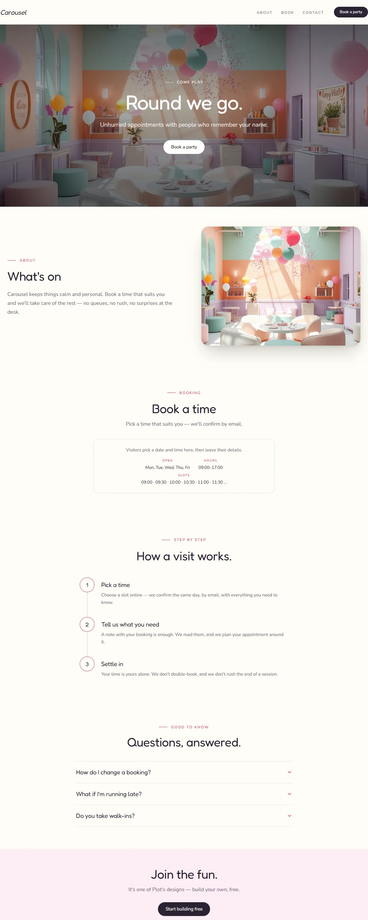
Bright multi-pastel with a punchy pink and rounded Fredoka. Playful, made for celebrations.
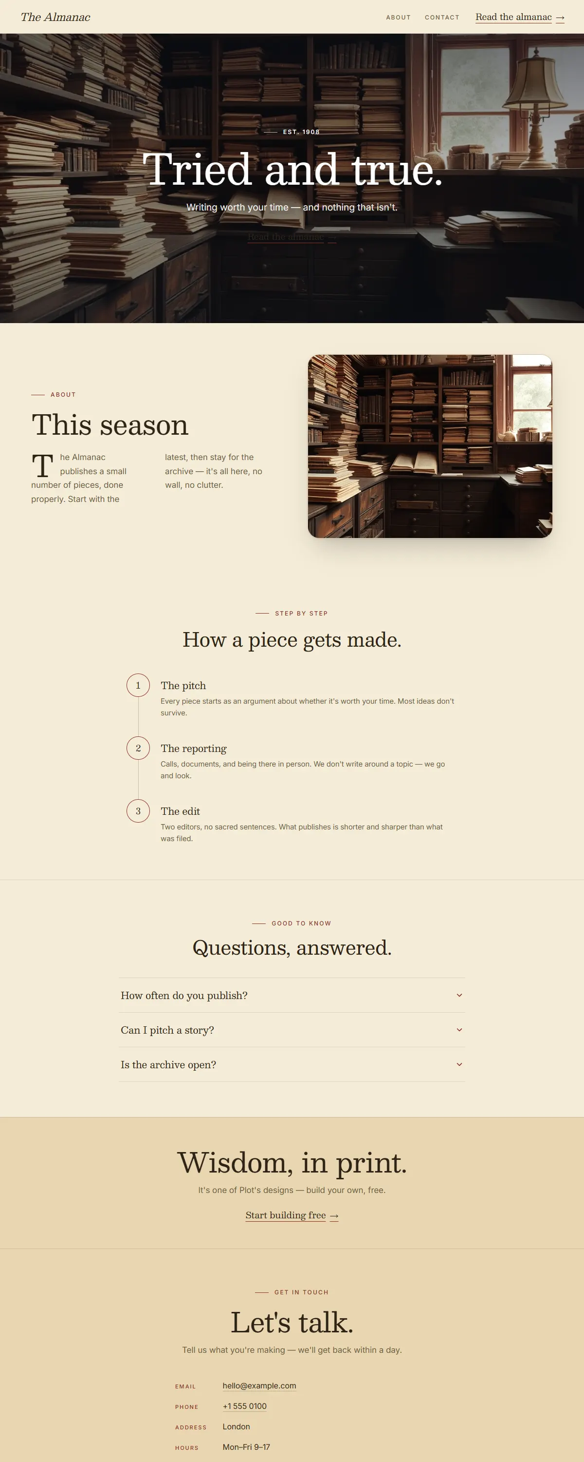
Sepia and oxblood with a sturdy Besley slab. Vintage almanac, tried-and-true.
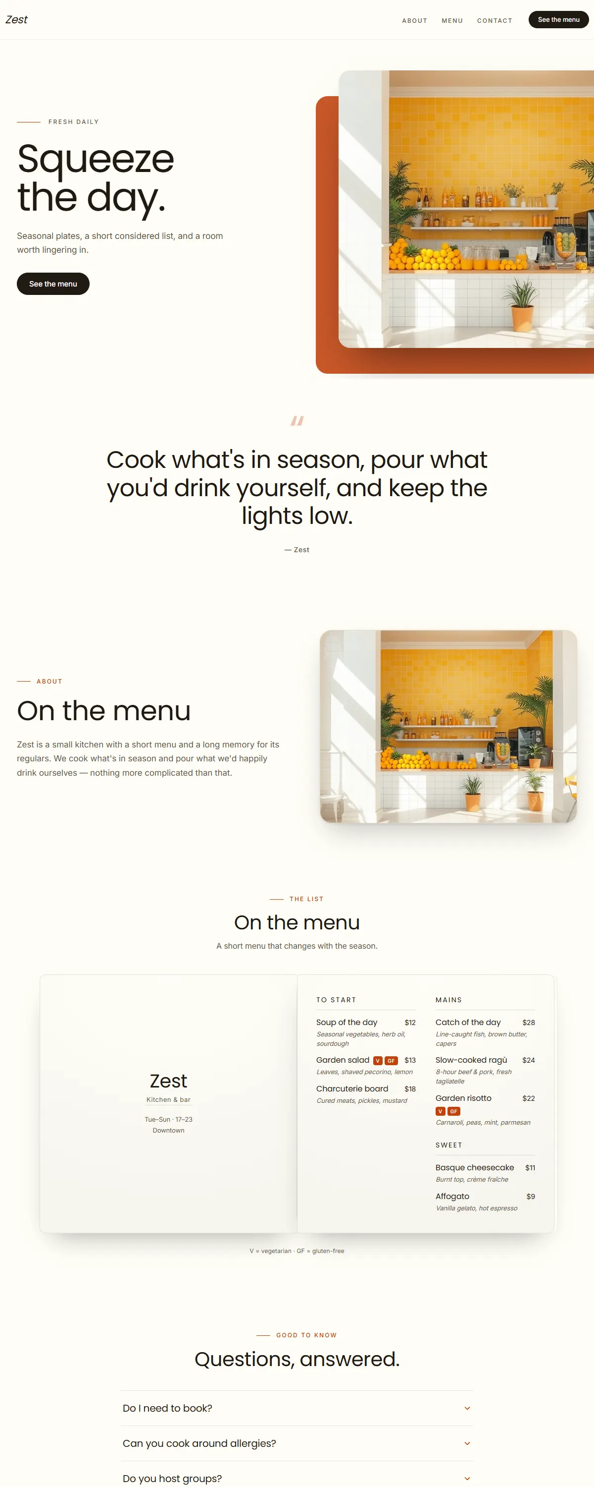
Crisp white and zesty orange with a rounded Poppins. Bright, fresh, good-for-you.
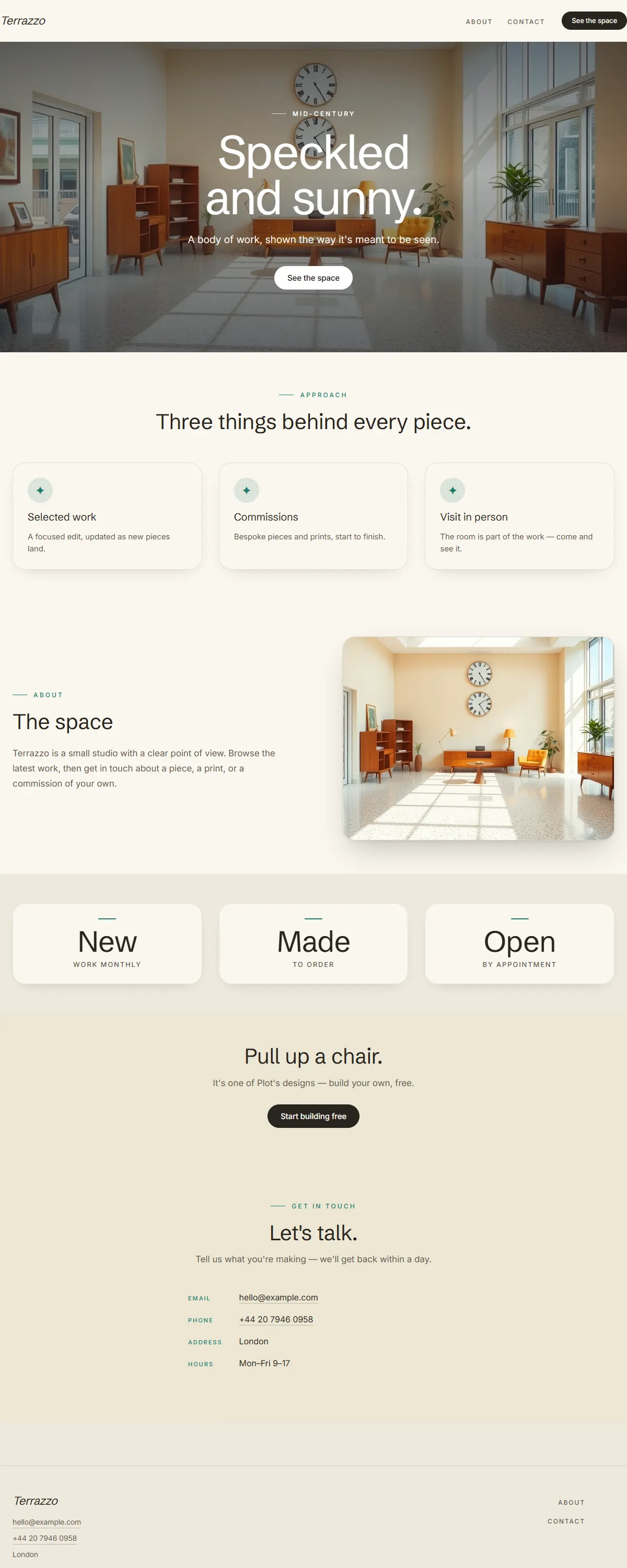
Cream and teal over a speckled terrazzo mood with Schibsted grotesk. Mid-century, sunny, retro.
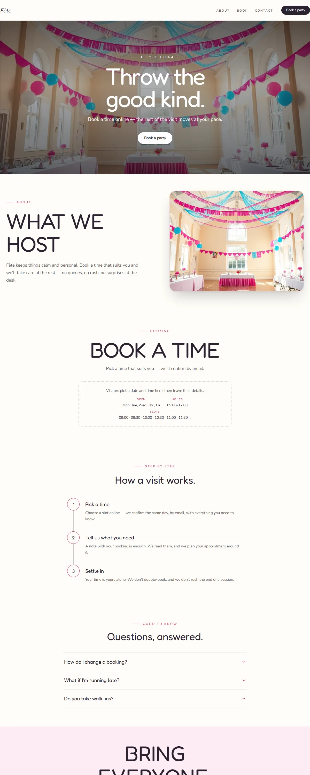
Cream with hot pink and sky blue and a rounded Fredoka. Bright, festive, made for celebrations.
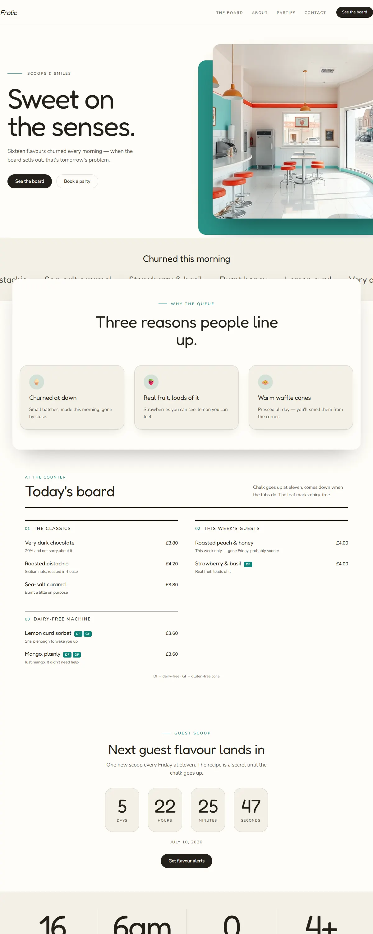
Sunny cream with a turquoise accent and a rounded Fredoka. Bright, sweet, and full of play.
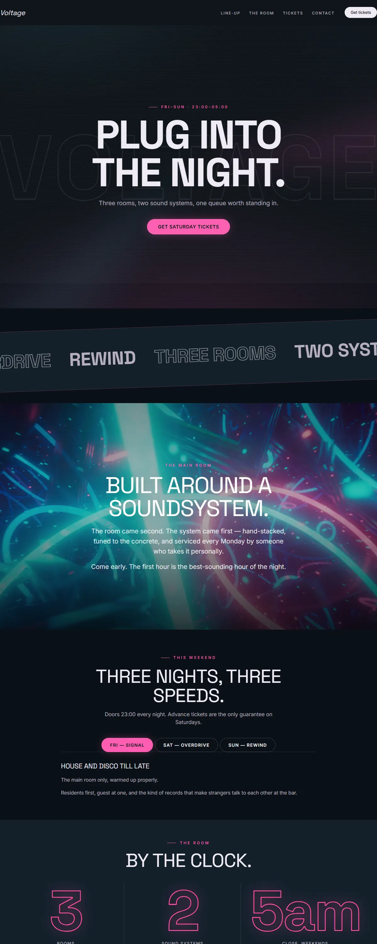
Teal-black with hot-magenta neon and bold Space Grotesk. Retro-synthwave after-hours.
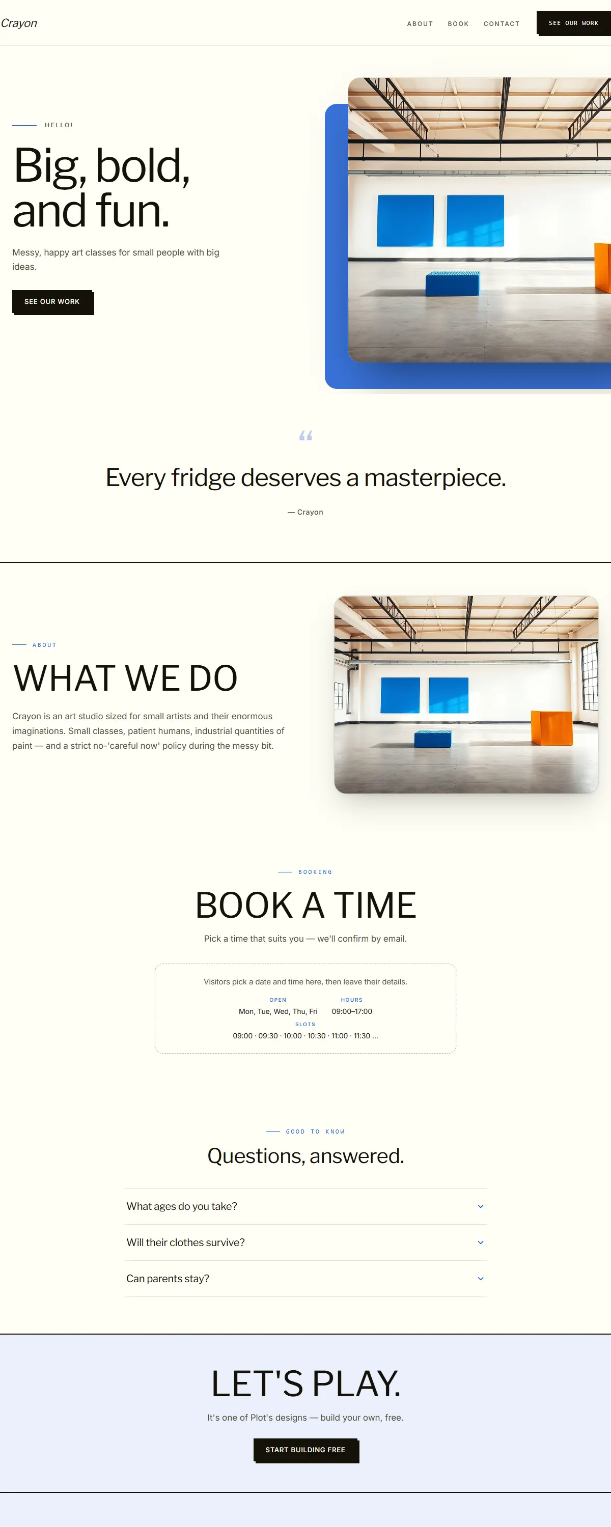
Bright cream with primary-blue blocks and a chunky Libre Franklin. Playful neo-brutalism.
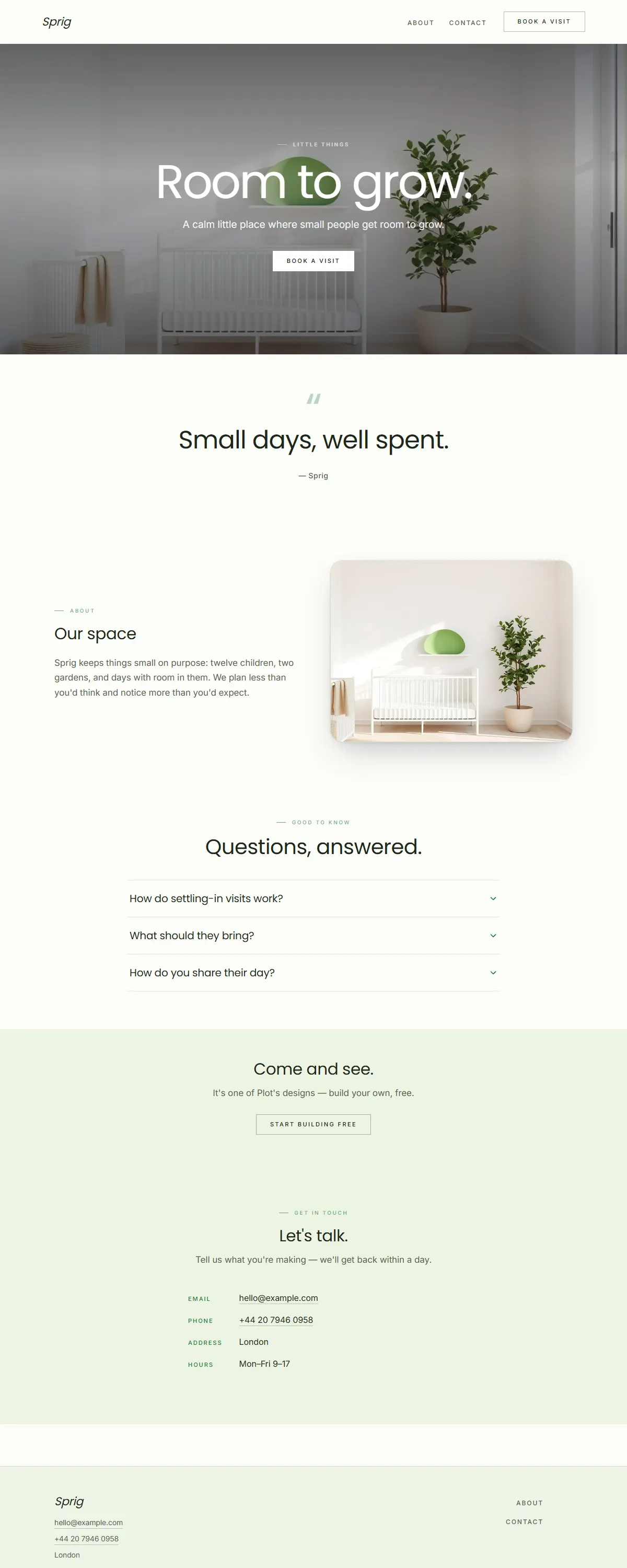
Bright white with a fresh-green pop and a rounded Poppins. Airy, friendly, made for little ones.
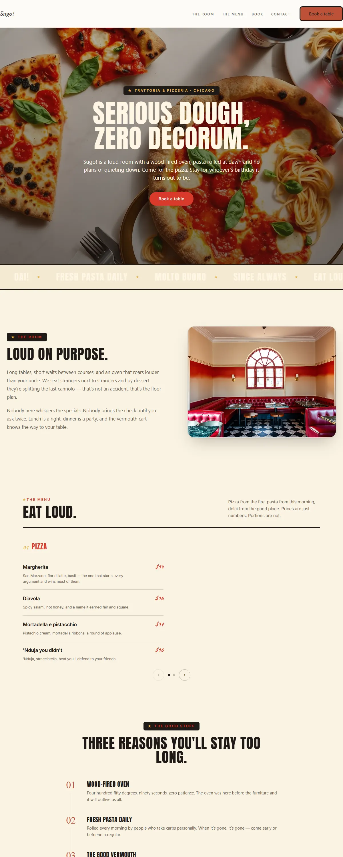
Warm cream, tomato red and hand-script over poster caps — a loud, sunny trattoria that treats lunch as the main event.
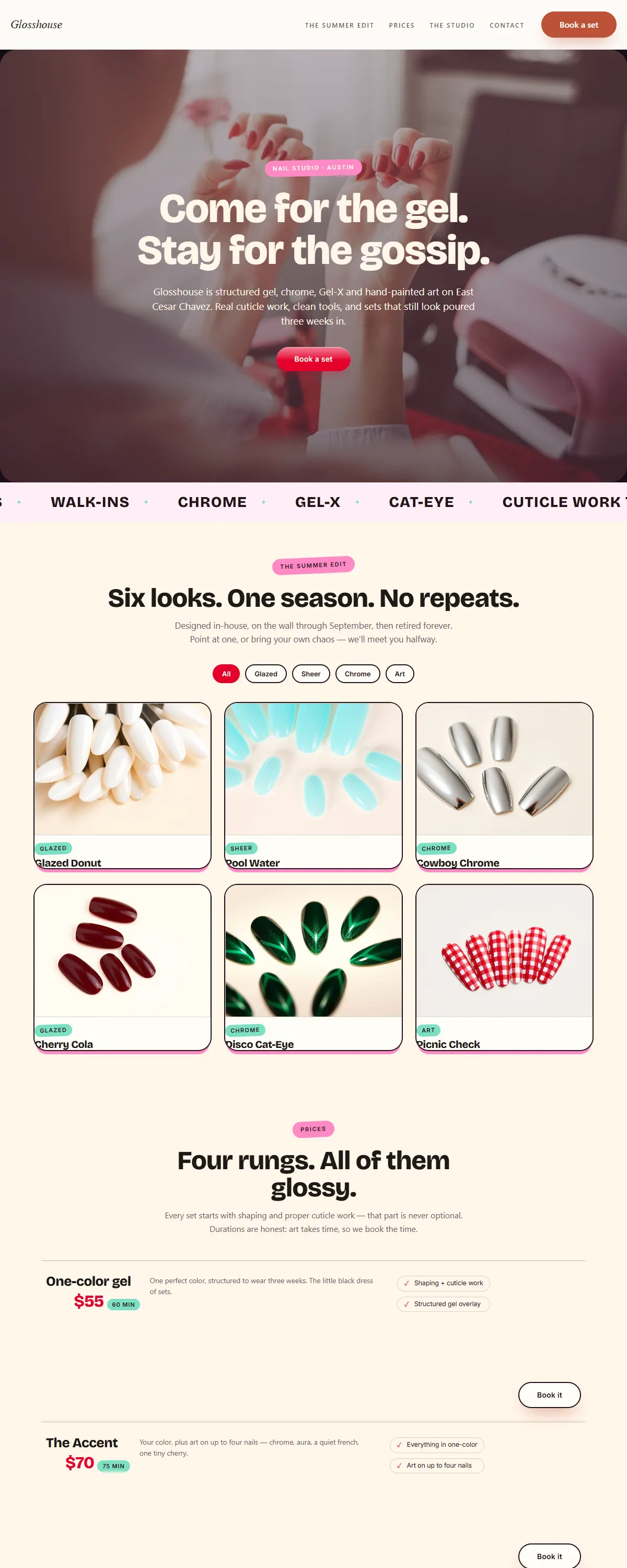
Cream, bubblegum and cherry with chunky soft display type — a candy-pop nail studio kept premium by a strict grid.
Ingen design passer på de filtre endnu — prøv at fjerne et.
Kan du lide det, du ser? Byg et site på et hvilket som helst af dem — gratis.
Byg gratis